Highlights from the 2016 New York R Conference

Originally posted on www.work-bench.com.

image

You might be asking yourself, “How was the 2016 New York R Conference?”

Well, if we had to sum it up in one picture, it would look a lot like this (thank you to Drew Conway for the slide & delivering the battle cry for data science in NYC):

image

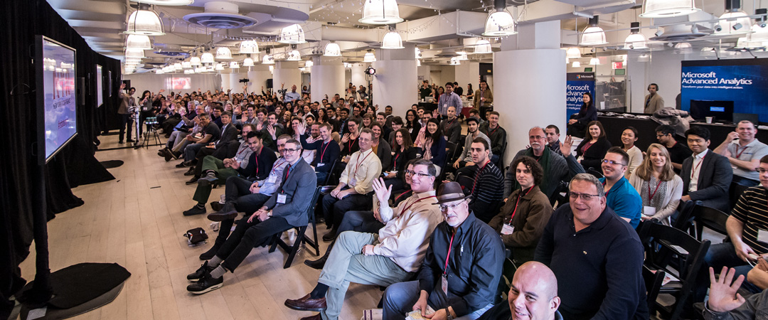
Our 2nd annual, sold-out New York R Conference was back this year on April 8th & 9th at Work-Bench. Co-hosted with our friends at Lander Analytics, this year’s conference was bigger and better than ever, with over 250 attendees, and speakers from Airbnb, AT&T, Columbia University, eBay, Etsy, RStudio, Socure, and Tamr. In case you missed the conference or want to relive the excitement, all of the talks and slides are now live on the R Conference website.

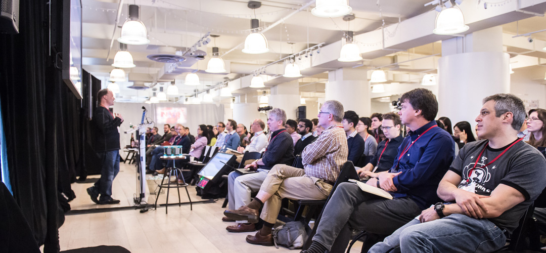
With 30 talks, each 20 minutes long and two forty-minute keynotes, the topics of the presentations were just as diverse as the speakers. Vivian Peng gave an emotional talk on data visualization using non-visual senses and “The Feels.” Bryan Lewis measured the shadows of audience members to demonstrate the pros and cons of projection methods, and Daniel Lee talked about life, love, Stan, and March Madness. But, even with 32 presentations from a diverse selection of speakers, two dominant themes emerged: 1) Community and 2) Writing better code.

Given the amazing caliber of speakers and attendees, community was on everyone’s mind from the start. Drew Conway emoted the past, present, and future of data science in NYC, and spoke to the dangers of tearing down the tent we built. Joe Rickert from Microsoft discussed the R Consortium and how to become involved. Wes McKinney talked about community efforts in improving interoperability between data science languages with the new Feather data frame file format under the Apache Arrow project. Elena Grewal discussed how Airbnb’s data science team made changes to the hiring process to increase the number of female hires, and Andrew Gelman even talked about how your political opinions are shaped by those around you in his talk about Social Penumbras.

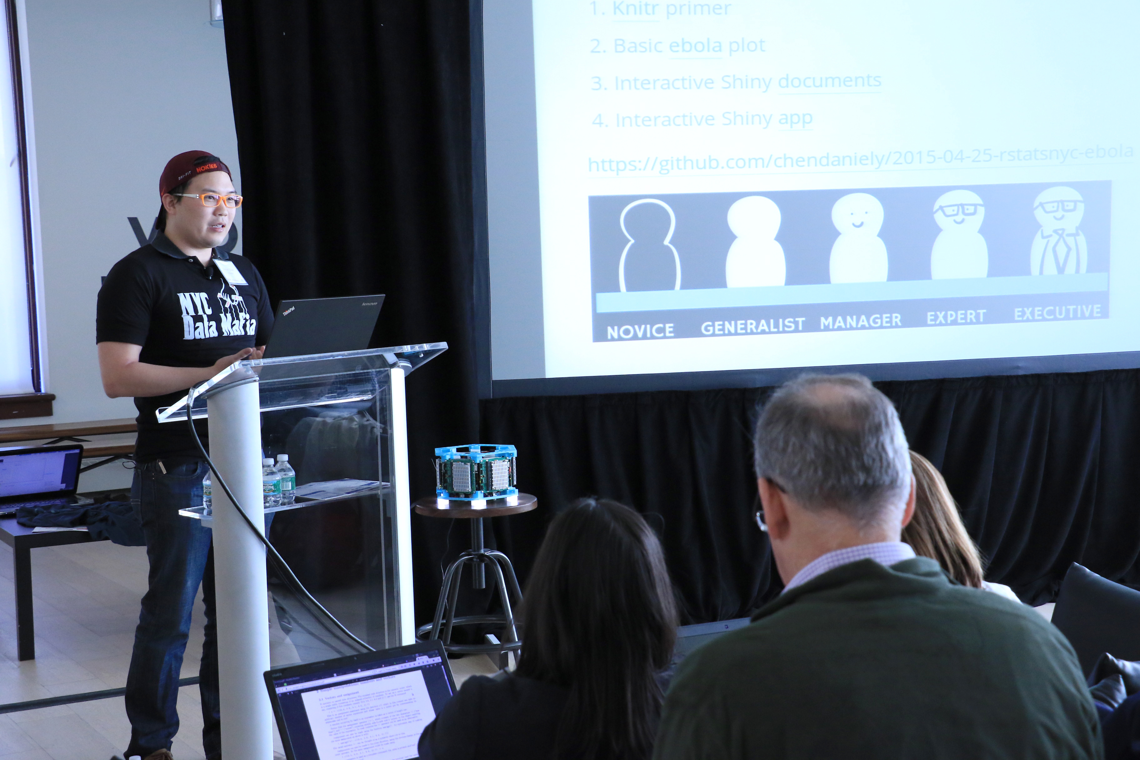
Writing better code also proved to be a dominant theme throughout the two day conference. Dan Chen of Lander Analytics talked about implementing tests in R. Similarly, Neal Richardson and Mike Malecki of Crunch.io talked about how they learned to stop munging and love tests, and Ben Lerner discussed how to optimize Python code using profilers and Cython. The perfect intersection of themes came from Bas van Schaik of Semmle who discussed how to use data science to write better code by treating code as data. While everyone had some amazing insights, these were our top five highlights:

JJ Allaire Releases a New Preview of RStudio

image

JJ Allaire, the second speaker of the conference, got the crowd fired up by announcing new features of RStudio and new packages. Particularly exciting was bookdown for authoring large documents, R Notebooks for interactive Markdown files and shared sessions so multiple people can code together from separate computers.

Andrew Gelman Discusses the Political Impact of the Social Penumbra

image

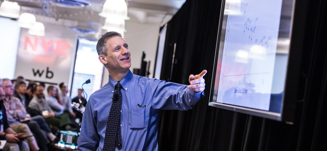
As always, Dr. Andrew Gelman wowed the crowd with his breakdown of how political opinions are shaped by those around us. He utilized his trademark visualizations and wit to convey the findings of complex models.

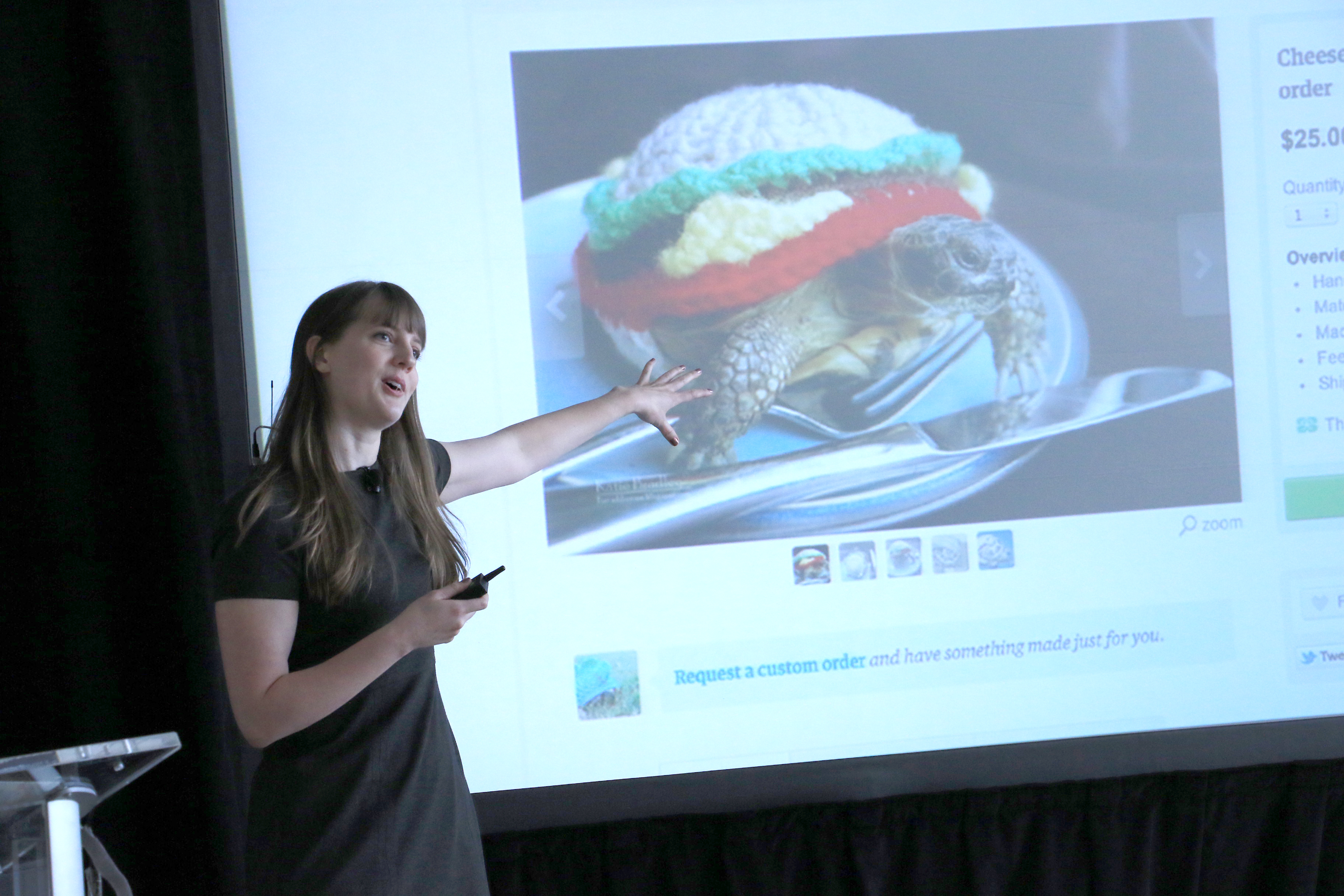
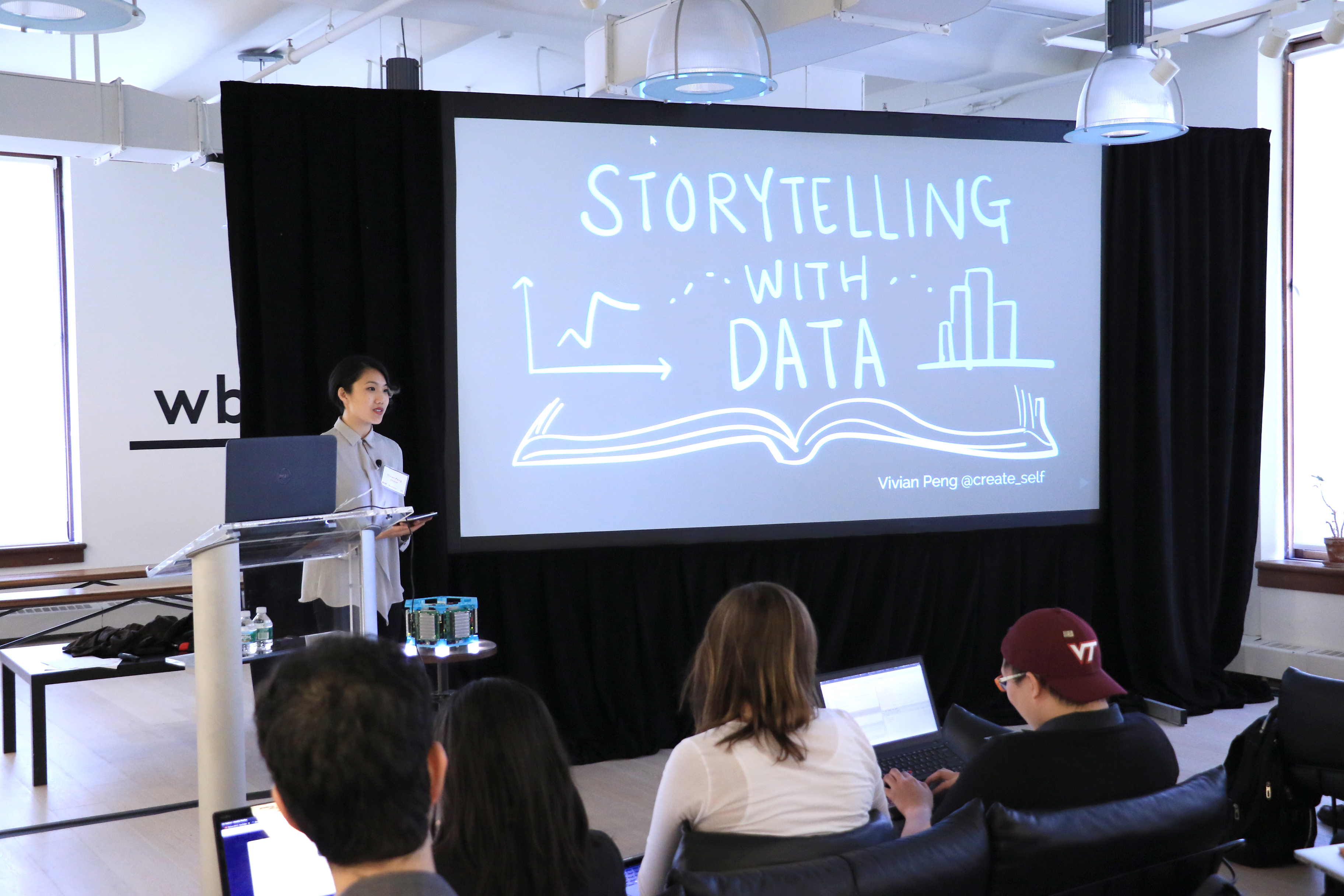
Vivian Peng Helps Kick off the Second Day with a Punch to the Gut

image

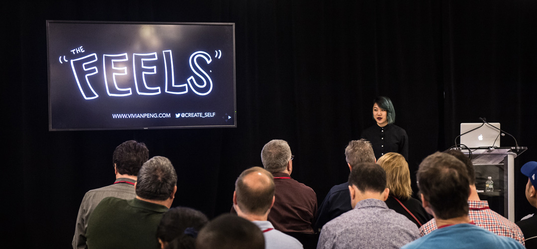
On the morning of the second day of the conference, Vivian Peng gave a heartfelt talk on using data visualization and non-visual senses to drive emotional reaction and shape public opinion on everything from the Syrian civil war to drug resistance statistics.

Ivor Cribben Studies Brain Activity with Time Varying Networks

image

University of Alberta Professor Ivor Cribben demonstrated his techniques for analyzing fMRI data. His use of network graphs, time series and extremograms brought an academic rigor to the conference.

Elena Grewal Talks About Scaling Data Science at Airbnb

image

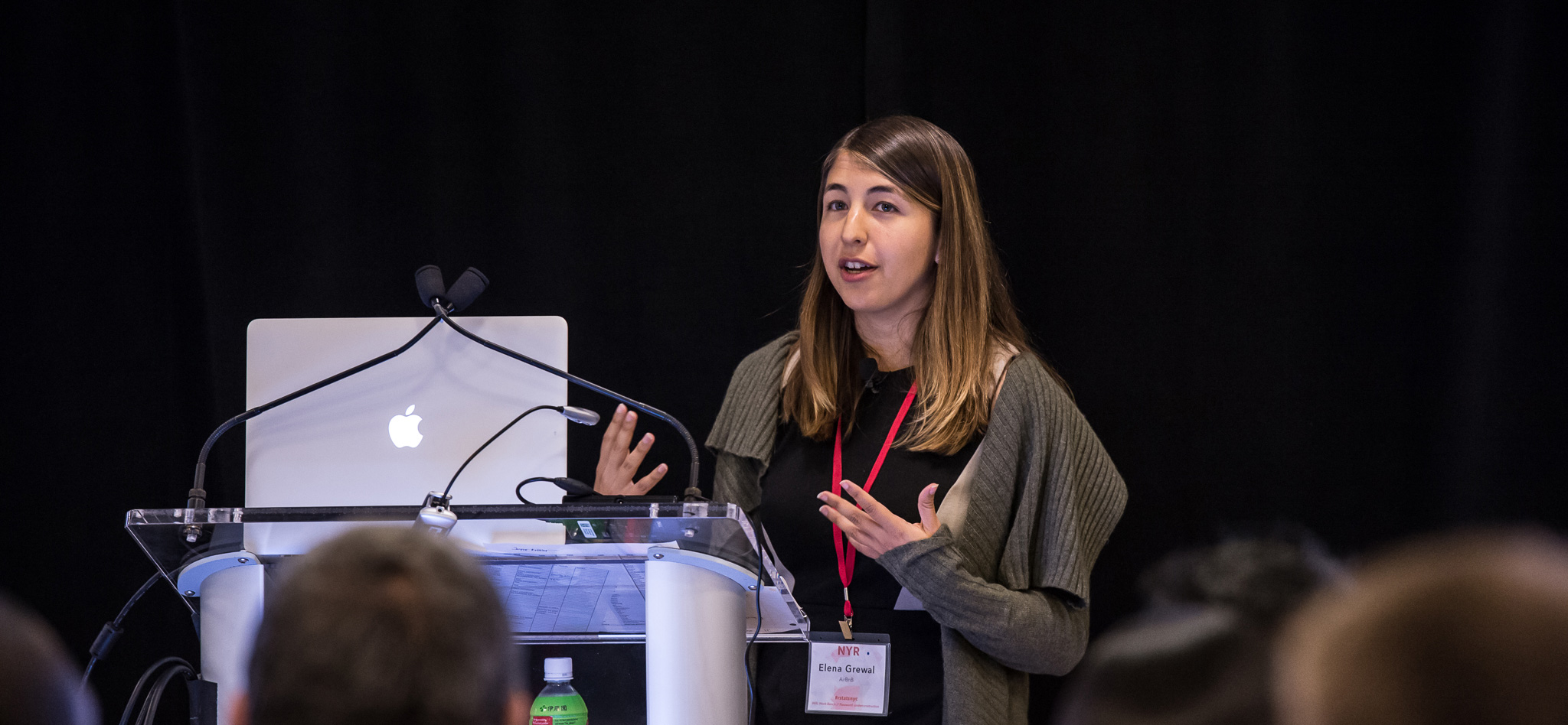
After a jam-packed 2 full days, Elena Grewal helped wind down the conference with a thoughtful introspection on how Airbnb has grown their data science team from 5 to 70 people, with a focus on increasing diversity and eliminating bias in the hiring process.

See the full conference videos & presentations below, and sign up for updates for the 2017 New York R Conference on www.rstats.nyc. To get your R fix in the meantime, follow @nyhackr, @Work_Bench, and @rstatsnyc on Twitter, and check out the New York Open Programming Statistical Meetup or one of Work-Bench’s upcoming events!

Related Posts


Jared Lander is the Chief Data Scientist of Lander Analytics a New York data science firm, Adjunct Professor at Columbia University, Organizer of the New York Open Statistical Programming meetup and the New York and Washington DC R Conferences and author of R for Everyone.

MIT Sports Analytics Conference

Last year, as I embarked on my NFL sports statistics work, I attended the Sloan Sports Analytics Conference for the first time. A year later, after a very successful draft, I was invited to present an R workshop to the conference.

My time slot was up against Nate Silver so I didn’t expect many people to attend.    Much to my surprise when I entered the room every seat was taken, people were lining the walls and sitting in the aisles.

My presentation, which was unrelated to the work I did, analyzed the Giants’ probability of passing versus rushing and the probability of which receiver was targeted.  It is available at the talks section of my site.

After the talk I spent the rest of the day fielding questions and gave away copies of R for Everyone and an NYC Data Mafia shirt.

Related Posts


Jared Lander is the Chief Data Scientist of Lander Analytics a New York data science firm, Adjunct Professor at Columbia University, Organizer of the New York Open Statistical Programming meetup and the New York and Washington DC R Conferences and author of R for Everyone.

BDA3

Earlier this week, my company, Lander Analytics, organized our first public Bayesian short course, taught by Andrew Gelman, Bob Carpenter and Daniel Lee.  Needless to say the class sold out very quickly and left a long wait list.  So we will schedule another public training (exactly when tbd) and will make the same course available for private training.

This was the first time we utilized three instructors (as opposed to a main instructor and assistants which we often use for large classes) and it led to an amazing dynamic.  Bob laid the theoretical foundation for Markov chain Monte Carlo (MCMC), explaining both with math and geometry, and discussed the computational considerations of performing simulation draws.  Daniel led the participants through hands-on examples with Stan, covering everything from how to describe a model, to efficient computation to debugging.  Andrew gave his usual, crowd dazzling performance use previous work as case studies of when and how to use Bayesian methods.

It was an intensive three days of training with an incredible amount of information.  Everyone walked away knowing a lot more about Bayes, MCMC and Stan and eager to try out their new skills, and an autographed copy of Andrew’s book, BDA3.

A big help, as always was Daniel Chen who put in so much effort making the class run smoothly from securing the space, physically moving furniture and running all the technology.

Related Posts


Jared Lander is the Chief Data Scientist of Lander Analytics a New York data science firm, Adjunct Professor at Columbia University, Organizer of the New York Open Statistical Programming meetup and the New York and Washington DC R Conferences and author of R for Everyone.


I R NY
On April 24th and 25th Lander Analytics and Work-Bench coorganized the (sold-out) inaugural New York R Conference. It was an amazing weekend of nerding out over R and data, with a little Python and Julia mixed in for good measure. People from all across the R community gathered to see rockstars discuss their latest and greatest efforts.

Highlights include:


BryanLewis
Bryan Lewis wowing the crowd (there were literally gasps) with rthreejs implemented with htmlwidgets.


HilaryParker
Hilary Parker receiving spontaneous applause in the middle of her talk about reproducible research at Etsy for her explainr, catsplainr and mansplainr packages.


JamesPowell
James Powell speaking flawless Mandarin in a talk tangentially about Python.


VivianPeng
Vivian Peng also receiving spontaneous applause for her discussion of storytelling with data.


WesMcKinney
Wes McKinney showing love for data.frames in all languages and sporting an awesome R t-shirt.


DanChen
Dan Chen using Shiny to study Ebola data.


AndyGelman
Andrew Gelman blowing away everyone with his keynote about Bayesian methods with particular applications in politics.

Videos of the talks are available at http://www.rstats.nyc/#speakers with slides being added frequently.

A big thank you to sponsors RStudio, Revolution Analytics, DataKind, Pearson, Brewla Bars and Twillory.


Next year’s conference is already being planned for April. To inquire about sponsoring or speaking please get in touch.

Related Posts


Jared Lander is the Chief Data Scientist of Lander Analytics a New York data science firm, Adjunct Professor at Columbia University, Organizer of the New York Open Statistical Programming meetup and the New York and Washington DC R Conferences and author of R for Everyone.


So far this year I have logged many miles in the air and on the rails. In between trips to Minneapolis and Boston I spent about a month traveling through India and Southeast Asia, mainly to conduct R courses in Singapore and Kuala Lumpur for the likes of Intel, Micron, Celcom, Maxis, DBS and other similar companies. The training courses were organized through Revolution Analytics’ Singapore office. Given the success of the classes, there will be more opportunities this spring or summer in Singapore, Kuala Lumpur and also in Australia.

Quite a lot of material was covered based on the offerings of my company, Lander Analytics and the content of my R for Everyone.

Day 1 – Basics

  • Getting and installing R
  • The RStudio Environment
  • The basics of R
    • Variables
    • Data Types
    • Reading data
    • Calling functions
    • Missing Data
  • Basic Math
  • Advanced Data Structures
    • data.frames
    • lists
    • matrices
    • arrays
  • Reading Data into R
    • read.table
    • RODBC
    • Binary data
  • Matrix Calculations
  • Data Munging
  • Writing functions
  • Conditionals
  • Loops
  • String manipulation and regular expressions
  • Visualization

Day 2 – Modeling

Day 3 – Machine Learning

Day 4 – Data Presentation and Portability

  • Reproducible reports using knitr
  • Basic Introduction to Markdown
  • Using knitr to automatically generate reports with embedded analytics
  • Using Markdown and knitr to automatically generate websites with embedded analytics
  • Using Markdown and knitr to make HTML5 slideshows with embedded analytics
  • Advanced plotting
  • Building R Packages
  • Shiny Overview

Day 5 – High Performance Computing with R

Given my extensive time abroad I thought it would be good to look at it all on a map using the Leaflet package in R.

Using the Google Maps API we can look up the latitude and longitude of the visited cities.

library(XML)
library(plyr)

cities <- c('Hong Kong', 'Haripal, India', 'Kolkata, India', 'Jaipur, India', 'Agra, India', 'Delhi, India', 
            'Singapore', 'Kuala Lumpur, Malaysia', 'Geroge Town, Malaysia')
lat.long <- function(place)
{
    theURL <- sprintf('http://maps.google.com/maps/api/geocode/xml?sensor=false&address=%s', place)
    doc <- xmlToList(theURL)
    data.frame(Place=place, Latitude=as.numeric(doc$result$geometry$location$lat), Longitude=as.numeric(doc$result$geometry$location$lng), stringsAsFactors=FALSE)
}

places <- adply(cities, 1, lat.long)
knitr::kable(places[, -1], digits=3, row.names=FALSE)
Place Latitude Longitude
Hong Kong 22.396 114.109
Haripal, India 22.817 88.105
Kolkata, India 22.573 88.364
Jaipur, India 26.912 75.787
Agra, India 27.177 78.008
Delhi, India 28.614 77.209
Singapore 1.352 103.820
Kuala Lumpur, Malaysia 3.139 101.687
Geroge Town, Malaysia 5.415 100.330

Now that we have the coordinates we use Leaflet to plot them.

library(leaflet)
leaflet(data=places) %>% addTiles() %>% setView(90, 15, zoom=4) %>% addPopups(lng=~Longitude, lat=~Latitude, popup=~Place) %>% addPolylines(~Longitude, ~Latitude, data=places[c(1, 3, 2:9, 1), ]) %>% addMarkers(lng=~Longitude, lat=~Latitude, popup=~Place, icon=JS("L.icon({iconUrl: 'https://www.jaredlander.com/images/jaredlanderfavicon.png', iconSize: [20, 20]})"))

Calculating all the miles traveled could be as simple as looking it up on TripIt, or we could do some quick Haversine distance calculations with the geosphere package.

First, we get the coordinates for New York, Minneapolis and Boston to have a complete picture of the distance.

newCities <- adply(c('New York, NY', 'Minneapolis, MN', 'Boston, MA'), 1, lat.long)
allPlaces <- rbind(newCities[c(1, 2, 1), ], places[c(1, 3, 2:9, 1), ], newCities[c(1, 3, 1), ])

Then in order to use distHaversine we need to set up a to and from relationship between the places. The easiest way will be to just shift the columns.

library(useful)
## Loading required package: ggplot2
shiftedPlaces <- shift.column(data=allPlaces, columns=names(places)[-1], newNames=c('To', 'Lat2', 'Long2'))

Now we can calculate the distance. This assumes that all trips followed a great circle, which might not be the case, especially for the car and rail portions of the trip.

library(geosphere)
## Loading required package: sp
shiftedPlaces$Distance <- distHaversine(shiftedPlaces[, c("Longitude", "Latitude")], shiftedPlaces[, c("Long2", "Lat2")], r=3959)

In total this led to 25,727 miles traveled.

knitr::kable(shiftedPlaces[, -1], digits=c(1, 3, 3, 1, 3, 3, 0), row.names=FALSE)
Place Latitude Longitude To Lat2 Long2 Distance
New York, NY 40.713 -74.006 Minneapolis, MN 44.978 -93.265 1016
Minneapolis, MN 44.978 -93.265 New York, NY 40.713 -74.006 1016
New York, NY 40.713 -74.006 Hong Kong 22.396 114.109 8046
Hong Kong 22.396 114.109 Kolkata, India 22.573 88.364 1642
Kolkata, India 22.573 88.364 Haripal, India 22.817 88.105 24
Haripal, India 22.817 88.105 Kolkata, India 22.573 88.364 24
Kolkata, India 22.573 88.364 Jaipur, India 26.912 75.787 844
Jaipur, India 26.912 75.787 Agra, India 27.177 78.008 138
Agra, India 27.177 78.008 Delhi, India 28.614 77.209 111
Delhi, India 28.614 77.209 Singapore 1.352 103.820 2574
Singapore 1.352 103.820 Kuala Lumpur, Malaysia 3.139 101.687 192
Kuala Lumpur, Malaysia 3.139 101.687 Geroge Town, Malaysia 5.415 100.330 183
Geroge Town, Malaysia 5.415 100.330 Hong Kong 22.396 114.109 1491
Hong Kong 22.396 114.109 New York, NY 40.713 -74.006 8046
New York, NY 40.713 -74.006 Boston, MA 42.360 -71.059 190
Boston, MA 42.360 -71.059 New York, NY 40.713 -74.006 190
leaflet(data=allPlaces) %>% addTiles() %>% setView(80, 20, zoom = 3) %>% addPolylines(~Longitude, ~Latitude) %>% addMarkers(lng=~Longitude, lat=~Latitude, popup=~Place, icon=JS("L.icon({
    iconUrl: 'https://www.jaredlander.com/images/jaredlanderfavicon.png', iconSize: [20, 20]})"))


Related Posts


Jared Lander is the Chief Data Scientist of Lander Analytics a New York data science firm, Adjunct Professor at Columbia University, Organizer of the New York Open Statistical Programming meetup and the New York and Washington DC R Conferences and author of R for Everyone.

Fiore's Slices
Subway Car

The other night I attended a talk about the history of Brooklyn pizza at the Brooklyn Historical Society by Scott Wiener of Scott’s Pizza Tours. Toward the end, a woman stated she had a theory that pizza slice prices stay in rough lockstep with New York City subway fares. Of course, this is a well known relationship that even has its own Wikipedia entry, so Scott referred her to a New York Times article from 1995 that mentioned the phenomenon.

However, he wondered if the preponderance of dollar slice shops has dropped the price of a slice below that of the subway and playfully joked that he wished there was a statistician in the audience.

Naturally, that night I set off to calculate the current price of a slice in New York City using listings from MenuPages. I used R’s XML package to pull the menus for over 1,800 places tagged as “Pizza” in Manhattan, Brooklyn and Queens (there was no data for Staten Island or The Bronx) and find the price of a cheese slice.

After cleaning up the data and doing my best to find prices for just cheese/plain/regular slices I found that the mean price was $2.33 with a standard deviation of $0.52 and a median price of $2.45. The base subway fare is $2.50 but is actually $2.38 after the 5% bonus for putting at least $5 on a MetroCard.

So, even with the proliferation of dollar slice joints, the average slice of pizza ($2.33) lines up pretty nicely with the cost of a subway ride ($2.38).

Taking it a step further, I broke down the price of a slice in Manhattan, Queens and Brooklyn. The vertical lines represented the price of a subway ride with and without the bonus.  We see that the price of a slice in Manhattan is perfectly right there with the subway fare.

The average price of a slice in each borough. The dots are the means and the error bars are the two standard deviation confidence intervals. The two vertical lines represent the discounted subway fare and the base far, respectively.

MenuPages even broke down Queens Neighborhoods so we can have a more specific plot. The average price of a slice in each Manhattan, Brooklyn and Queens neighborhoods. The dots are the means and the error bars are the two standard deviation confidence intervals. The two vertical lines represent the discounted subway fare and the base far, respectively.

The code for downloading the menus and the calculations is after the break.

Continue reading

Related Posts


Jared Lander is the Chief Data Scientist of Lander Analytics a New York data science firm, Adjunct Professor at Columbia University, Organizer of the New York Open Statistical Programming meetup and the New York and Washington DC R Conferences and author of R for Everyone.

IMG_1577

After two years of writing and editing and proof reading and checking my book, R for Everyone is finally out!

There are so many people who helped me along the way, especially my editor Debra Williams, production editor Caroline Senay and the man who recruited me to write it in the first place, Paul Dix.  Even more people helped throughout the long process, but with so many to mention I’ll leave that in the acknowledgements page.

Online resources for the book are available (https://www.jaredlander.com/r-for-everyone/) and will continue to be updated.

As of now the three major sites to purchase the book are Amazon, Barnes & Noble (available in stores January 3rd) and InformIT.  And of course digital versions are available.

Related Posts


Jared Lander is the Chief Data Scientist of Lander Analytics a New York data science firm, Adjunct Professor at Columbia University, Organizer of the New York Open Statistical Programming meetup and the New York and Washington DC R Conferences and author of R for Everyone.


A friend recently posted the following the problem:

There are 10 green balls, 20 red balls, and 25 blues balls in a a jar. I choose a ball at random. If I choose a green then I take out all the green balls, if i choose a red ball then i take out all the red balls, and if I choose, a blue ball I take out all the blue balls, What is the probability that I will choose a red ball on my second try?

The math works out fairly easily. It’s the probability of first drawing a green ball AND then drawing a red ball, OR the probability of drawing a blue ball AND then drawing a red ball.

\[
\frac{10}{10+20+25} * \frac{20}{20+25} + \frac{25}{10+20+25} * \frac{20}{10+20} = 0.3838
\]

But I always prefer simulations over probability so let’s break out the R code like we did for the Monty Hall Problem and calculating lottery odds.  The results are after the break.

Continue reading

Related Posts


Jared Lander is the Chief Data Scientist of Lander Analytics a New York data science firm, Adjunct Professor at Columbia University, Organizer of the New York Open Statistical Programming meetup and the New York and Washington DC R Conferences and author of R for Everyone.


plot of chunk plot-ggplot

For a d3 bar plot visit https://www.jaredlander.com/plots/PizzaPollPlot.html.


I finally compiled the data from all the pizza polling I’ve been doing at the New York R meetups. The data are available as json at https://www.jaredlander.com/data/PizzaPollData.php.

This is easy enough to plot in R using ggplot2.

require(rjson)
require(plyr)
pizzaJson <- fromJSON(file = "http://jaredlander.com/data/PizzaPollData.php")
pizza <- ldply(pizzaJson, as.data.frame)
head(pizza)
##   polla_qid      Answer Votes pollq_id                Question
## 1         2   Excellent     0        2  How was Pizza Mercato?
## 2         2        Good     6        2  How was Pizza Mercato?
## 3         2     Average     4        2  How was Pizza Mercato?
## 4         2        Poor     1        2  How was Pizza Mercato?
## 5         2 Never Again     2        2  How was Pizza Mercato?
## 6         3   Excellent     1        3 How was Maffei's Pizza?
##            Place      Time TotalVotes Percent
## 1  Pizza Mercato 1.344e+09         13  0.0000
## 2  Pizza Mercato 1.344e+09         13  0.4615
## 3  Pizza Mercato 1.344e+09         13  0.3077
## 4  Pizza Mercato 1.344e+09         13  0.0769
## 5  Pizza Mercato 1.344e+09         13  0.1538
## 6 Maffei's Pizza 1.348e+09          7  0.1429
require(ggplot2)
ggplot(pizza, aes(x = Place, y = Percent, group = Answer, color = Answer)) + 
    geom_line() + theme(axis.text.x = element_text(angle = 46, hjust = 1), legend.position = "bottom") + 
    labs(x = "Pizza Place", title = "Pizza Poll Results")

plot of chunk plot-ggplot

But given this is live data that will change as more polls are added I thought it best to use a plot that automatically updates and is interactive. So this gave me my first chance to need rCharts by Ramnath Vaidyanathan as seen at October’s meetup.

require(rCharts)
pizzaPlot <- nPlot(Percent ~ Place, data = pizza, type = "multiBarChart", group = "Answer")
pizzaPlot$xAxis(axisLabel = "Pizza Place", rotateLabels = -45)
pizzaPlot$yAxis(axisLabel = "Percent")
pizzaPlot$chart(reduceXTicks = FALSE)
pizzaPlot$print("chart1", include_assets = TRUE)

Unfortunately I cannot figure out how to insert this in WordPress so please see the chart at https://www.jaredlander.com/plots/PizzaPollPlot.html. Or see the badly sized one below.

There are still a lot of things I am learning, including how to use a categorical x-axis natively on linecharts and inserting chart titles. I found a workaround for the categorical x-axis by using tickFormat but that is not pretty. I also would like to find a way to quickly switch between a line chart and a bar chart. Fitting more labels onto the x-axis or perhaps adding a scroll bar would be nice too.

Related Posts


Jared Lander is the Chief Data Scientist of Lander Analytics a New York data science firm, Adjunct Professor at Columbia University, Organizer of the New York Open Statistical Programming meetup and the New York and Washington DC R Conferences and author of R for Everyone.

The wonderful people at Gilt are having me teach an introductory course on R this Friday.

The class starts with the very basics such as variable types, vectors, data.frames and matrices.  After that we explore munging data with aggregate, plyr and reshape2.  Once the data is prepared we will use ggplot2 to visualize it and then fit models using lm, glm and decision trees.

Most of the material comes from my upcoming book R for Everyone.

Participants are encouraged to bring computers so they can code along with the live examples.  They should also have R and RStudio preinstalled.

Related Posts


Jared Lander is the Chief Data Scientist of Lander Analytics a New York data science firm, Adjunct Professor at Columbia University, Organizer of the New York Open Statistical Programming meetup and the New York and Washington DC R Conferences and author of R for Everyone.