The Wordle craze has inspired many clones, including Worldle. In this version, you are shown an outline of a country or territory (including uninhabited islands) and have six guesses to figure out which country or territory is displayed. With each incorrect guess you are told how far the center of the country you guessed is from the center of the correct country in kilometers, as well as the general direction.
When playing the other day, I had this outline and did not even have a clue about what country it could be.
Outline of the selected country.
So I started with some random guesses, hoping I could narrow it down by rudimentary triangulation. After three guesses I had the following results.
The best I could tell was that the correct answer was somewhere in the middle of the South Atlantic Ocean but it was probably a small island that would be hard to find by panning through Google Maps. So I decided to use R and the {sf} package to help locate the correct answer.
The goal with the code is to find the centers of each guess, draw circles around those centers, each with a radius as given by the distance in the game, then see where the three circles intersect. This is the general idea behind triangulation and should show us roughly where the correct country is positioned.
First, I needed to find the centers of my incorrect guesses, so I used the {rnaturalearth} package to pull up the boundaries of the countries guessed so far and then use st_centroid() to compute their centroids.
library(sf)
library(dplyr)

data(countries110, package='rnaturalearth')

# this is an sp object so we make it into sf
countries <- countries110 |> st_as_sf()

# here we narrow it down to the countries we want to keep
starting <- countries |>
    select(brk_name) |>
    inner_join(guesses, by=c('brk_name'='Country')) |>
    # leaflet makes you assign your own colors
    mutate(color=RColorBrewer::brewer.pal(n(), 'Set1'))

# this finds the centroids of each country
# the warning doesn't apply to us
centers <- starting |>
    st_make_valid() |>
    st_centroid()
## Warning in st_centroid.sf(st_make_valid(starting)): st_centroid assumes
## attributes are constant over geometries of x
# these are the centers of each guess
centers
brk_name
Distance
Direction
geometry
color
Iceland
13427
South
POINT (-18.76554 65.07986)
#E41A1C
Lesotho
3404
Southwest
POINT (28.17182 -29.62479)
#377EB8
Sierra Leone
7144
South
POINT (-11.79541 8.529459)
#4DAF4A
Now we map these points to see how we’re doing. For this blog, the maps are static though when recreating this in the console or an HTML rmarkdown document, they would be pannable and zoomable.
library(leaflet)

leaflet() |>
    addTiles() |>
    # we use the color column defined earlier
    addPolygons(data=starting, fillColor=~color, stroke=FALSE, opacity=1) |>
    addMarkers(data=centers)
The countries we guessed so far and the center of their polygons.
For each of our guesses, we want to draw a circle extending out from their centers. The radius of each circle is given by the distance reported in the game. To compute these circles we use st_buffer() which creates a polygon around a given geometry, the points in this case.
The latest version of {sf} uses spherical geometry by default. This means we can pass an sf object that uses lat/long to st_buffer(), specifying the dist argument in kilometers, and st_buffer() will account for the curvature of the Earth. In previous versions, we would first convert to a meters-based projection (which is hard to do on a global scale) then compute the buffer then convert back to lat/long. Spherical geometry is a huge improvement.
st_buffer() returns the entire circle as a filled in polygon, but we actually just want the boundaries of the circles because we want to compute the intersection of the boundaries not of the insides of the circles. To convert our circle polygons to just the outlines we use st_cast("LINESTRING").
circles <- centers |>
    # we use the distance from each center
    # this is stored in km so we multiply by 1000 to get meters
    st_buffer(dist=centers$Distance*1000) |>
    # get just the outline of the cirles
    st_cast("LINESTRING")
## Warning in st_cast.sf(st_buffer(centers, dist = centers$Distance * 1000), :
## repeating attributes for all sub-geometries for which they may not be constant
leaflet() |>
    addTiles() |>
    # we use the color column defined earlier
    addPolylines(data=circles, color=~color, popup=~brk_name) |>
    addMarkers(data=centers)
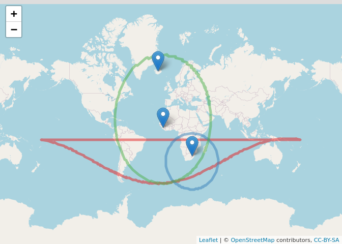
Circles extending from the centers of each country showing the distance from each to the correct country. The correct country should be located where all three circles intersect. Notice the red circle is misshapen because it is for Iceland which has a very large radius and is near the north pole. For our purposes, we only care about the lower half of it. The back half can be thought of as extending around the other side of the globe.
The circle for Iceland, in red, is only displayed as a semicircle. This is due to its radius being so large and extending over the north pole. Fortunately, that doesn’t matter for our purposes. By looking where the three circles intersect we should be able to find the country we are searching for.
With triangulation, the three circles will intersect in just one spot. It may appear that all three circles intersect in two places, but this is an artifact of the circle around Iceland being weirdly displayed.
To find where all the circles intersect we find any intersection amongst them with st_intersection() then narrow down the resulting points to those that have three or more overlaps.
This means we should focus our search at (3.4838,-54.7352). Since the measurements are not exact we look for this point on a map plus a little extra to help us see what’s around it.
leaflet() |>
    addTiles() |>
    addCircles(data=overlaps) |>
    # 100 km search area
    addPolylines(data=overlaps |> st_buffer(dist=100*1000))
The point where all the circles intersect with a 100 km buffer for he search area.
And we found Bouvet Island! This little uninhabited nature reserve isn’t even in the data.frame provided by {rnaturalearth} so I’m not sure how I would have found it without {sf}.
Spatial analytics and GIS are a really powerful part of data science and I have been using them more and more for clients lately. I’ve also given a coupletalks recently where you can see more about GIS.
While Worldle is fun to play on its own, it was even more fun using R to find the solution for a particularly tricky problem.
In previous posts I talked about collecting temperature data from different rooms in my house and automating that process using Docker and GitHub Actions. Now it is time to analyze that data to figure out what is happening in the house to make informed decisions about replacing the HVAC units and how I can make the house more comfortable for everyone until then.
During this process I pull the data into R from a DigitalOcean space (like an AWS S3 bucket) using {arrow}, manipulate the data with {dplyr}, {tidyr} and {tsibble}, visualize the data with {timetk}, fit models with {fable} and visualize the models with {coefplot}.
Getting the Data
As discussed in the post about tracking the data, we created a CSV for each day of data in a DigitalOcean space. The CSV tracks room temperatures, thermostat settings, outdoor temperature, etc for every five-minute interval during each day.
In the past, if multiple files had to be read into a single data.frame or tibble the best course of action would have been to combine map_df() from {purrr} with read_csv() or fread() from {readr} and {data.table}, respectively. But as seen in Wes McKinney and Neal Richardson’stalk from the 2020 New York R Conference, using open_data() from {arrow} then collecting the data with dplyr::collect()should be faster. An added bonus is that {arrow} has functionality built in to pull from an S3 bucket, and that includes DigitalOcean spaces.
The first step is to use arrow::S3FileSystem$create() to make a reference to the S3 file system. Several pieces of information are needed for this:
endpoint_override: Since we are using DigitalOcean and not AWS we need to change the default to something along the lines of "nyc3.digitaloceanspaces.com", depending on the region.
The Access Key can be retrieved at any time, but the Secret Key is only displayed one time, so we must save it somewhere.
This is all the same information used when writing the files to the DigitalOcean space in the first place. We also save it all in environment variables in the .Renviron file to avoid exposing this sensitive information in our code. It is very important to not check this file into git to reduce risk of exposing the private keys.
space <- arrow::S3FileSystem$create(
  access_key=Sys.getenv('AWS_ACCESS_KEY_ID'),
  secret_key=Sys.getenv('AWS_SECRET_ACCESS_KEY'),
  scheme="https",
  endpoint_override=glue::glue("{Sys.getenv('DO_REGION')}.{Sys.getenv('DO_BASE')}")
)
space
## S3FileSystem
The space object represents the S3 file system we have access to. Its elements are mostly file system type functions such as cd()ls(), CopyFile() and GetFileInfo() and are accessed via space$function_name(). To see a listing of files in a folder inside a bucket we call space$ls() with the bucket and folder name as the argument, in quotes.
To use open_dataset() we need a path to the folder holding the files. This is built with space$path(). The structure is "bucket_name/folder_name". For security, even the bucket and folder names are stored in environment variables. For this example, the real values have been substituted with "bucket_name" and "folder_name".
Now we can call open_dataset() to get access to all the files in that folder. We need to specify format="csv" to let the function know the files are CSVs as opposed to parquet or other formats.
Printing out the temps_dataset object shows the column names along with the type of data stored in each column. {arrow} is pretty great and lets us do column selection and row filtering on the data sitting in files which opens up a whole world of data analysis on data too large to fit in memory. We are simply going to select columns of interest and collect all the data into one data.frame (actually a tibble). Notice we call select() before collect() because this reduces the number of columns being transmitted over the network.
library(dplyr)
temps_raw %>% head()
## # A tibble: 6 x 16
##   Name  Sensor date       time  temperature   fan zoneAveTemp HVACmode
##   <chr> <chr>  <date>     <chr>       <dbl> <int>       <dbl> <chr>
## 1 Upst… Bedro… 2021-01-01 00:0…        67.8   300          70 heat
## 2 Upst… Bedro… 2021-01-01 00:0…        72.4   300          70 heat
## 3 Upst… Offic… 2021-01-01 00:0…        NA     300          70 heat
## 4 Upst… Upsta… 2021-01-01 00:0…        63.1   300          70 heat
## 5 Upst… Offic… 2021-01-01 00:0…        NA     300          70 heat
## 6 Upst… Offic… 2021-01-01 00:0…        NA     300          70 heat
## # … with 8 more variables: outdoorTemp <dbl>, outdoorHumidity <int>, sky <int>,
## #   wind <int>, zoneClimate <chr>, zoneHeatTemp <dbl>, zoneCoolTemp <dbl>,
## #   zoneHVACmode <chr>
Preparing the Data
The data are in need of some minor attention. First, the time column is read in as a character instead of time. This is a known issue, so instead we combine it with the date column using tidyr::unite() then convert this combination into a datetime (or timestamp) with lubridate::as_datetime(), which requires us to set a time zone. Then, the sensors named Upstairs Thermostat and Downstairs Thermostat actually represent Bedroom 3 and Dining Room, respectively, so we rename those using case_when() from {dplyr}, leaving all the other sensor names as is. Then we only keep rows where the time is earlier than the present. This is due to a quirk of the Ecobee API where it can return future readings, which happens because we request all of the latest day’s data.
Since the actual data may contain sensitive information a sanitized version is stored as parquet files on a public DigitalOcean space. This dataset is not as up to date but it will do for those that want to follow along.
publicspace <- arrow::S3FileSystem$create(
  # anonymous means we do not need to provide credentials
  # is crucial, otherwise the function looks for credentials
  anonymous=TRUE,
  # and crashes R if it can't find them
  scheme="https",
  # the data are stored in the nyc3 region
  endpoint_override='nyc3.digitaloceanspaces.com'
)
publicspace$ls('temperaturedata', recursive=TRUE)
## # A tibble: 6 x 15
##   Name  Sensor time                temperature   fan zoneAveTemp HVACmode
##   <chr> <chr>  <dttm>                    <dbl> <int>       <dbl> <chr>
## 1 Upst… Bedro… 2021-01-01 00:00:00        67.8   300          70 heat
## 2 Upst… Bedro… 2021-01-01 00:00:00        72.4   300          70 heat
## 3 Upst… Offic… 2021-01-01 00:00:00        NA     300          70 heat
## 4 Upst… Bedro… 2021-01-01 00:00:00        63.1   300          70 heat
## 5 Upst… Offic… 2021-01-01 00:00:00        NA     300          70 heat
## 6 Upst… Offic… 2021-01-01 00:00:00        NA     300          70 heat
## # … with 8 more variables: outdoorTemp <dbl>, outdoorHumidity <int>, sky <int>,
## #   wind <int>, zoneClimate <chr>, zoneHeatTemp <dbl>, zoneCoolTemp <dbl>,
## #   zoneHVACmode <chr>
Visualizing with Interactive Plots
The first step in any good analysis is visualizing the data. In the past, I would have recommended {dygraphs} but have since come around to {feasts} from Rob Hyndman’s team and {timetk} from Matt Dancho due to their ease of use, better flexibility with data types and because I personally think they are more visually pleasing.
In order to show the outdoor temperature on the same footing as the sensor temperatures, we select the pertinent columns with the outdoor data from the tempstibble and stack them at the bottom of temps, after accounting for duplicates (Each sensor has an outdoor reading, which is the same across sensors).
all_temps <- dplyr::bind_rows(
  temps,
  temps %>%
    dplyr::select(Name, Sensor, time, temperature=outdoorTemp) %>%
    dplyr::mutate(Sensor='Outdoors', Name='Outdoors') %>%
    dplyr::distinct()
)
Then we use plot_time_series() from {timetk} to make a plot that has a different colored line for each sensor and for the outdoors (with sensors being grouped into facets according to which thermostat they are associated with). Ordinarily the interactive version would be better (.interactive=TRUE below), but for the sake of this post static displays better.
From this we can see a few interesting patterns. Bedroom 1 is consistently higher than the other bedrooms, but lower than the offices which are all on the same thermostat. All the downstairs rooms see their temperatures drop overnight when the thermostat is lowered to conserve energy. Between February 12 and 18 this dip was not as dramatic, due to running an experiment to see how raising the temperature on the downstairs thermostat would affect rooms on the second floor.
Computing Cross Correlations
One room in particular, Bedroom 2, always seemed colder than all the rest of the rooms, so I wanted to figure out why. Was it affected by physically adjacent rooms? Or maybe it was controlled by the downstairs thermostat rather than the upstairs thermostat as presumed.
So the first step was to see which rooms were correlated with each other. But computing correlation with time series data isn’t as simple because we need to account for lagged correlations. This is done with the cross-correlation function (ccf).
In order to compute the ccf, we need to get the data into a time series format. While R has extensive formats, most notably the built-in ts and its extension xts by Jeff Ryan, we are going to use tsibble, from Rob Hyndman and team, which are tibbles with a time component.
The tsibble object can treat multiple time series as individual data and this requires the data to be in long format. For this analysis, we want to treat multiple time series as interconnected, so we need to put the data into wide format using pivot_wider().
wide_temps <- all_temps %>%
  # we only need these columns
  select(Sensor, time, temperature) %>%
  # make each time series its own column
  tidyr::pivot_wider(
    id_cols=time,
    names_from=Sensor,
    values_from=temperature
  ) %>%
  # convert into a tsibble
  tsibble::as_tsibble(index=time) %>%
  # fill down any NAs
  tidyr::fill()


wide_temps
## # A tibble: 15,840 x 12
##    time                `Bedroom 2` `Bedroom 1` `Office 1` `Bedroom 3` `Office 3`
##    <dttm>                    <dbl>       <dbl>      <dbl>       <dbl>      <dbl>
##  1 2021-01-01 00:00:00        67.8        72.4         NA        63.1         NA
##  2 2021-01-01 00:05:00        67.8        72.8         NA        62.7         NA
##  3 2021-01-01 00:10:00        67.9        73.3         NA        62.2         NA
##  4 2021-01-01 00:15:00        67.8        73.6         NA        62.2         NA
##  5 2021-01-01 00:20:00        67.7        73.2         NA        62.3         NA
##  6 2021-01-01 00:25:00        67.6        72.7         NA        62.5         NA
##  7 2021-01-01 00:30:00        67.6        72.3         NA        62.7         NA
##  8 2021-01-01 00:35:00        67.6        72.5         NA        62.5         NA
##  9 2021-01-01 00:40:00        67.6        72.7         NA        62.4         NA
## 10 2021-01-01 00:45:00        67.6        72.7         NA        61.9         NA
## # … with 15,830 more rows, and 6 more variables: `Office 2` <dbl>, `Living
## #   Room` <dbl>, Playroom <dbl>, Kitchen <dbl>, `Dining Room` <dbl>,
## #   Outdoors <dbl>
Some rooms’ sensors were added after the others so there are a number of NAs at the beginning of the tracked time.
We compute the ccf using CCF() from the {feasts} package then generate a plot by piping that result into autoplot(). Besides a tsibble, CCF() needs two arguments, the columns whose cross-correlation is being computed.
The negative lags are when the first column is a leading indicator of the second column and the positive lags are when the first column is a lagging indicator of the second column. In this case, Living Room seems to follow Bedroom 2 rather than lead.
We want to compute the ccf between Bedroom 2 and every other room. We call CCF() on each column in wide_temps against Bedroom 2, including Bedroom 2 itself, by iterating over the columns of wide_temps with map(). We use a ~ to treat CCF() as a quoted function and wrap .x in double curly braces to take advantage of non-standard evaluation. This creates a list of objects that can be plotted with autoplot(). We make a list of ggplot objects by iterating over the ccf objects using imap(). This allows us to use the name of each element of the list in ggtitle. Lastly, wrap_plots() from {patchwork} is used to show all the plots in one display.
library(patchwork)
library(ggplot2)


room_ccf <- wide_temps %>%
  purrr::map(~CCF(wide_temps, {{.x}}, `Bedroom 2`))


# we don't want the CCF with time, outdoor temp or the Bedroom 2 itself
room_ccf$time <- NULL
room_ccf$Outdoors <- NULL
room_ccf$`Bedroom 2` <- NULL


biggest_cor <- room_ccf %>% purrr::map_dbl(~max(.x$ccf)) %>% max()


room_ccf_plots <- purrr::imap(
  room_ccf,
  ~ autoplot(.x) +
    # show the maximally cross-correlation value
    # so it easier to compare rooms
    geom_hline(yintercept=biggest_cor, color='red', linetype=2) +
    ggtitle(.y) +
    labs(x=NULL, y=NULL) +
    ggthemes::theme_few()
)


wrap_plots(room_ccf_plots, ncol=3)
This brings up an odd result. Office 1, Office 2, Office 3, Bedroom 1, Bedroom 2 and Bedroom 3 are all controlled by the same thermostat, but Bedroom 2 is only really cross-correlated with Bedroom 3 (and negatively with Office 3). Instead, Bedroom 2 is most correlated with Playroom and Living Room, both of which are controlled by a different thermostat.
So it will be interesting to see which thermostat setting (the set desired temperature) is most cross-correlated with Bedroom 2. At the same time we’ll check how much the outdoor temperature cross-correlates with Bedroom 2 as well.
temp_settings <- all_temps %>%
  # there is a column for outdoor temperatures so we don't need these rows
  filter(Name != 'Outdoors') %>%
  select(Name, time, HVACmode, zoneCoolTemp, zoneHeatTemp) %>%
  # this information is repeated for each sensor, so we only need it once
  distinct() %>%
  # depending on the setting, the set temperature is in two columns
  mutate(setTemp=if_else(HVACmode == 'heat', zoneHeatTemp, zoneCoolTemp)) %>%
  tidyr::pivot_wider(id_cols=time, names_from=Name, values_from=setTemp) %>%
  # get the reading data
  right_join(wide_temps %>% select(time, `Bedroom 2`, Outdoors), by='time') %>%
  as_tsibble(index=time)


temp_settings
This plot makes a strong argument for Bedroom 2 being more affected by the downstairs thermostat than the upstairs like we presume. But I don’t think the downstairs thermostat is actually controlling the vents in Bedroom 2 because I have looked at the duct work and followed the path (along with a professional HVAC technician) from the furnace to the vent in Bedroom 2. What I think is more likely is that the rooms downstairs get so cold (I lower the temperature overnight to conserve energy), and there is not much insulation between the floors, so the vent in Bedroom 2 can’t pump enough warm air to compensate.
I did try to experiment for a few nights (February 12 and 18) by not lowering the downstairs temperature but the eyeball test didn’t reveal any impact. Perhaps a proper A/B test is called for.
Fitting Time Series Models with {fable}
Going beyond cross-correlations, an ARIMA model with exogenous variables can give an indication if input variables have a significant impact on a time series while accounting for autocorrelation and seasonality. We want to model the temperature in Bedroom 2 while using all the other rooms, the outside temperature and the thermostat settings to see which affected Bedroom 2 the most. We fit a number of different models then compare them using AICc (AIC corrected) to see which fits the best.
To do this we need a tsibble with each of these variables as a column. This requires us to join temp_settings with wide_temps.
ts_mods %>%
  glance() %>%
  # sort .model according to AICc for better plotting
  mutate(.model=forcats::fct_reorder(.model, .x=AICc, .fun=sort)) %>%
  # smaller is better for AICc
  # so negate it so that the tallest bar is best
  ggplot(aes(x=.model, y=-AICc)) +
  geom_col() +
  theme(axis.text.x=element_text(angle=25))
The best two models (as judged by AICc) are mod3 and mod1, some of the simpler models. The key thing they have in common is that Bedroom 1 is a predictor, which somewhat contradicts the findings from the cross-correlation function. We can examine mod3 by selecting it out of ts_mods then calling report().
This shows that Bedroom 1 and Bedroom 3 are significant predictors with SARIMA(3,1,2)(0,0,1) errors.
The third best model is one of the more complicated models, mod15. Not all the predictors are significant, though we should not judge a model, or the predictors, based on that.
What all these top performing models have in common is the inclusion of the other bedrooms as predictors.
While helping me interpret the data, my wife pointed out that all the colder rooms are on one side of the house while the warmer rooms are on the other side. That colder side is the one that gets hit by winds which are rather strong. This made me remember a long conversation I had with a very friendly and knowledgeable sales person at GasTec who said that wind can significantly impact a house’s heat due to it blowing away the thermal envelope. I wanted to test this idea, but while the Ecobee API returns data on wind, the value is always 0, so it doesn’t tell me anything. Hopefully, I can get that fixed.
Running Everything with {targets}
There were many moving parts to the analysis, so I managed it all with {targets}. Each step seen in this post is a separate target in the workflow. There is even a target to build an html report from an R Markdown file. The key is to load objects created by the workflow into the R Markdown document with tar_read() or tar_load(). Then tar_render() will figure out how the R Markdown document figures into the computational graph.
In addition to the R Markdown I made a shiny dashboard using the R Markdown flexdashboard format. I host this on RStudio Connect so I can get a live view of the data and examine the models. Besides from being a partner with RStudio, I really love this product and I use it for all of my internal reporting (and side projects) and we have a whole practice around getting companies up to speed with the tool.
What Comes Next?
So what can be done with this information? Based on the ARIMA model the other bedrooms on the same floor are predictive of Bedroom 2, which makes sense since they are controlled by the same thermostat. Bedroom 3 is consistently one of the coldest in the house and shares a wall with Bedroom 2, so maybe that wall could use some insulation. Bedroom 1 on the other hand is the hottest room on that floor, so my idea is to find a way to cool off that room (we sealed the vents with magnetic covers), thus lowering the average temperature on the floor, causing the heat to kick in, raising the temperature everywhere, including Bedroom 2.
The cross-correlation functions also suggest a relationship with Playroom and Living Room, which are some of the colder rooms downstairs and the former is directly underneath Bedroom 2. I’ve already put caulking cord in the gaps around the floorboards in the Playroom and that has noticeably raised the temperature in there, so hopefully that will impact Bedroom 2. We already have storm windows on just about every window and have added thermal curtains to Bedroom 2, Bedroom 3 and the Living Room. My wife and I also discovered air billowing in from around, not in, the fireplace in the Living Room, so if we can close that source of cold air, that room should get warmer then hopefully Bedroom 2 as well. Lastly, we want to insulate between the first floor ceiling and second floor.
While we make these fixes, we’ll keep collecting data and trying new ways to analyze it all. It will be interesting to see how the data change in the summer.
These three posts were intended to show the entire process from data collection to automation (what some people are calling robots) to analysis, and show how data can be used to make actionable decisions. This is one more way I’m improving my life with data.
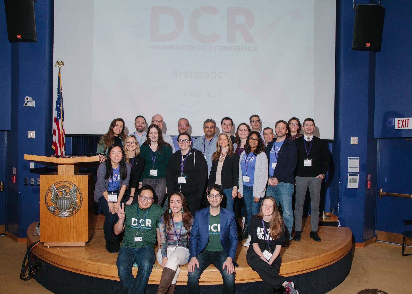
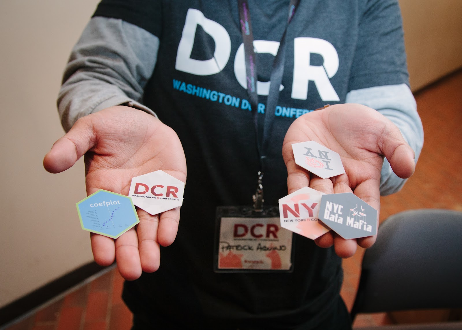
My team at Lander Analytics has been putting together conferences for six years, and they’ve always had the same fun format, which the community has really enjoyed. There’s the NYR conference for New Yorkers and those who want to fly, drive or train to join the New York community, and there’s DCR, which gathers the DC-area community. The last DCR Conference at Georgetown University went really well, as you can see in this recap. With the shift to virtual gatherings brought on by the pandemic, our community has gone fully remote, including the monthly Open Statistical Programming Meetup. With that, we realized the DCR Conference didn’t just need to be for folks from the DC-area anymore, instead, we could welcome a global audience like we did with this year’s NYR. And that gave birth to R|Gov, the Government and Public Sector R Conference.
R|Gov is really a new industry-focused conference. Instead of drawing on speakers from a particular city or area, the talks will focus on work done in specific fields. In this case, in government, defense, NGOs and the public sector, and we have speakers from not only the DC-area, but also from Geneva, Switzerland, Nashville, Tennessee, Quebec, Canada and Los Angeles, California. For the last three years, we have been working with Data Community DC, R-Ladies DC, and the Statistical Programming DC Meetup, to put on DCR, and continue to do so for R|Gov as we find great speakers and organizations who want to collaborate in driving attendance and building the community.
Like NYR and DCR, the topics at R|Gov range from practical how-tos, to theoretical findings, to processes, to tooling and the speakers this year come from the Center for Army Analysis, NASA, Columbia University, The U.S. Bureau of Labor Statistics, the Inter-American Development Bank, The United States Census Bureau, Harvard Business School, In-Q-Tel, Virginia Tech, Deloitte, NYC Department of Health and Mental Hygiene and Georgetown University, among others. We will also be hosting two rum and gin master classes, including one with Mount Gay, which comes from the oldest continuously running rum distillery in the world, and which George Washington served at his inauguration!
The R Conference series is quite a bit different from other industry and academic conferences. The talks are twenty minutes long with no audience questions with the exception of special talks from the likes of Andrew Gelman or Hadley Wickham. Whether in person or virtual, we play music, have prize giveaways and involve food in the programming. When they were in person, we prided ourselves on avocado toast, pizza, ice cream and beer. For prizewinners, we autographed books right on stage since the authors were either speakers or in the audience. With the virtual events we try to capture as much of that spirit as possible, and the community really enjoyed the virtual R Conference | NY in August. A very lively event remotely and in the flesh, it is also one of the more informative conferences I have ever seen.
This virtual conference will include much of the in-person format, just recreated virtually. We will have 24 talks, a panel, workshops, community and networking breaks, happy hours, prizes and giveaways, a Twitter Contest, Meet the Speaker series, Job Board access, and participation in the Art Auction. We hope to see you there December 2-4, on a comfy couch near you.
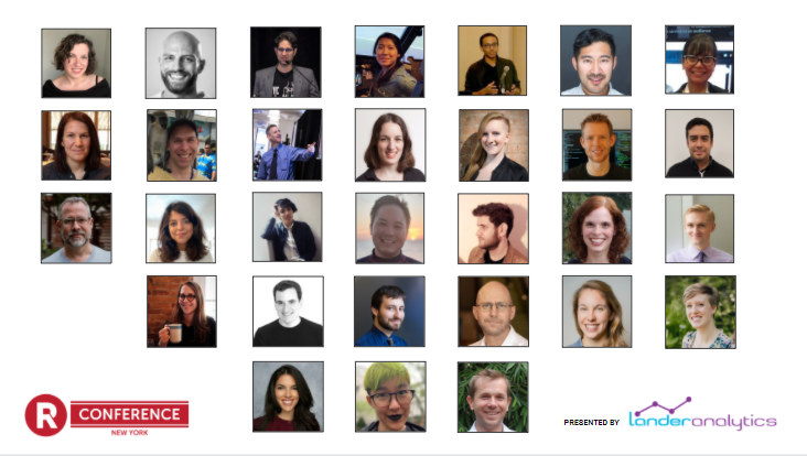
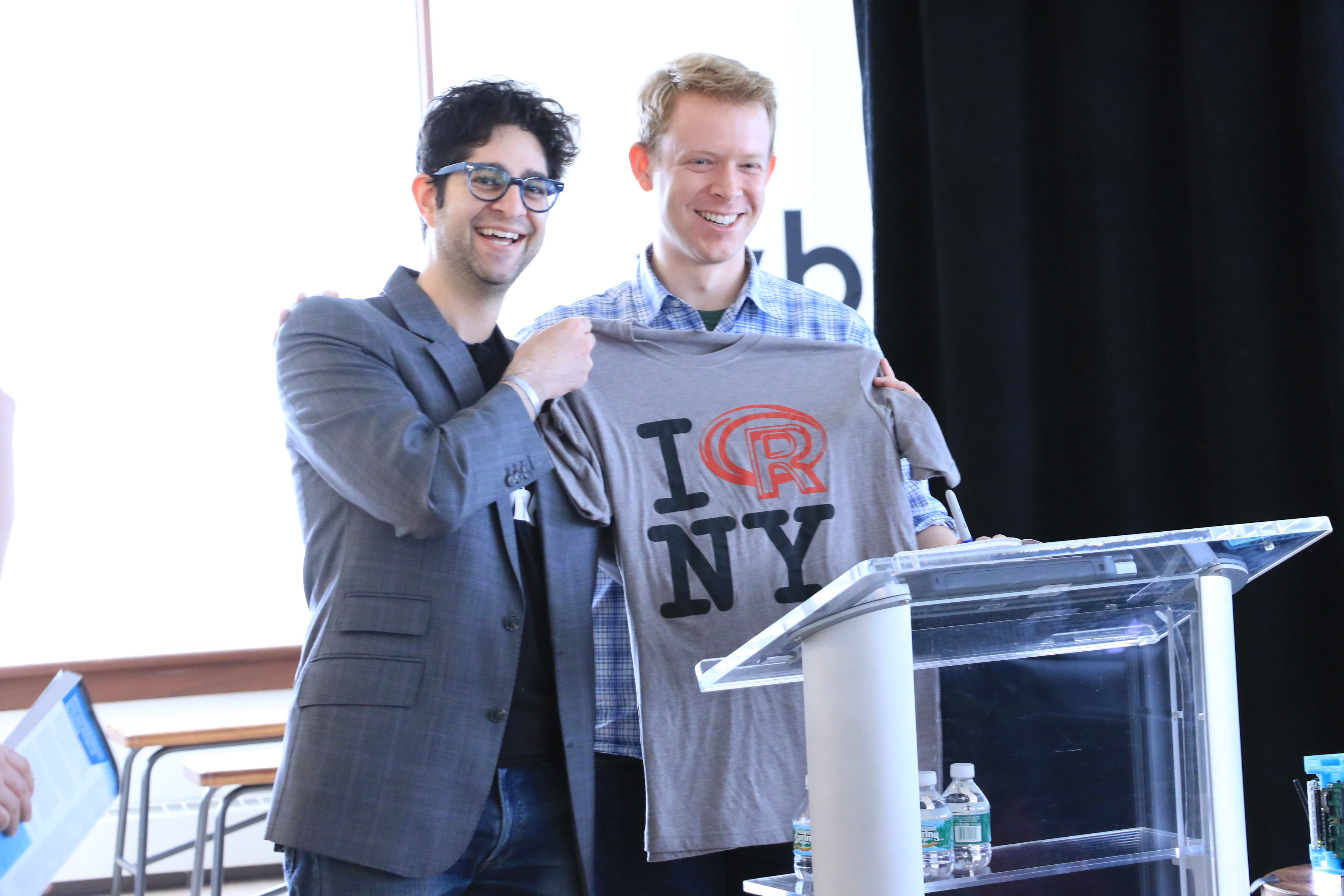
The sixth annual (and first virtual) “New York” R Conference took place August 5-6 & 12-15. Almost 300 attendees, and 30 speakers, plus a stand-up comedian and a whiskey masterclass leader, gathered remotely to explore, share, and inspire ideas.
Let’s take a look at some of the highlights from the conference:
Andrew Gelman Gave Another 40-Minute Talk (no slides, as always)
Our favorite quotes from Andrew Gelman’s talk, Truly Open Science: From Design and Data Collection to Analysis and Decision Making, which had no slides, as usual:
“Everyone training in statistics becomes a teacher.”
“The most important thing you should take away — put multiple graphs on a page.”
“Honesty and transparency are not enough.”
“Bad science doesn’t make someone a bad person.”
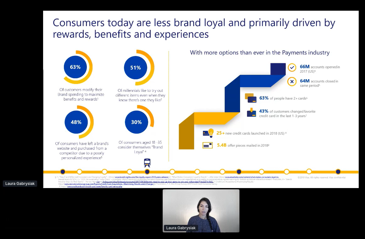
Laura Gabrysiak Shows us We Are Driven By Experience, and not Brand Loyalty…Hope you Folks had a Good Experience!
Laura’s talk on re-Inventing customer engagement with machine learning went through several interesting use cases from her time at Visa. In addition to being a data scientist, she is an active community organizer and the co-founder of R-Ladies Miami.
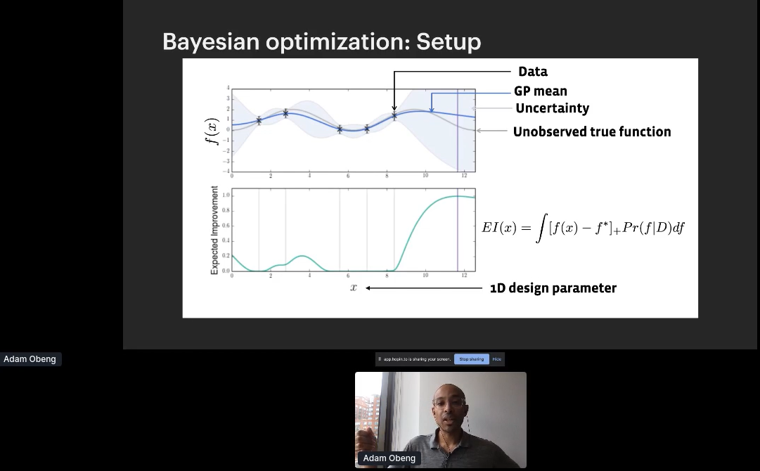
Adam Obeng Delivered a Talk on Adaptive Experimentation
One of my former students at Columbia University, Adam Obeng, gave a great presentation on his adaptive experimentation. We learned that adaptive experimentation is three things: The name of (1) a family of techniques, (2) Adam’s team at Facebook, and (3) an open source package produced by said team. He went through the applications which are hyper-parameter optimization for ML, experimentation with multiple continuous treatments, and physical experiments or manufacturing.
Dr. Jacqueline Nolis Invited Us to Crash Her Viral Website, Tweet Mashup
Jacqueline asked the crowd to crash her viral website,Tweet Mashup, and gave a great talk on her experience building it back in 2016. Her website that lets you combine the tweets of two different people. After spending a year making it in .NET, when she launched the site it became an immediate sensation. Years later, she was getting more and more frustrated maintaining the F# code and decided to see if I could recreate it in Shiny. Doing so would require having Shiny integrate with the Twitter API in ways that hadn’t been done by anyone before, and pushing the Twitter API beyond normal use cases.
Attendees Participated in Two Virtual Happy Hours Packed with Fun
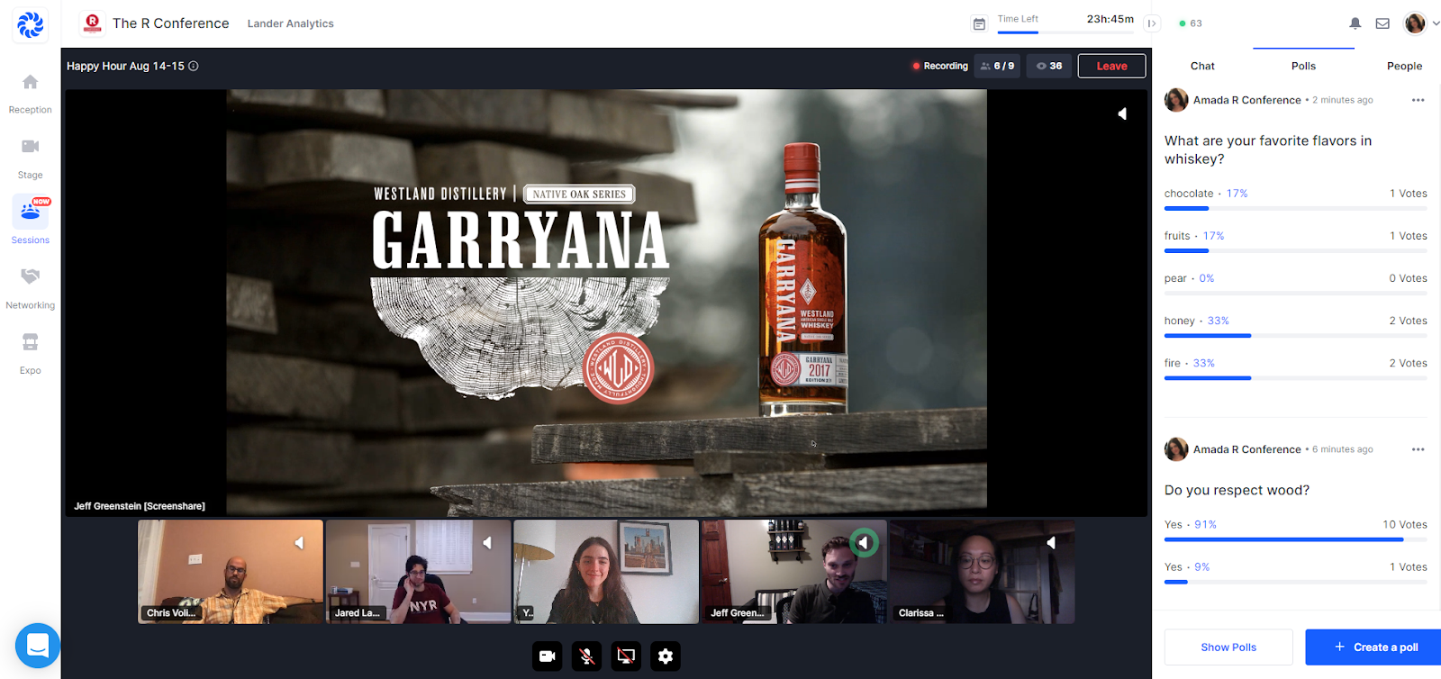
At the Friday Happy Hour, we had a mathematical standup comedian for the first time in R Conference history. Comic and math major Rachel Lander (no relationship to me!) entertained us with awesome math and stats jokes.
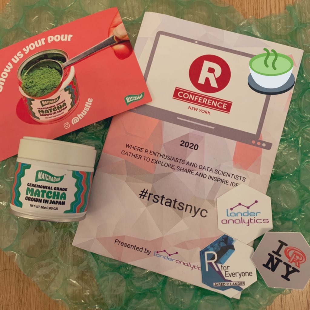
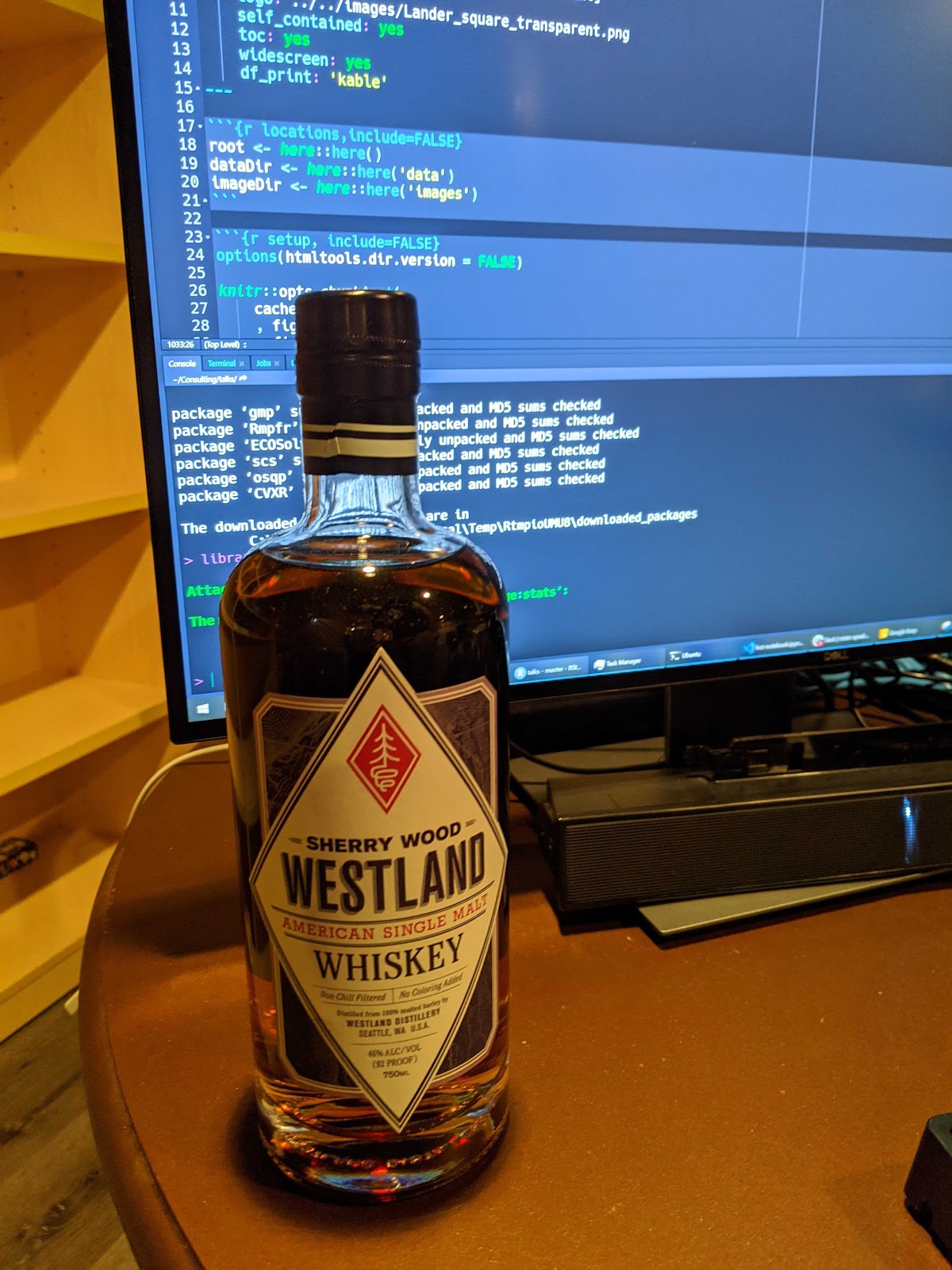
Following the stand up, we had a Whiskey Master Class with our Vibe Sponsor Westland Distillery, and another one on Saturday with Bruichladdich Distillery (hard to pronounce and easy to drink). Attendees and speakers learned and drank together, whether it be their whiskey, matchas, soda or water.
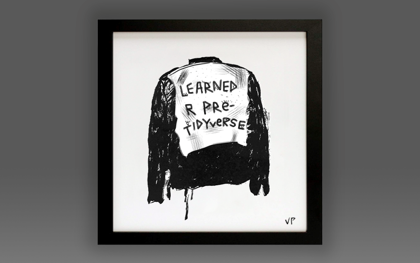
All Proceeds from the A(R)T Auction went to the R Foundation Again
A newer tradition, the A(R)T Auction, took place again! We featured pieces by artists in the R Community, and all proceeds were donated to the R Foundation. The highest-selling piece at auction was Street Cred (2020) by Vivian Peng (Lander Analytics and Los Angeles Mayor’s Office, Innovation Team). The second highest was a piece by Jacqueline Nolis (Brightloom, and Build a Career in Data Science co-author), R Conference speaker, Designed by Allison Horst, artist in residence at RStudio.
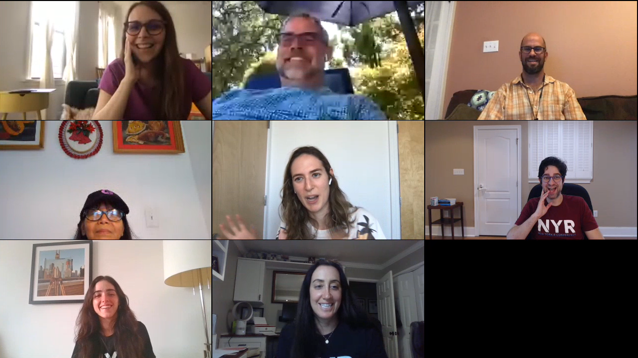
The R-Ladies Group Photo Happened, Even Remotely!
As per tradition, we took an R-Ladies group photo, but, for the first time, remotely– as a screenshot! We would like to note that many more R-Ladies were present in the chat, but just chose not to share video.
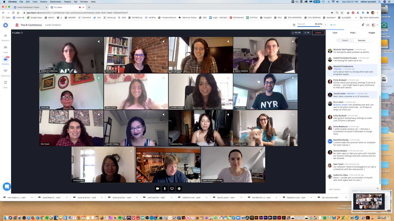
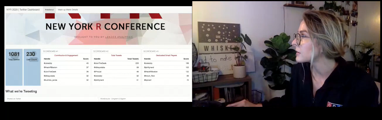
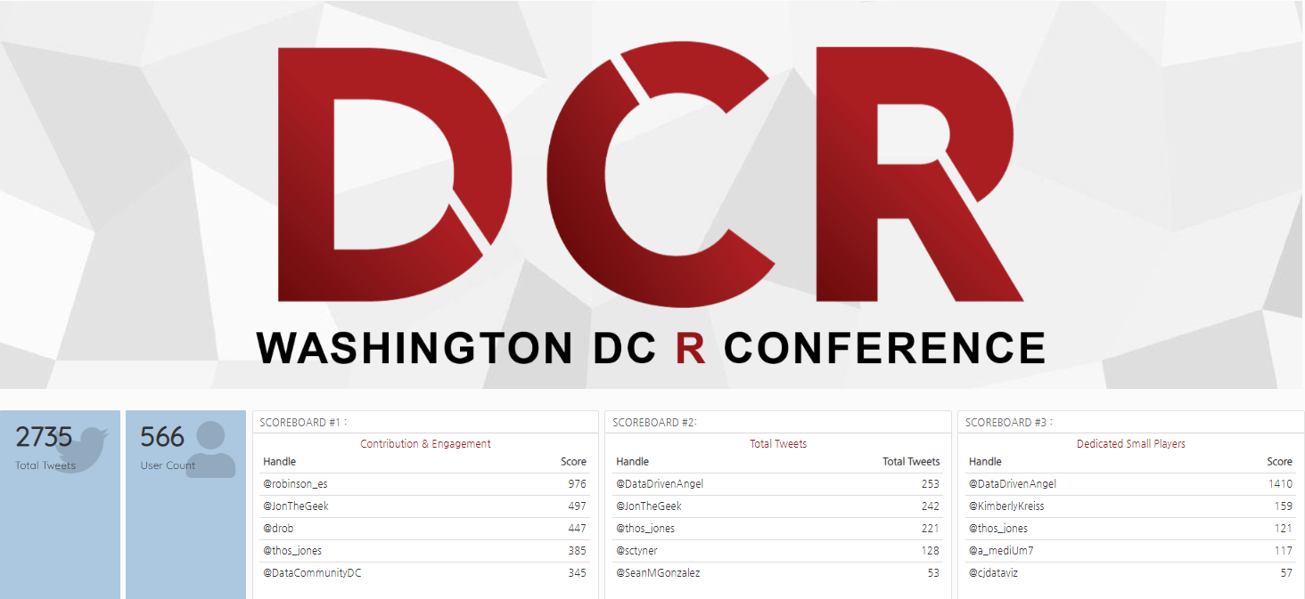
Jon Harmon, Edna Mwenda, and Jessica Streeter win Raspberri Pis, Bluetooth Headphones, and Tenkeyless Keyboards for Most Active Tweeting During the Conference
This year’s Twitter Contest, in Malorie’s words, was a “ruthless but noble war.” You can see the NYR 2020 Dashboard here. A custom started that DCR 2018 by our Twitter scorekeeper Malorie Hughes (@data_all_day) has returned every year by popular demand, and now she’s stuck with it forever! Congratulations to our winners!
50+ Conference Attendees Participated in Pre-Conference Workshops Before
For the first time ever, workshops took place over the course of several days to promote work-life balance, and to give attendees the chance to take more than one course. We ran the following seven workshops:
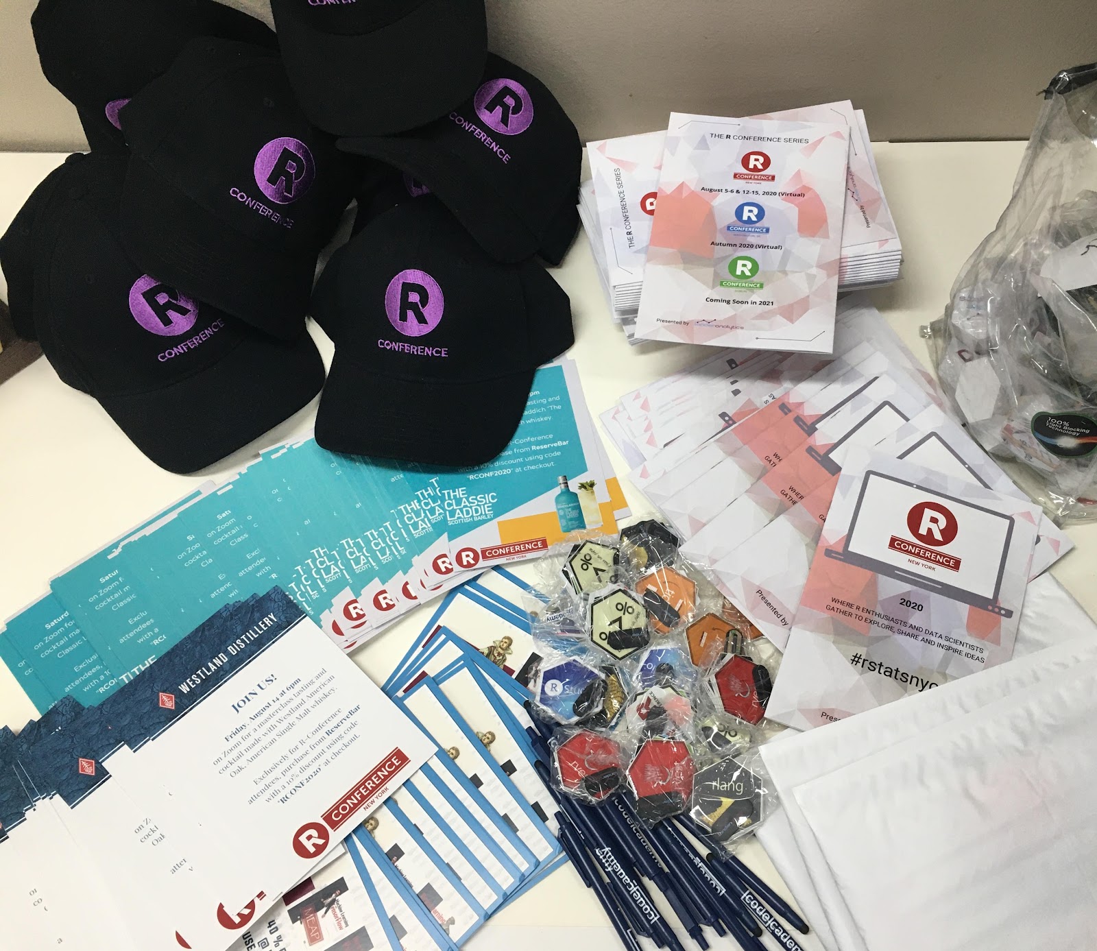
We recreated as much of the in-person experience as possible with attendee networking sessions, the speaker walk-on songs and fun facts, abundant prizes and giveaways, the Twitter contest, an art auction, and happy hours. In addition to all of this, we mailed conference programs, hex stickers, and other swag to each attendee (in the U.S.), along with discount codes from our Vibe Sponsors, MatchaBar, Westland Distillery and Bruichladdich Distillery.
Thank you, Lander Analytics Team!
Even though it was virtual, there was a lot of work that went into the conference, and I want to thank my amazing team at Lander Analytics along with our producer, Bill Prickett, for making it all come together.
Looking Forward to D.C. and Dublin If you attended, we hope you had an incredible experience. If you did not, we hope to see you at the virtual DC R Conference in the fall, and at the first Dublin R Conference and the NYR next year!
The Second Annual DCR Conference made its way to the ICC Auditorium at Georgetown University last week on November 8th and 9th. A sold-out crowd of R enthusiasts and data scientists gathered to explore, share and inspire ideas.
As always, the food was delicious! Our caterer even surprised us with Lander cookies.
Lander Analytics CookiesThe Excellent Buffet
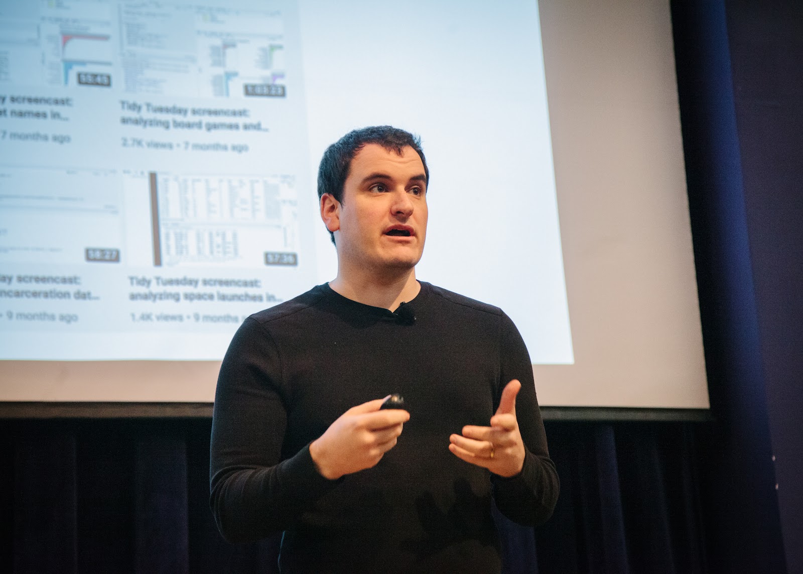
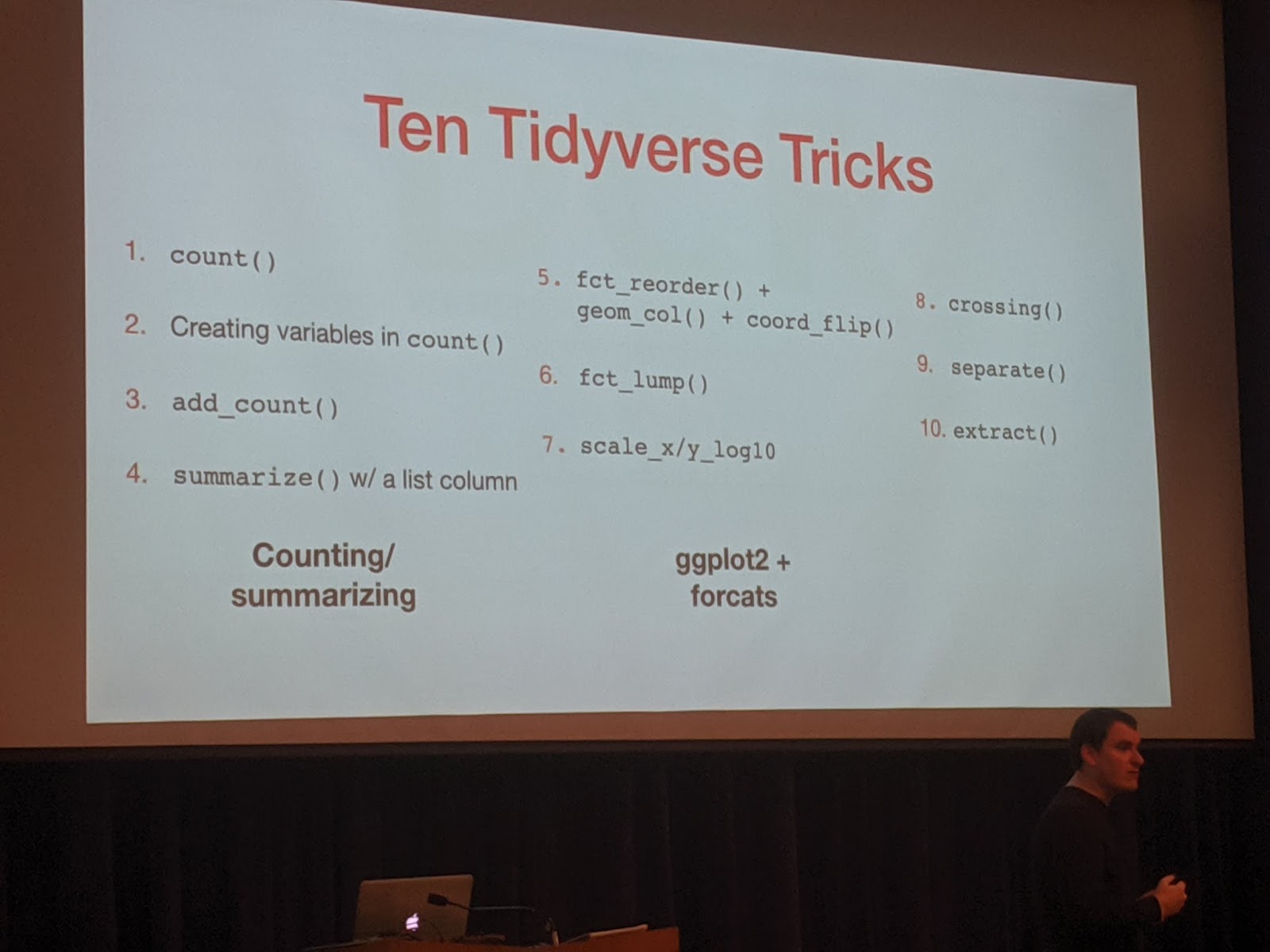
David Robinson shared his Ten Tremendous Tricks in the Tidyverse. Always enthusiastic, DRob did a great job showing both well known and obscure functions for an easier data workflow.
DRobTen Tidyverse Tricks
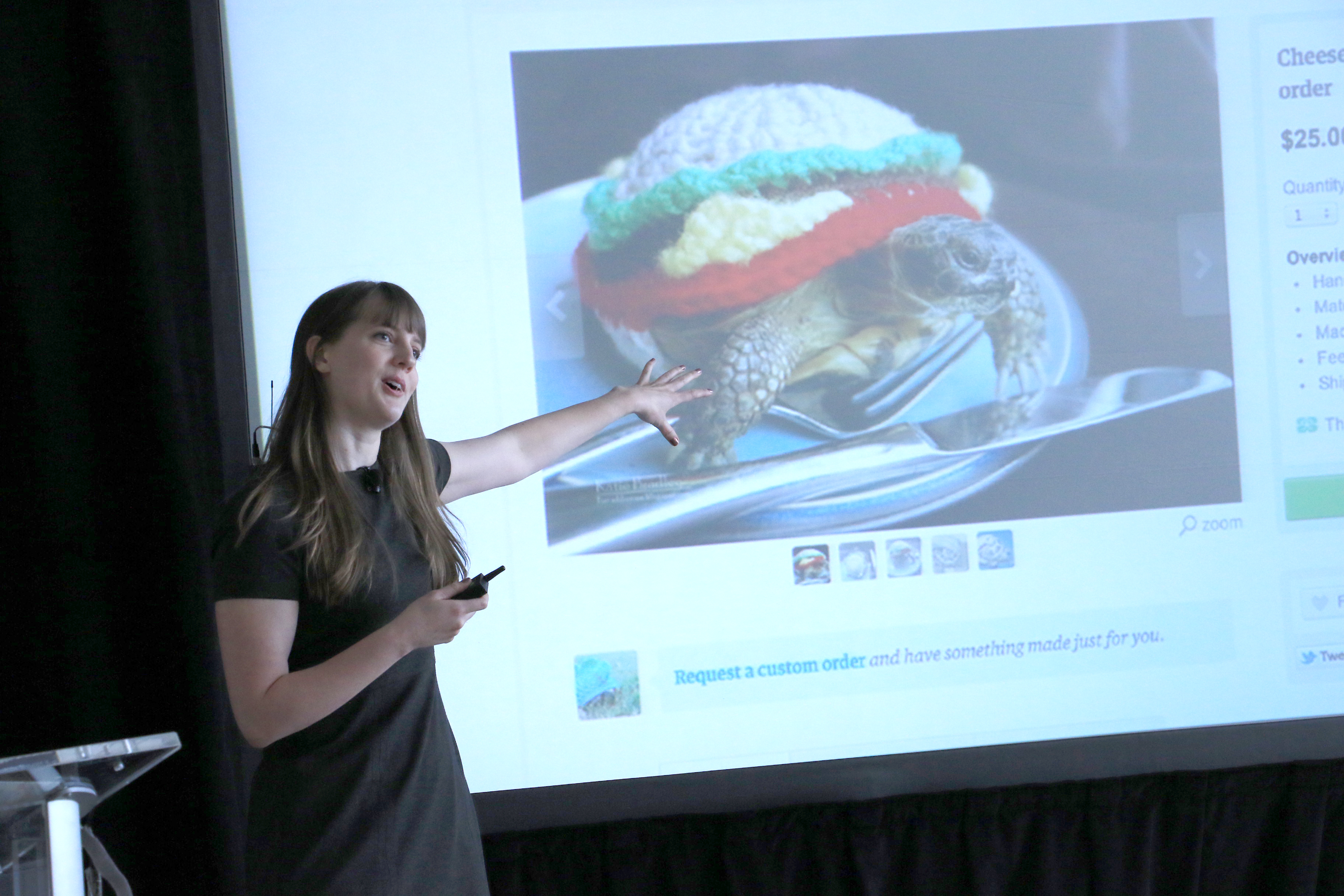
Elizabeth Sweeney gave an awesome talk on Visualizing the Environmental Impact of Beef Consumption using Plotly and Shiny. We explored the impact of eating different cuts of beef in terms of the number of animal lives, Co2 emissions, water usage, and land usage. Did you know that there is a big difference in the environmental impact of consuming 100 pounds of hanger steak versus the same weight in ground beef? She used plotly to make interactive graphics and R Shiny to make an interactive webpage to explore the data.
Elizabeth Showing off Brains
The integrated development environment, RStudio, fully integrated themselves into the environment.
The RStudio Team
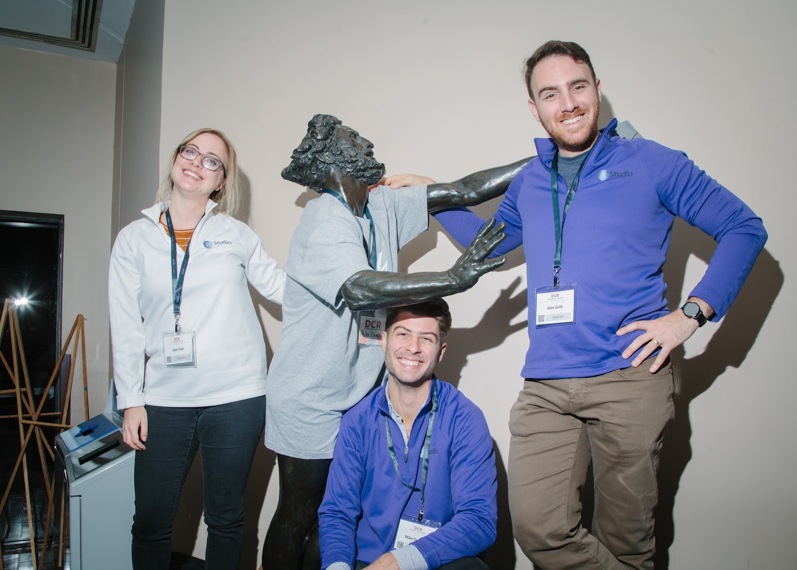
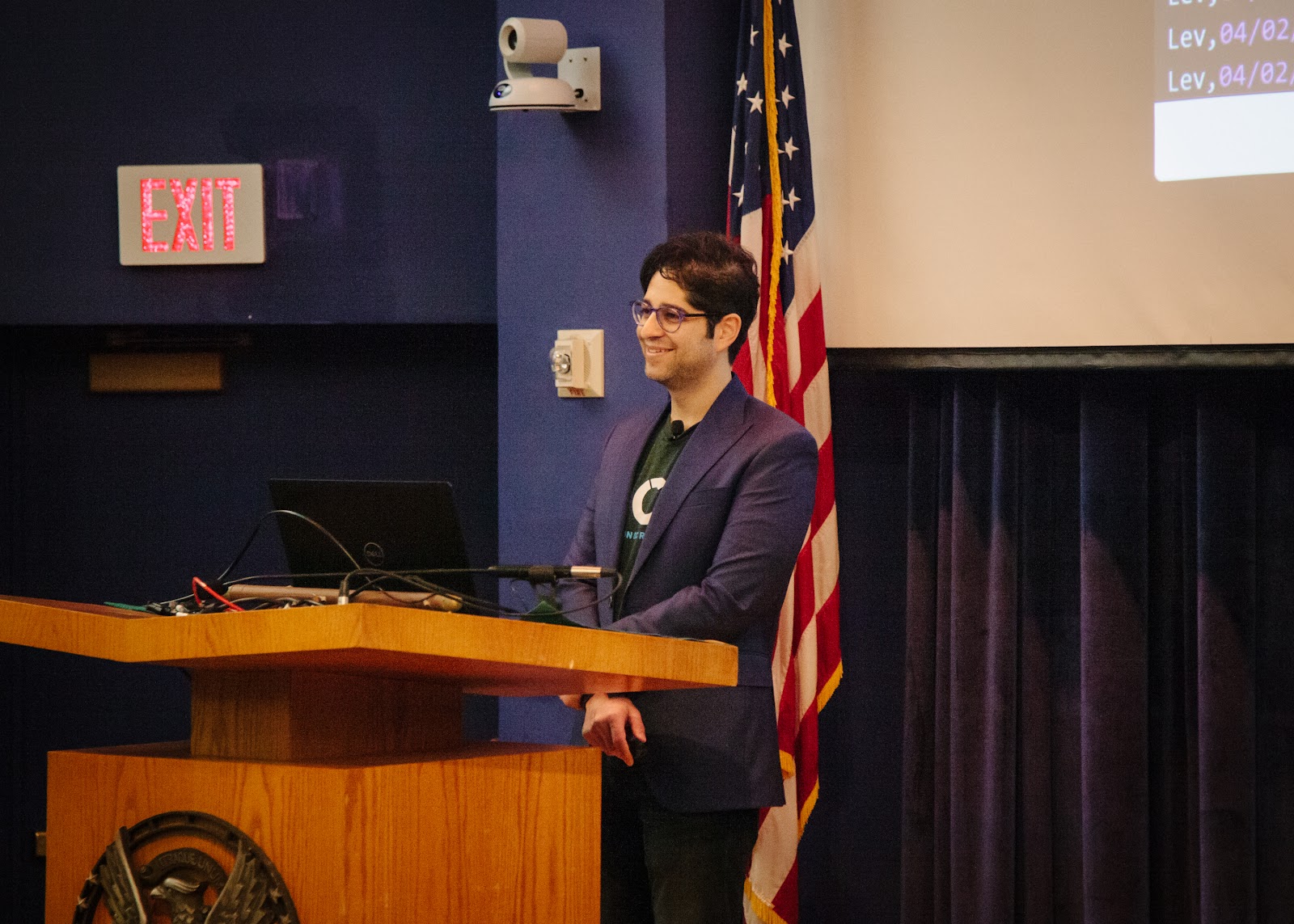
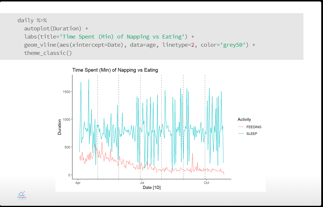
As a father, I’ve earned the right to make dad jokes (see above). You can see the slides for my talk, Raising Baby with R. While babies are commonly called bundles of joy, they are also bundles of data. Being the child of a data scientist and neuroscientist my son was certain to be analyzed myriad ways. I discussed how we used data to narrow down possible names then looked at using time series methods to analyze his sleeping and eating patterns. All in the name of science.
Talking Baby Data
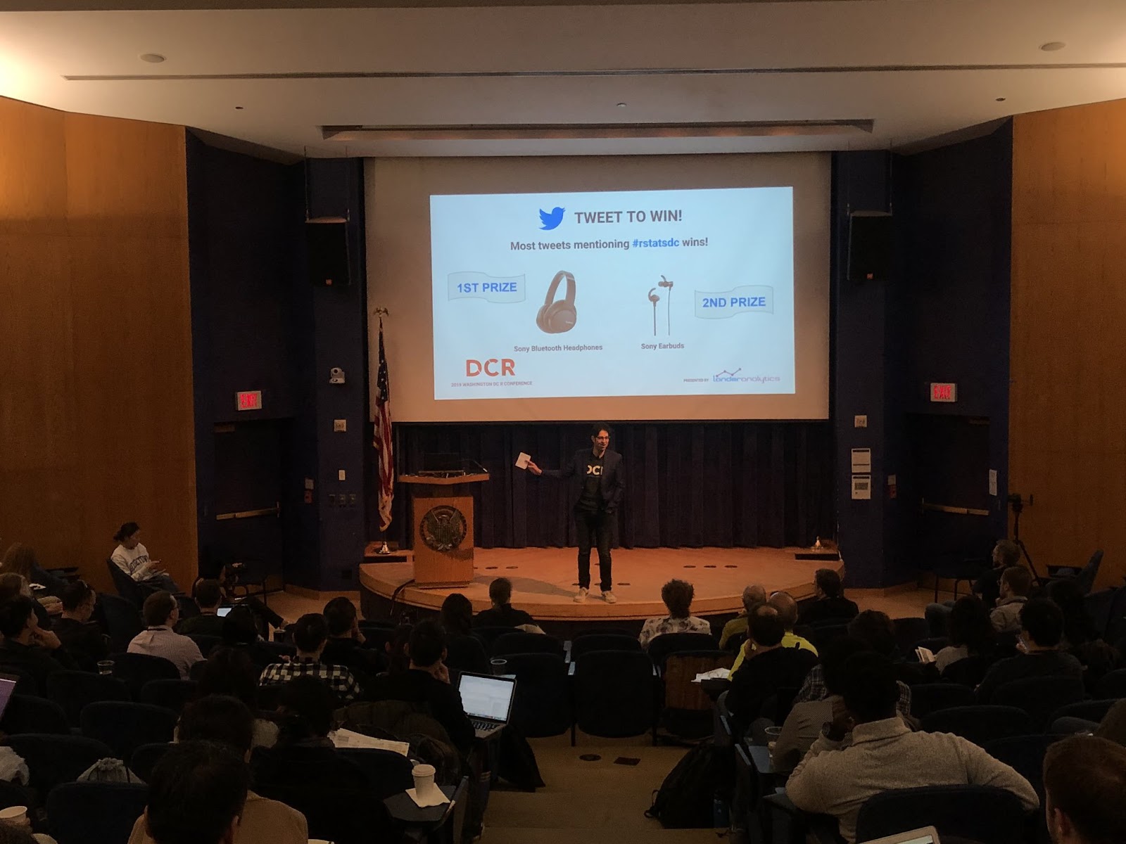
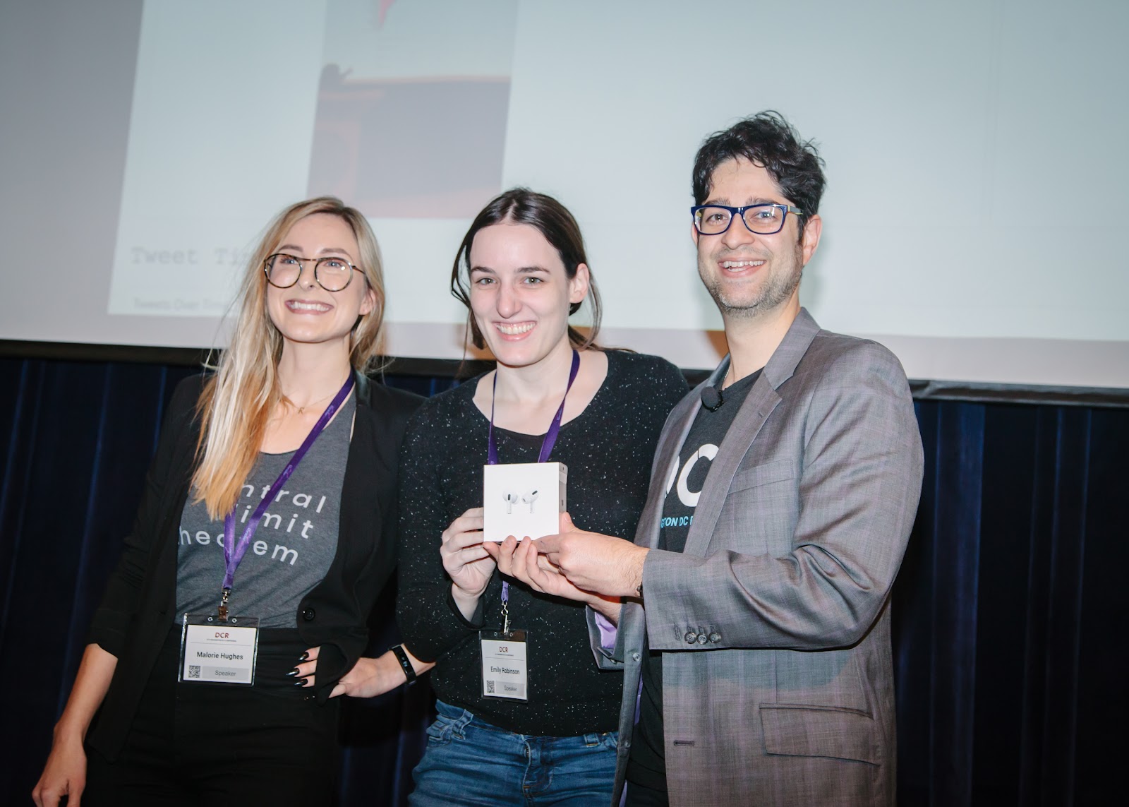
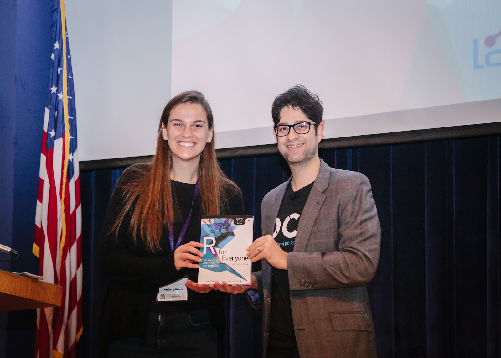
Malorie Hughes Analyzing Tweets Again
We also organized a Tweeting competition with the help of Malorie Hughes, our Twitter scorekeeper. Check out the DCR 2019 Twitter Dashboard with the Mash-Up Metric Details she created.
Tweeting DashboardAs Usual, Emily was the Overall WinnerKim Won a Copy of my BookJon Really Worked Hard to Win These Headphones
There was a glitch in the system and one of our own organizers and former Python user won a prize. We let her keep it, and now she has no excuse not to learn R.
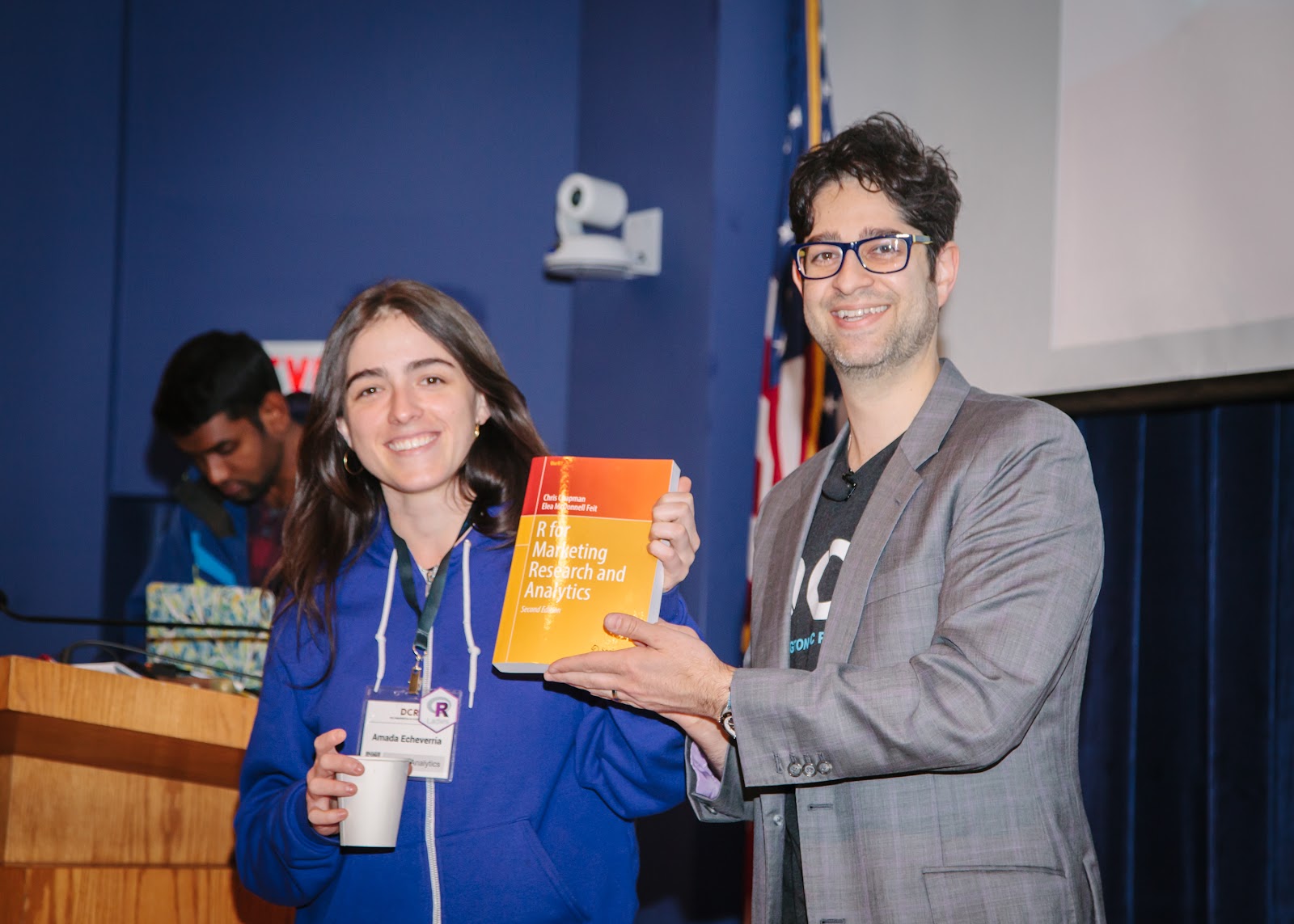
Amada, our Marketing Person, Won an R in Marketing Book
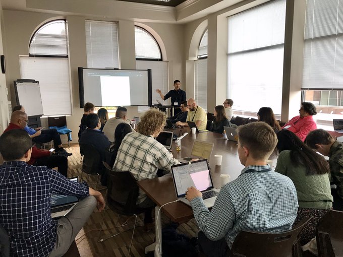
Not to mention we had some great workshops on November 7th, preceding the conference:
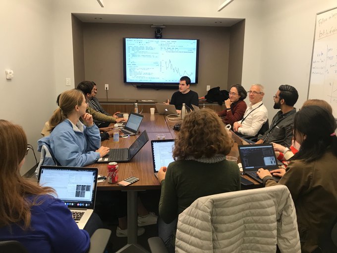
This was the first time we utilized three instructors (as opposed to a main instructor and assistants which we often use for large classes) and it led to an amazing dynamic. Bob laid the theoretical foundation for Markov chain Monte Carlo (MCMC), explaining both with math and geometry, and discussed the computational considerations of performing simulation draws. Daniel led the participants through hands-on examples with Stan, covering everything from how to describe a model, to efficient computation to debugging. Andrew gave his usual, crowd dazzling performance use previous work as case studies of when and how to use Bayesian methods.
It was an intensive three days of training with an incredible amount of information. Everyone walked away knowing a lot more about Bayes, MCMC and Stan and eager to try out their new skills, and an autographed copy of Andrew’s book, BDA3.
A big help, as always was Daniel Chen who put in so much effort making the class run smoothly from securing the space, physically moving furniture and running all the technology.
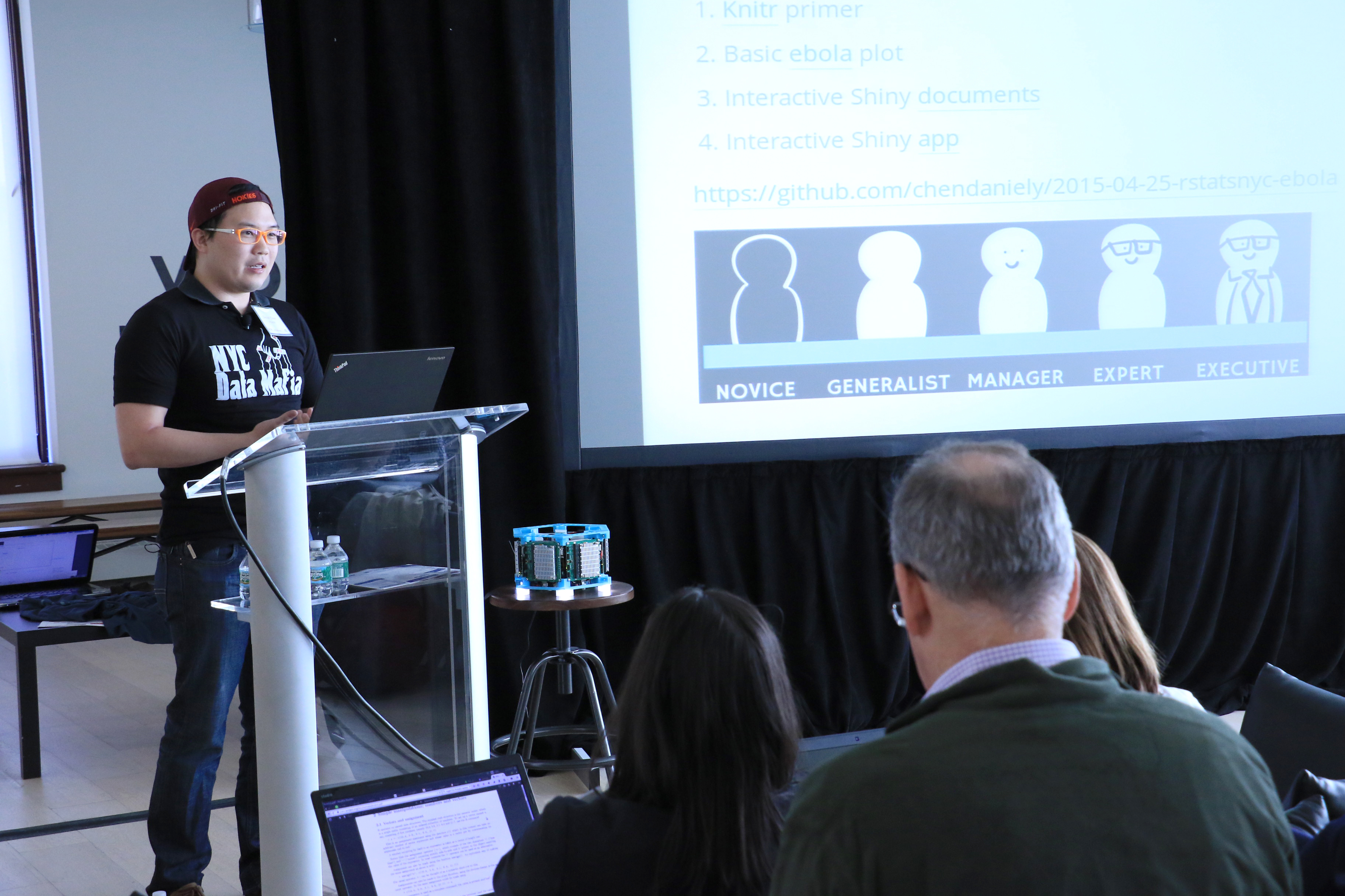
On April 24th and 25th Lander Analytics and Work-Bench coorganized the (sold-out) inaugural New York R Conference. It was an amazing weekend of nerding out over R and data, with a little Python and Julia mixed in for good measure. People from all across the R community gathered to see rockstars discuss their latest and greatest efforts.