Last night we celebrated Rounded Pi Day by rounding at the 10,000’s digit to get 3.1416 which nicely works with the date 3/14/16. This was great after Mega Pi Day worked out so perfectly last year. And this all built uponpreviousyears’celebrations.
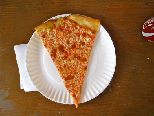
We ate a large quantity of pizza at Lombardi’s. and for the second year in a row we got the Pi Cake from Empire Cakes with peanut butter and chocolate flavors. The base was inscribed with historic approximations of Pi: 25/8, 256/81, 339/108, 223/71, 377/120, 3927/1250, 355/113, 62832/20000, 22/7.
##   polla_qid      Answer Votes pollq_id                Question
## 1         2   Excellent     0        2  How was Pizza Mercato?
## 2         2        Good     6        2  How was Pizza Mercato?
## 3         2     Average     4        2  How was Pizza Mercato?
## 4         2        Poor     1        2  How was Pizza Mercato?
## 5         2 Never Again     2        2  How was Pizza Mercato?
## 6         3   Excellent     1        3 How was Maffei's Pizza?
##            Place      Time TotalVotes Percent
## 1  Pizza Mercato 1.344e+09         13  0.0000
## 2  Pizza Mercato 1.344e+09         13  0.4615
## 3  Pizza Mercato 1.344e+09         13  0.3077
## 4  Pizza Mercato 1.344e+09         13  0.0769
## 5  Pizza Mercato 1.344e+09         13  0.1538
## 6 Maffei's Pizza 1.348e+09          7  0.1429
require(ggplot2)
ggplot(pizza, aes(x = Place, y = Percent, group = Answer, color = Answer)) +
    geom_line() + theme(axis.text.x = element_text(angle = 46, hjust = 1), legend.position = "bottom") +
    labs(x = "Pizza Place", title = "Pizza Poll Results")
But given this is live data that will change as more polls are added I thought it best to use a plot that automatically updates and is interactive. So this gave me my first chance to needrCharts by Ramnath Vaidyanathan as seen at October’s meetup.
There are still a lot of things I am learning, including how to use a categorical x-axis natively on linecharts and inserting chart titles. I found a workaround for the categorical x-axis by using tickFormat but that is not pretty. I also would like to find a way to quickly switch between a line chart and a bar chart. Fitting more labels onto the x-axis or perhaps adding a scroll bar would be nice too.
Continuing the annualtradition of Pi Cakes from Chrissie Cook we have gotten another Pi Cake! This year we let Drew Conway’s wife pick the flavors and she went with vanilla and red velvet (the blue color is to cause some cognitive dissonance). Looking forward to enjoying this tonight after some pizza.
Taking a break from my normal exposition on stats, New York or pizza I’d like to espouse the wonders of baking soda and vinegar!
My sink was clogged, not with anything specific, but just years worth of gunk. So after scraping out what I could with my hands and a wire hanger–and wanting to avoid caustic chemicals like Drano–I searched the Internet to see if Listerene or Coca-Cola might do the trick. But extensivesearchingled me to baking soda and vinegar.
It’s very simple: Stuff a half cup of baking soda into the train then pour a half cup of vinegar down it, return the sink stopper and wait 15 minutes. Then pour down another half cup of vinegar, close the stopper and wait another 15 minutes. After that pour a gallon (a tea kettle’s worth) of boiling water down the drain and you’re done! Not only will it unclog your drain, it leaves all the chrome shining like new!
For those of us who never got to make a model volcano in science class it was really awesome watching the baking soda and vinegar react
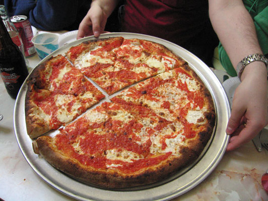
As mentioned earlier, yesterday was Pi Day so a bunch of statisticians and other such nerds celebrated at the new(ish) Artichoke Basille near the High Line. We had three pies: the signature Artichoke, the Margherita and the Anchovy, which was delicious but only some of us ate. And of course we had our custom cake from Chrissie Cook.
Happy Pi Day everybody! I’ll be out celebrating with the rest of the NYC Data Mafia eating pizza and devouring the above Pi Cake, custom baked by Chrissie Cook.
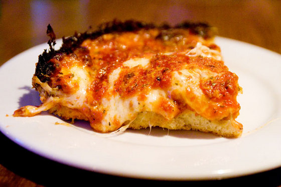
It gets really interesting when he says, “You know these deep-dish pizzas—it’s not pizza. It’s very good, but … call it tomato pie or something.” While an argument can certainly me made that deep-dish pizza is almost a casserole, I think the folks down in Trenton (where Scalia was born) have already claimed the name tomato pie, referring to a round pie with the sauce on top.
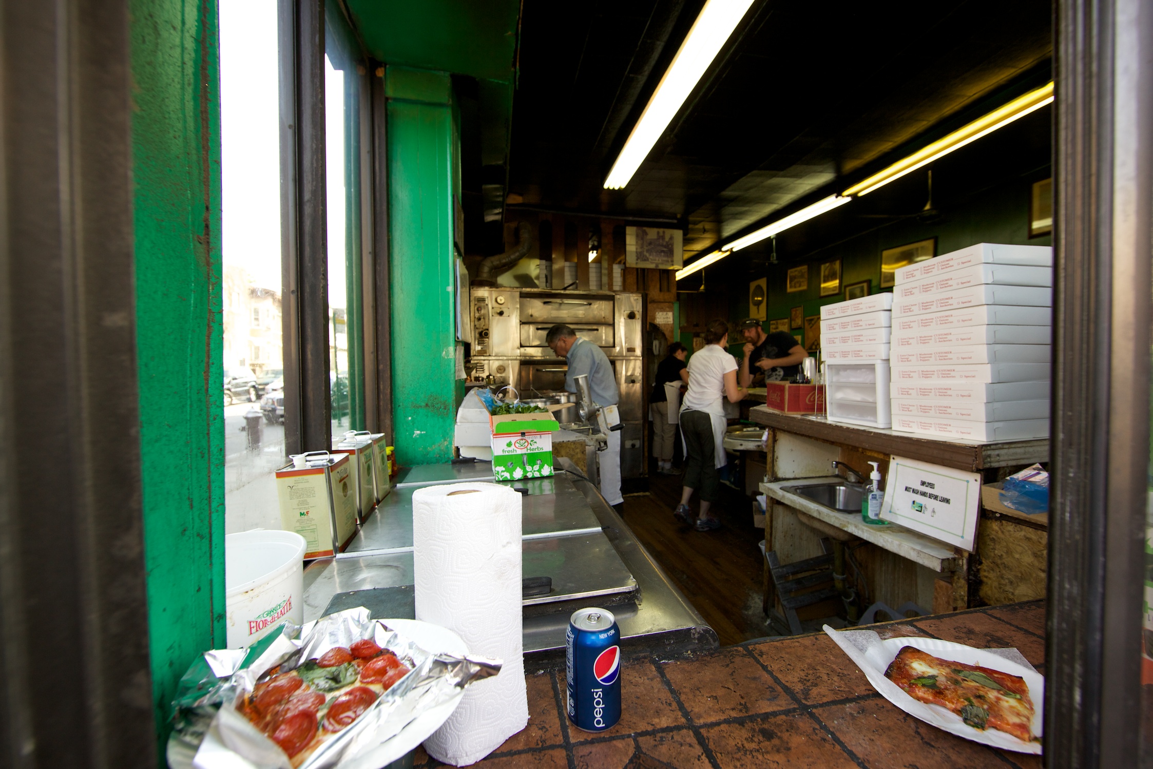
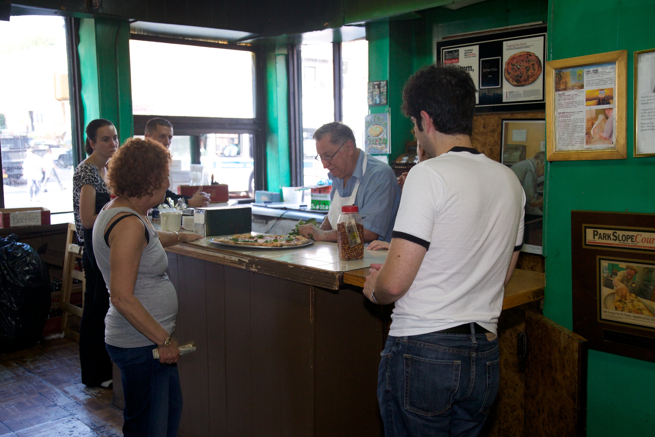
Last Wednesday I made a trip to Di Fara in Midwood, Brooklyn. Since that place is wellcoveredandlauded I won’t talk about the pizza, as amazing as it is.
I gave Dom a copy of my thesis (pdf) on NYCpizza and he loved that his place was one of the few pizzerias mentioned by name (along with Lombardi’s and Otto Enoteca, two of my favorites) in the paper. My friend captured these great photos and I’m extremely thankful to Dom for letting me in his kitchen.
And to make the trip all the more surreal, Avenue J was lined with lulav and etrog vendors trying to clear out stock before Sukkot started. The juxtaposition of Di Fara and the surrounding Orthodox neighborhood was striking and really shows the beauty of New York City.
Last week Slice ran a post about a tomato taste test they conducted with Scott Wiener (of Scott’s NYC Pizza Tours), Brooks Jones, Jason Feirman, Nick Sherman and Roberto Caporuscio from Keste. While the methods used may not be rigorous enough for definitive results, I took the summary data that was in the post and performed some simple analyses.
The first thing to note is that there are only 16 data points, so multiple regression is not an option. We can all thank the Curse of Dimensionality for that. So I stuck to simpler methods and visualizations. If I can get the raw data from Slice, I can get a little more advanced.
For the sake of simplicity I removed the tomatoes from Eataly because their price was such an outlier that it made visualizing the data difficult. As usual, most of the graphics were made using ggplot2 by Hadley Wickham. The coefficient plots were made using a little function I wrote. Here is the code. Any suggestions for improvement are greatly appreciated, especially if you can help with increasing the left hand margin of the plot. And as always, all the work was done in R.
The most obvious relationship we want to test is Overall Quality vs. Price. As can be seen from the scatterplot below with a fitted loess curve, there is not a linear relationship between price and quality.


