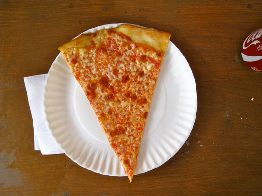
 Daily Intel caught wind of a California Lawyer interview with US Supreme Court Justice Antonin Scalia where he proclaims New York pizza “is infinitely better than Washington pizza, and infinitely better than Chicago pizza.” I may be biased to New York pizza as well, but that is a debate I’ll save for another day.
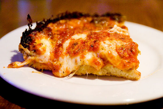
It gets really interesting when he says, “You know these deep-dish pizzas—it’s not pizza. It’s very good, but … call it tomato pie or something.” While an argument can certainly me made that deep-dish pizza is almost a casserole, I think the folks down in Trenton (where Scalia was born) have already claimed the name tomato pie, referring to a round pie with the sauce on top.
Hopefully Slice will chime in on this.
Jared Lander is the Chief Data Scientist of Lander Analytics a New York data science and AI firm, Adjunct Professor at Columbia University, Organizer of the New York Open Statistical Programming meetup and the New York and Government Data Science and AI Conferences and author of R for Everyone.

