Pi Cake 2019
Pi Cake 2019

On Pi Day this year I was giving a keynote talk at DataFest in Scotland, so we celebrated Pi Day a week later, on the 21st. While it wasn’t the exact date, there’s never a bad time to eat pizza and Pi Cake.

This was the tenth Pi Cake, and it’s pretty hard to beat the Einstein design on last year’s Pi Cake, so Empire Cakes gave created us a cake with the actual definition of pi: The ratio of a circle’s circumference to its diameter.

For pizza we went to the new Lombardi’s in Chelsea. They use an amazing electric oven instead of coal, so if you look closely you can tell the difference, but the pizza was still great and the decor was fantastic. 

And now Pi Cake throughout the years:

Related Posts


Jared Lander is the Chief Data Scientist of Lander Analytics a New York data science firm, Adjunct Professor at Columbia University, Organizer of the New York Open Statistical Programming meetup and the New York and Washington DC R Conferences and author of R for Everyone.

2018 New York R Conference

The 2018 New York R Conference was the biggest and best yet. This is both in terms of the crowd size and content.  The speakers included some of the R community’s best such as Hadley Wickham, David Robinson, Jennifer Hill, Max Kuhn, Andreas Mueller (ok, a little Python), Evelina Gabasova, Sean Taylor and Jeff Ryan. I am proud to say we were almost at gender parity for both attendees and speakers which is amazing for a tech conference. Brooke Watson even excitedly noted that we had a line for the women’s room.

Particularly gratifying for me was seeing so many of my students speak. Eurry Kim, Dan Chen and Alex Boghosian all gave excellent talks.

Some highlights that stuck out to me are:

Emily Robinson Shows There is More to the Tidyverse than Hadley

The Expanded Tidyverse

Emily Robinson, otherwise known as ERob, gave an excellent talk showing how the Tidyverse is so much more than just Hadley and that there are many people inspired by him to contribute in the Tidy way.

Sean Taylor Forecasted the Future with Prophet

Sean Taylor

Sean Taylor, former New Yorker and unrepentant Eagles fan, demonstrate his powerful R and Python, package Prophet, for forecasting time series data. Facebook open sourced his work so we could all benefit.

OG Data Mafia Founder Drew Conway Popped In

Giving away a data mafia shirt

A lucky fan got an autographed NYC Data Mafia t-shirt from Drew Conway.

David Smith Playing Minecraft Through R

Minecraft in R

David Smith played Minecraft through R, including building objects and moving through the world.

Evelina Gabasova Used Social Network Analysis to Break Down Star Wars

It's a Trap

Evelina Gabasova wowed the audience with her fun talk and detailed analysis of character interaction in Star Wars.

Dusty Turner Represented West Point

Dusty Talking Army Sports

Dusty Turner taught us how the United States Military Academy uses R for both student instruction and evaluation.

Hadley Wickham Delved into the Nitty Gritty of R

Hadley shows off objects are stored in memory

Hadley Wickham showed us how to get into the internals of R and figure out how to examine objects from a memory perspective.

Jennifer Hill Demonstrated Awesome Machine Learning Techniques for Causal Inference

Jennifer Hill Explaining Causal Inference

Following her sold-out meetup appearance in March, Jennifer continued to push the boundaries of causal inference.

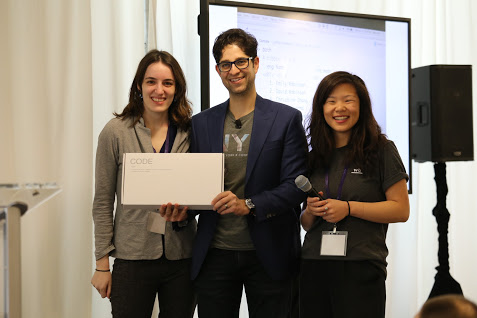
I Made the Authors of Caret and scitkit-learn Show That R and Python Can Get Along

Caret and Scikit-learn in one place

While both Andreas and Max gave great individual talks, I made them pose for this peace-making photo.

David Robinson Got the Upper Hand in a Sibling Twitter Duel

DRob Teaching

Given only about 30 minutes notice, David put together an entire slideshow on how to livetweet and how to compete with your sibling.

In the End Emily Robinson Beat Her Brother For Best Tweeting

Emily won the prize for best tweeting

Despite David’s headstart Emily was the best tweeter (as calculated by Max Kuhn and Mara Averick) so she won the WASD Code mechanical keyboard with MX Cherry Clear switches.

Silent Auction of Data Paintings

The Robinson Family bought the Pizza Data painting for me

Thomas Levine made paintings of famous datasets that we auctioned off with the proceeds supporting the R Foundation and the Free Software Foundation. The Robinson family very graciously chipped in and bought the painting of the Pizza Poll data for me! I’m still floored by this and in love with the painting.

Ice Cream Sandwiches

Ice Cream Sandwiches

In addition to bagels and eggs sandwiches from Murray’s Bagels, Israeli food from Hummus and Pita Company, avocado toast and coffee from Bluestone Lane Coffee and pizza from Fiore’s, we also had ice creams sandwiches from World’s Best Cookie Dough.

All the Material

To catch up on all the presentations check out Mara Averick’s excellent notes:

Or check out all of Brooke’s drawings, collated by Dan Chen.

Videos and Upcoming Events

The videos will be posted at rstats.nyc in a few weeks for all to enjoy.

There are a number of other events coming up including:

We are already beginning plans for next year’s conference and are working on bringing it to DC as well! Stay tuned for all that and more.

Dan loves his mug

Related Posts


Jared Lander is the Chief Data Scientist of Lander Analytics a New York data science firm, Adjunct Professor at Columbia University, Organizer of the New York Open Statistical Programming meetup and the New York and Washington DC R Conferences and author of R for Everyone.

Pi Day 2018

It’s Pi Day, when we celebrate all things round by eating pizza and Pi Cake. This is the ninth year we have celebrated Pi Day and the fourth year in a row we got the Pi Cake from Empire Cakes. This year’s pizza place was Arturo’s on Thompson and Houston. Arturo’s is a great example of old New York pizza with an oven dating to the 1920’s.

In addition to the traditional Pi Symbol atop the cake we added Albert Einstein since today is also his birthday. It seems fitting that we lost one of the world’s other greatest physicists, Stephen Hawking on the same math holiday.

Pi Cake 2018

The crew has grown quite large from the five of us who celebrated our first pie day almost a decade ago.

Some more pictures from this fun night.

And now Pi Cake throughout the years:

Related Posts


Jared Lander is the Chief Data Scientist of Lander Analytics a New York data science firm, Adjunct Professor at Columbia University, Organizer of the New York Open Statistical Programming meetup and the New York and Washington DC R Conferences and author of R for Everyone.

Snowstorm Stella impacted both our numbers and our location, but last night a smaller crew braved the cold weather and messy streets to celebrate Pi Day with pizza and Pi Cake at Ribalta.

We naturally ate a lot of round pies and even a rectangular pie to honor Hippocrates’ squaring the lune.

This year’s Pi Cake came from Empire Cakes for the third year in a row.  It was their Brooklyn Blackout cake with Chocolate frosting, a blue Pi symbol on top and blue circles with red radii around the sides.

Some pictures from last night:

IMG_20170314_224825_430 IMG_20170314_225301_523 IMG_1967 IMG_20170314_201119 IMG_20170314_205344

And all the years’ Pi Cakes:

Related Posts


Jared Lander is the Chief Data Scientist of Lander Analytics a New York data science firm, Adjunct Professor at Columbia University, Organizer of the New York Open Statistical Programming meetup and the New York and Washington DC R Conferences and author of R for Everyone.

Last night we celebrated Rounded Pi Day by rounding at the 10,000’s digit to get 3.1416 which nicely works with the date 3/14/16.  This was great after Mega Pi Day worked out so perfectly last year.  And this all built upon previous years’ celebrations.

We ate a large quantity of pizza at Lombardi’s. and for the second year in a row we got the Pi Cake from Empire Cakes with peanut butter and chocolate flavors.  The base was inscribed with historic approximations of Pi:  25/8, 256/81, 339/108, 223/71, 377/120, 3927/1250, 355/113, 62832/20000, 22/7.

Some pictures from the fantastic night:

IMG_20160314_193523 IMG_20160314_203411 IMG_20160314_203443

Previous year’s Pi Cakes:

Related Posts


Jared Lander is the Chief Data Scientist of Lander Analytics a New York data science firm, Adjunct Professor at Columbia University, Organizer of the New York Open Statistical Programming meetup and the New York and Washington DC R Conferences and author of R for Everyone.

Pi Cake 2015
This year we celebrated Mega Pi Day with the date (3/14/15) covering the first four digits of Pi. And of course, we unveiled the Pi Cake at 9:26 to get the next three digits.  This year the cake came from Empire Cakes and was peanut butter flavored.  We even had the bakery put as many digits as would fit around the cake.

A large group from the NYC Data Mafia came out and Scott Wiener of Scott’s Pizza Tours ensured we had the perfect assortment and quantity of pizza.


A look at Pi Cakes from previous years:

Related Posts


Jared Lander is the Chief Data Scientist of Lander Analytics a New York data science firm, Adjunct Professor at Columbia University, Organizer of the New York Open Statistical Programming meetup and the New York and Washington DC R Conferences and author of R for Everyone.

Fiore's Slices
Subway Car

The other night I attended a talk about the history of Brooklyn pizza at the Brooklyn Historical Society by Scott Wiener of Scott’s Pizza Tours. Toward the end, a woman stated she had a theory that pizza slice prices stay in rough lockstep with New York City subway fares. Of course, this is a well known relationship that even has its own Wikipedia entry, so Scott referred her to a New York Times article from 1995 that mentioned the phenomenon.

However, he wondered if the preponderance of dollar slice shops has dropped the price of a slice below that of the subway and playfully joked that he wished there was a statistician in the audience.

Naturally, that night I set off to calculate the current price of a slice in New York City using listings from MenuPages. I used R’s XML package to pull the menus for over 1,800 places tagged as “Pizza” in Manhattan, Brooklyn and Queens (there was no data for Staten Island or The Bronx) and find the price of a cheese slice.

After cleaning up the data and doing my best to find prices for just cheese/plain/regular slices I found that the mean price was $2.33 with a standard deviation of $0.52 and a median price of $2.45. The base subway fare is $2.50 but is actually $2.38 after the 5% bonus for putting at least $5 on a MetroCard.

So, even with the proliferation of dollar slice joints, the average slice of pizza ($2.33) lines up pretty nicely with the cost of a subway ride ($2.38).

Taking it a step further, I broke down the price of a slice in Manhattan, Queens and Brooklyn. The vertical lines represented the price of a subway ride with and without the bonus.  We see that the price of a slice in Manhattan is perfectly right there with the subway fare.

The average price of a slice in each borough. The dots are the means and the error bars are the two standard deviation confidence intervals. The two vertical lines represent the discounted subway fare and the base far, respectively.

MenuPages even broke down Queens Neighborhoods so we can have a more specific plot. The average price of a slice in each Manhattan, Brooklyn and Queens neighborhoods. The dots are the means and the error bars are the two standard deviation confidence intervals. The two vertical lines represent the discounted subway fare and the base far, respectively.

The code for downloading the menus and the calculations is after the break.

Continue reading

Related Posts


Jared Lander is the Chief Data Scientist of Lander Analytics a New York data science firm, Adjunct Professor at Columbia University, Organizer of the New York Open Statistical Programming meetup and the New York and Washington DC R Conferences and author of R for Everyone.

IMG_2085

It’s here!  Another Pi Day, another Pi Cake, as tradition demands.  Once again from Chrissie Cook.

Previous cakes in the gallery after the break.

Related Posts


Jared Lander is the Chief Data Scientist of Lander Analytics a New York data science firm, Adjunct Professor at Columbia University, Organizer of the New York Open Statistical Programming meetup and the New York and Washington DC R Conferences and author of R for Everyone.

Based on data collected from polls conducted at the beginning of the New York Open Statistical Programming meetups.


Related Posts


Jared Lander is the Chief Data Scientist of Lander Analytics a New York data science firm, Adjunct Professor at Columbia University, Organizer of the New York Open Statistical Programming meetup and the New York and Washington DC R Conferences and author of R for Everyone.


plot of chunk plot-ggplot

For a d3 bar plot visit https://www.jaredlander.com/plots/PizzaPollPlot.html.


I finally compiled the data from all the pizza polling I’ve been doing at the New York R meetups. The data are available as json at https://www.jaredlander.com/data/PizzaPollData.php.

This is easy enough to plot in R using ggplot2.

require(rjson)
require(plyr)
pizzaJson <- fromJSON(file = "http://jaredlander.com/data/PizzaPollData.php")
pizza <- ldply(pizzaJson, as.data.frame)
head(pizza)
##   polla_qid      Answer Votes pollq_id                Question
## 1         2   Excellent     0        2  How was Pizza Mercato?
## 2         2        Good     6        2  How was Pizza Mercato?
## 3         2     Average     4        2  How was Pizza Mercato?
## 4         2        Poor     1        2  How was Pizza Mercato?
## 5         2 Never Again     2        2  How was Pizza Mercato?
## 6         3   Excellent     1        3 How was Maffei's Pizza?
##            Place      Time TotalVotes Percent
## 1  Pizza Mercato 1.344e+09         13  0.0000
## 2  Pizza Mercato 1.344e+09         13  0.4615
## 3  Pizza Mercato 1.344e+09         13  0.3077
## 4  Pizza Mercato 1.344e+09         13  0.0769
## 5  Pizza Mercato 1.344e+09         13  0.1538
## 6 Maffei's Pizza 1.348e+09          7  0.1429
require(ggplot2)
ggplot(pizza, aes(x = Place, y = Percent, group = Answer, color = Answer)) + 
    geom_line() + theme(axis.text.x = element_text(angle = 46, hjust = 1), legend.position = "bottom") + 
    labs(x = "Pizza Place", title = "Pizza Poll Results")

plot of chunk plot-ggplot

But given this is live data that will change as more polls are added I thought it best to use a plot that automatically updates and is interactive. So this gave me my first chance to need rCharts by Ramnath Vaidyanathan as seen at October’s meetup.

require(rCharts)
pizzaPlot <- nPlot(Percent ~ Place, data = pizza, type = "multiBarChart", group = "Answer")
pizzaPlot$xAxis(axisLabel = "Pizza Place", rotateLabels = -45)
pizzaPlot$yAxis(axisLabel = "Percent")
pizzaPlot$chart(reduceXTicks = FALSE)
pizzaPlot$print("chart1", include_assets = TRUE)

Unfortunately I cannot figure out how to insert this in WordPress so please see the chart at https://www.jaredlander.com/plots/PizzaPollPlot.html. Or see the badly sized one below.

There are still a lot of things I am learning, including how to use a categorical x-axis natively on linecharts and inserting chart titles. I found a workaround for the categorical x-axis by using tickFormat but that is not pretty. I also would like to find a way to quickly switch between a line chart and a bar chart. Fitting more labels onto the x-axis or perhaps adding a scroll bar would be nice too.

Related Posts


Jared Lander is the Chief Data Scientist of Lander Analytics a New York data science firm, Adjunct Professor at Columbia University, Organizer of the New York Open Statistical Programming meetup and the New York and Washington DC R Conferences and author of R for Everyone.