Pi Cake 2019
Pi Cake 2019

On Pi Day this year I was giving a keynote talk at DataFest in Scotland, so we celebrated Pi Day a week later, on the 21st. While it wasn’t the exact date, there’s never a bad time to eat pizza and Pi Cake.

This was the tenth Pi Cake, and it’s pretty hard to beat the Einstein design on last year’s Pi Cake, so Empire Cakes gave created us a cake with the actual definition of pi: The ratio of a circle’s circumference to its diameter.

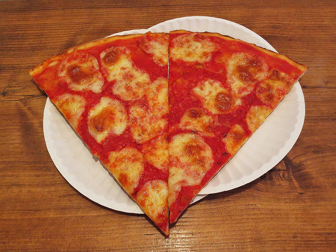
For pizza we went to the new Lombardi’s in Chelsea. They use an amazing electric oven instead of coal, so if you look closely you can tell the difference, but the pizza was still great and the decor was fantastic. 

And now Pi Cake throughout the years:

Related Posts


Jared Lander is the Chief Data Scientist of Lander Analytics a New York data science firm, Adjunct Professor at Columbia University, Organizer of the New York Open Statistical Programming meetup and the New York and Washington DC R Conferences and author of R for Everyone.

Pi Day 2018

It’s Pi Day, when we celebrate all things round by eating pizza and Pi Cake. This is the ninth year we have celebrated Pi Day and the fourth year in a row we got the Pi Cake from Empire Cakes. This year’s pizza place was Arturo’s on Thompson and Houston. Arturo’s is a great example of old New York pizza with an oven dating to the 1920’s.

In addition to the traditional Pi Symbol atop the cake we added Albert Einstein since today is also his birthday. It seems fitting that we lost one of the world’s other greatest physicists, Stephen Hawking on the same math holiday.
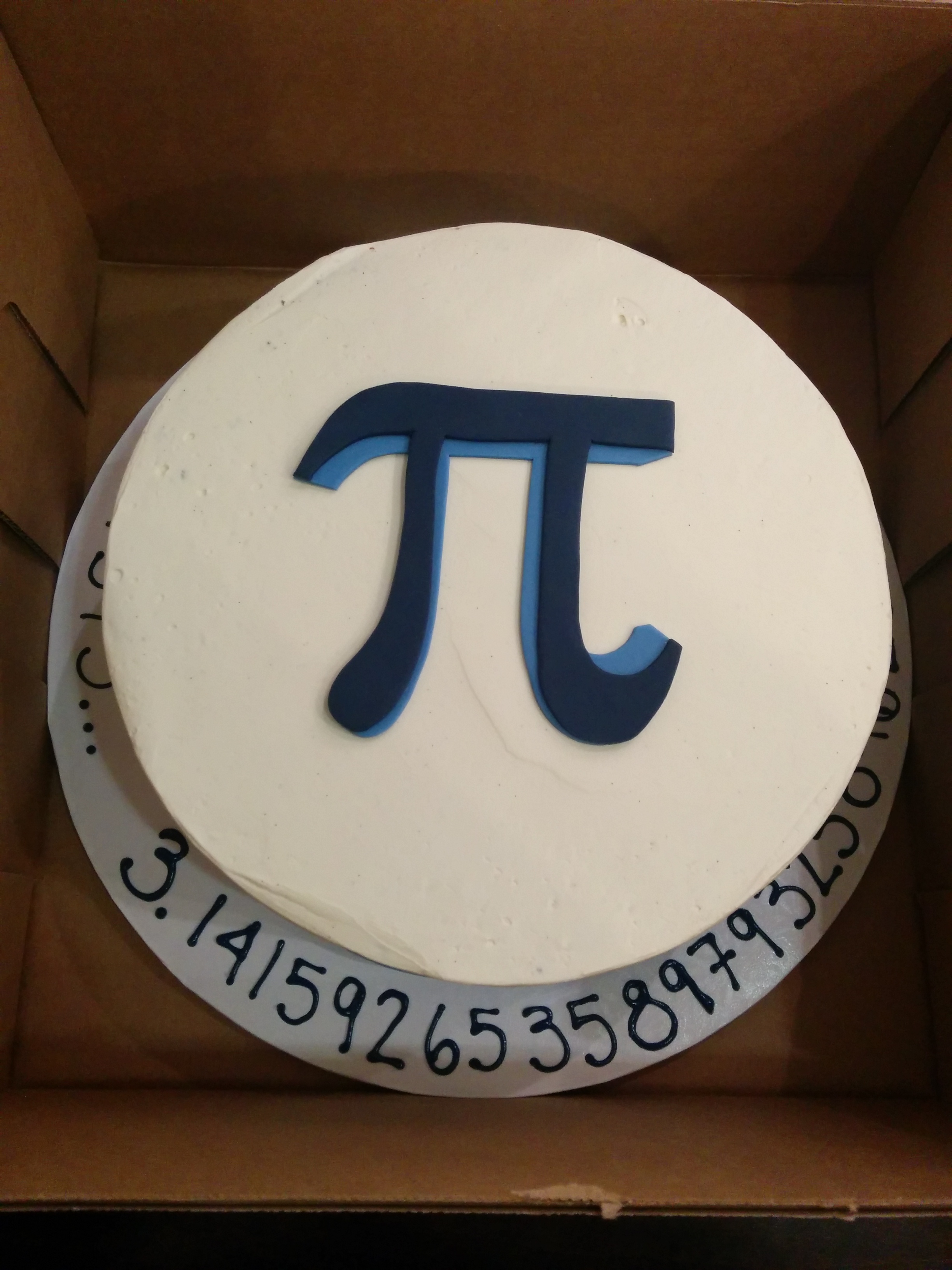
Pi Cake 2018

The crew has grown quite large from the five of us who celebrated our first pie day almost a decade ago.

Some more pictures from this fun night.

And now Pi Cake throughout the years:

Related Posts


Jared Lander is the Chief Data Scientist of Lander Analytics a New York data science firm, Adjunct Professor at Columbia University, Organizer of the New York Open Statistical Programming meetup and the New York and Washington DC R Conferences and author of R for Everyone.

Snowstorm Stella impacted both our numbers and our location, but last night a smaller crew braved the cold weather and messy streets to celebrate Pi Day with pizza and Pi Cake at Ribalta.

We naturally ate a lot of round pies and even a rectangular pie to honor Hippocrates’ squaring the lune.

This year’s Pi Cake came from Empire Cakes for the third year in a row.  It was their Brooklyn Blackout cake with Chocolate frosting, a blue Pi symbol on top and blue circles with red radii around the sides.

Some pictures from last night:

IMG_20170314_224825_430 IMG_20170314_225301_523 IMG_1967 IMG_20170314_201119 IMG_20170314_205344

And all the years’ Pi Cakes:

Related Posts


Jared Lander is the Chief Data Scientist of Lander Analytics a New York data science firm, Adjunct Professor at Columbia University, Organizer of the New York Open Statistical Programming meetup and the New York and Washington DC R Conferences and author of R for Everyone.

Last night we celebrated Rounded Pi Day by rounding at the 10,000’s digit to get 3.1416 which nicely works with the date 3/14/16.  This was great after Mega Pi Day worked out so perfectly last year.  And this all built upon previous years’ celebrations.

We ate a large quantity of pizza at Lombardi’s. and for the second year in a row we got the Pi Cake from Empire Cakes with peanut butter and chocolate flavors.  The base was inscribed with historic approximations of Pi:  25/8, 256/81, 339/108, 223/71, 377/120, 3927/1250, 355/113, 62832/20000, 22/7.

Some pictures from the fantastic night:

IMG_20160314_193523 IMG_20160314_203411 IMG_20160314_203443

Previous year’s Pi Cakes:

Related Posts


Jared Lander is the Chief Data Scientist of Lander Analytics a New York data science firm, Adjunct Professor at Columbia University, Organizer of the New York Open Statistical Programming meetup and the New York and Washington DC R Conferences and author of R for Everyone.

Pi Cake 2015
This year we celebrated Mega Pi Day with the date (3/14/15) covering the first four digits of Pi. And of course, we unveiled the Pi Cake at 9:26 to get the next three digits.  This year the cake came from Empire Cakes and was peanut butter flavored.  We even had the bakery put as many digits as would fit around the cake.

A large group from the NYC Data Mafia came out and Scott Wiener of Scott’s Pizza Tours ensured we had the perfect assortment and quantity of pizza.


A look at Pi Cakes from previous years:

Related Posts


Jared Lander is the Chief Data Scientist of Lander Analytics a New York data science firm, Adjunct Professor at Columbia University, Organizer of the New York Open Statistical Programming meetup and the New York and Washington DC R Conferences and author of R for Everyone.

Fiore's Slices
Subway Car

The other night I attended a talk about the history of Brooklyn pizza at the Brooklyn Historical Society by Scott Wiener of Scott’s Pizza Tours. Toward the end, a woman stated she had a theory that pizza slice prices stay in rough lockstep with New York City subway fares. Of course, this is a well known relationship that even has its own Wikipedia entry, so Scott referred her to a New York Times article from 1995 that mentioned the phenomenon.

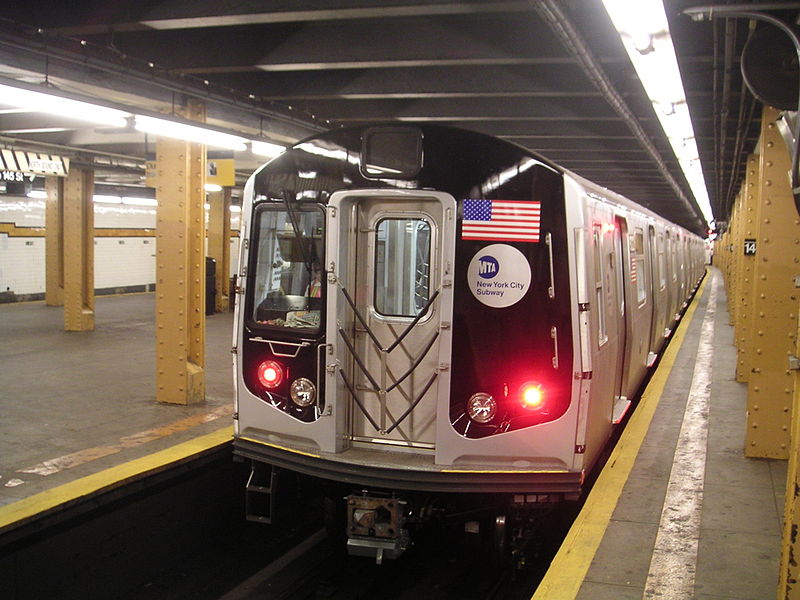
However, he wondered if the preponderance of dollar slice shops has dropped the price of a slice below that of the subway and playfully joked that he wished there was a statistician in the audience.

Naturally, that night I set off to calculate the current price of a slice in New York City using listings from MenuPages. I used R’s XML package to pull the menus for over 1,800 places tagged as “Pizza” in Manhattan, Brooklyn and Queens (there was no data for Staten Island or The Bronx) and find the price of a cheese slice.

After cleaning up the data and doing my best to find prices for just cheese/plain/regular slices I found that the mean price was $2.33 with a standard deviation of $0.52 and a median price of $2.45. The base subway fare is $2.50 but is actually $2.38 after the 5% bonus for putting at least $5 on a MetroCard.

So, even with the proliferation of dollar slice joints, the average slice of pizza ($2.33) lines up pretty nicely with the cost of a subway ride ($2.38).

Taking it a step further, I broke down the price of a slice in Manhattan, Queens and Brooklyn. The vertical lines represented the price of a subway ride with and without the bonus.  We see that the price of a slice in Manhattan is perfectly right there with the subway fare.

The average price of a slice in each borough. The dots are the means and the error bars are the two standard deviation confidence intervals. The two vertical lines represent the discounted subway fare and the base far, respectively.

MenuPages even broke down Queens Neighborhoods so we can have a more specific plot. The average price of a slice in each Manhattan, Brooklyn and Queens neighborhoods. The dots are the means and the error bars are the two standard deviation confidence intervals. The two vertical lines represent the discounted subway fare and the base far, respectively.

The code for downloading the menus and the calculations is after the break.

Continue reading

Related Posts


Jared Lander is the Chief Data Scientist of Lander Analytics a New York data science firm, Adjunct Professor at Columbia University, Organizer of the New York Open Statistical Programming meetup and the New York and Washington DC R Conferences and author of R for Everyone.

Based on data collected from polls conducted at the beginning of the New York Open Statistical Programming meetups.


Related Posts


Jared Lander is the Chief Data Scientist of Lander Analytics a New York data science firm, Adjunct Professor at Columbia University, Organizer of the New York Open Statistical Programming meetup and the New York and Washington DC R Conferences and author of R for Everyone.


plot of chunk plot-ggplot

For a d3 bar plot visit https://www.jaredlander.com/plots/PizzaPollPlot.html.


I finally compiled the data from all the pizza polling I’ve been doing at the New York R meetups. The data are available as json at https://www.jaredlander.com/data/PizzaPollData.php.

This is easy enough to plot in R using ggplot2.

require(rjson)
require(plyr)
pizzaJson <- fromJSON(file = "http://jaredlander.com/data/PizzaPollData.php")
pizza <- ldply(pizzaJson, as.data.frame)
head(pizza)
##   polla_qid      Answer Votes pollq_id                Question
## 1         2   Excellent     0        2  How was Pizza Mercato?
## 2         2        Good     6        2  How was Pizza Mercato?
## 3         2     Average     4        2  How was Pizza Mercato?
## 4         2        Poor     1        2  How was Pizza Mercato?
## 5         2 Never Again     2        2  How was Pizza Mercato?
## 6         3   Excellent     1        3 How was Maffei's Pizza?
##            Place      Time TotalVotes Percent
## 1  Pizza Mercato 1.344e+09         13  0.0000
## 2  Pizza Mercato 1.344e+09         13  0.4615
## 3  Pizza Mercato 1.344e+09         13  0.3077
## 4  Pizza Mercato 1.344e+09         13  0.0769
## 5  Pizza Mercato 1.344e+09         13  0.1538
## 6 Maffei's Pizza 1.348e+09          7  0.1429
require(ggplot2)
ggplot(pizza, aes(x = Place, y = Percent, group = Answer, color = Answer)) + 
    geom_line() + theme(axis.text.x = element_text(angle = 46, hjust = 1), legend.position = "bottom") + 
    labs(x = "Pizza Place", title = "Pizza Poll Results")

plot of chunk plot-ggplot

But given this is live data that will change as more polls are added I thought it best to use a plot that automatically updates and is interactive. So this gave me my first chance to need rCharts by Ramnath Vaidyanathan as seen at October’s meetup.

require(rCharts)
pizzaPlot <- nPlot(Percent ~ Place, data = pizza, type = "multiBarChart", group = "Answer")
pizzaPlot$xAxis(axisLabel = "Pizza Place", rotateLabels = -45)
pizzaPlot$yAxis(axisLabel = "Percent")
pizzaPlot$chart(reduceXTicks = FALSE)
pizzaPlot$print("chart1", include_assets = TRUE)

Unfortunately I cannot figure out how to insert this in WordPress so please see the chart at https://www.jaredlander.com/plots/PizzaPollPlot.html. Or see the badly sized one below.

There are still a lot of things I am learning, including how to use a categorical x-axis natively on linecharts and inserting chart titles. I found a workaround for the categorical x-axis by using tickFormat but that is not pretty. I also would like to find a way to quickly switch between a line chart and a bar chart. Fitting more labels onto the x-axis or perhaps adding a scroll bar would be nice too.

Related Posts


Jared Lander is the Chief Data Scientist of Lander Analytics a New York data science firm, Adjunct Professor at Columbia University, Organizer of the New York Open Statistical Programming meetup and the New York and Washington DC R Conferences and author of R for Everyone.


How was Lunetta Pizza?

  • Good (57%, 4 Votes)
  • Average (43%, 3 Votes)
  • Excellent (0%, 0 Votes)
  • Poor (0%, 0 Votes)
  • Never Again (0%, 0 Votes)

Total Voters: 7

Loading ... Loading …

Aggregated results.

Results from individual previous polls are below. Continue reading

Related Posts


Jared Lander is the Chief Data Scientist of Lander Analytics a New York data science firm, Adjunct Professor at Columbia University, Organizer of the New York Open Statistical Programming meetup and the New York and Washington DC R Conferences and author of R for Everyone.

How was Pizza Mercato?

  • Good (46%, 6 Votes)
  • Average (31%, 4 Votes)
  • Never Again (15%, 2 Votes)
  • Poor (8%, 1 Votes)
  • Excellent (0%, 0 Votes)

Total Voters: 13

Loading ... Loading …

Related Posts


Jared Lander is the Chief Data Scientist of Lander Analytics a New York data science firm, Adjunct Professor at Columbia University, Organizer of the New York Open Statistical Programming meetup and the New York and Washington DC R Conferences and author of R for Everyone.