plot of chunk make-graph

With the recent availability (new link) of play-by-play NFL data I got to analyzing my favorite team, the New York Giants with some very hasty EDA.

From the above graph you can see that on 1st down Eli preferred to throw to Hakim Nicks and on 2nd and 3rd downs he slightly favored Victor Cruz.

The code for the analysis is after the break.

Continue reading

Related Posts


Jared Lander is the Chief Data Scientist of Lander Analytics a New York data science firm, Adjunct Professor at Columbia University, Organizer of the New York Open Statistical Programming meetup and the New York and Washington DC R Conferences and author of R for Everyone.

Thanks to Rachel Schutt, who I’m teaching with at Columbia, and Cathy O’Neil from MathBabe I had the opportunity to go on TV and talk about the statistics of tonight’s Powerball lottery.

There’s an article with a brief quote from me and a video where I may a very quick appearance at the 1:14 mark.  My interview during the live broadcast actually went on for about three minutes but I can’t find that online.  If I can transfer the video from my DVR, I’ll post that too.

In the longer interview I discussed the probability of winning and the expected value of a given ticket and other such statistical nuggets.  In particular I broke down how choosing numbers based on birthdays eliminates any number higher than 31 mean you are missing out on 28 of the 59 possible numbers that are uniformly distributed.  Hopefully I’ll find that longer cut.

The video can be found here:  Video

Related Posts


Jared Lander is the Chief Data Scientist of Lander Analytics a New York data science firm, Adjunct Professor at Columbia University, Organizer of the New York Open Statistical Programming meetup and the New York and Washington DC R Conferences and author of R for Everyone.

A friend of mine has told me on numerous occasions that since 1960 the Yankees have not won a World Series while a Republican was President.  Upon hearing this my Republican friends (both Yankee and Red Sox fans) turn incredulous and say that this is ridiculous.  So I decided to investigate.  To be clear this is in no way shows causality, but just checks the numbers.

The data was easily attainable so it really came down to plotting.

The plot above shows every Yankee win (and loss) since 1960 and the party of the President at the time.  It is clear to see that all nine Yankees World Series wins came while a Democrat inhabited the White House.  The fluctuation plot below shows Yankee wins both before and after 1960 and the complete lack of a block for Republican/Post-1960 simply makes the case.

There are similar plots for the American League after the jump.

Continue reading

Related Posts


Jared Lander is the Chief Data Scientist of Lander Analytics a New York data science firm, Adjunct Professor at Columbia University, Organizer of the New York Open Statistical Programming meetup and the New York and Washington DC R Conferences and author of R for Everyone.
Wes McKinney and I are hosting our first ever Open Statistical Programming meetup tomorrow night after taking over for Drew Conway.  Please attend, have some pizza, enjoy the talk then come out for some beer.

This meetup is about EDA, Visualization and Collaboration on the Web and will be presented by Carlos Scheidegger from AT&T Labs.

This month’s pizza will be from Pizza Mercato in the Village.

Related Posts


Jared Lander is the Chief Data Scientist of Lander Analytics a New York data science firm, Adjunct Professor at Columbia University, Organizer of the New York Open Statistical Programming meetup and the New York and Washington DC R Conferences and author of R for Everyone.

Couldn’t resist showing off this article in Wired Magazine that quotes me.  It’s a good take on the new, semi-corporate hacking culture, but then again, I may be a bit biased.

http://www.wired.com/business/2012/06/hackathons-arent-just-for-hacking/

Related Posts


Jared Lander is the Chief Data Scientist of Lander Analytics a New York data science firm, Adjunct Professor at Columbia University, Organizer of the New York Open Statistical Programming meetup and the New York and Washington DC R Conferences and author of R for Everyone.

Distribution of Lottery Winners based on 1,000 Simulations

With tonight’s Mega Millions jackpot estimated to be over $640 million there are long lines of people waiting to buy tickets.  Of course you always hear about the probability of winning which is easy enough to calculate:  Five numbers ranging from 1 through 56 are drawn (without replacement) then a sixth ball is pulled from a set of 1 through 46.  That means there are choose(56, 5) * 46 = 175,711,536 possible different combinations.  That is why people are constantly reminded of how unlikely they are to win.

But I want to see how likely it is that SOMEONE will win tonight.  So let’s break out R and ggplot!

As of this afternoon it was reported (sorry no source) that two tickets were sold for every American.  So let’s assume that each of these tickets is an independent Bernoulli trial with probability of success of 1/175,711,536.

Running 1,000 simulations we see the distribution of the number of winners in the histogram above.

So we shouldn’t be surprised if there are multiple winners tonight.

The R code:

winners <- rbinom(n=1000, size=600000000, prob=1/175000000)
qplot(winners, geom="histogram", binwidth=1, xlab="Number of Winners")

Related Posts


Jared Lander is the Chief Data Scientist of Lander Analytics a New York data science firm, Adjunct Professor at Columbia University, Organizer of the New York Open Statistical Programming meetup and the New York and Washington DC R Conferences and author of R for Everyone.

Shortly after the Giants fantastic defeat of the Patriots in Super Bowl XLVI (I was a little disappointed that Eli, Coughlin and the Vince Lombardi Trophy all got off the parade route early and the views of City Hall were obstructed by construction trailers, but Steve Weatherford was awesome as always) a friend asked me to settle a debate amongst some people in a Super Bowl pool.

He writes:

We have 10 participants in a superbowl pool.  The pool is a “pick the player who scores first” type pool.  In a hat, there are 10 Giants players.  Each participant picks 1 player out of the hat (in no particular order) until the hat is emptied.  Then 10 Patriots players go in the hat and each participant picks again.

In the end, each of the 10 participants has 1 Giants player and 1 Patriots player.  No one has any duplicate players as 10 different players from each team were selected.  Pool looks as follows:

Participant 1 Giant A Patriot Q
Participant 2 Giant B Patriot R
Participant 3 Giant C Patriot S
Participant 4 Giant D Patriot T
Participant 5 Giant E Patriot U
Participant 6 Giant F Patriot V
Participant 7 Giant G Patriot W
Participant 8 Giant H Patriot X
Participant 9 Giant I Patriot Y
Participant 10 Giant J Patriot Z

Winners = First Player to score wins half the pot.  First player to score in 2nd half wins the remaining half of the pot.

The question is, what are the odds that someone wins Both the 1st and 2nd half.  Remember, the picks were random.

Before anyone asks about the safety, one of the slots was for Special Teams/Defense.

There are two probabilistic ways of thinking about this.  Both hinge on the fact that whoever scores first in each half is both independent and not mutually exclusive.

First, let’s look at the two halves individually.  In a given half any of 20 players can score first (10 from the Giants and 10 from the Patriots) and an individual participant can win with two of those.  So a participant has a 2/20 = 1/10 chance of winning a half.  Thus that participant has a (1/10) * (1/10) = 1/100 chance of winning both halves.  Since there are 10 participants there is an overall probability of 10 * (1/100) = 1/10 of any single participant winning both halves.

The other way is to think a little more combinatorically.  There are 20 * 20 = 400 different combinations of players scoring first in each half.  A participant has two players which are each valid for each half giving them four of the possible combinations leading to a 4 / 400 = 1/100 probability that a single participant will win both halves.  Again, there are 10 participants giving an overall 10% chance of any one participant winning both halves.

Since both methods agreed I am pretty confidant in the results, but just in case I ran some simulations in R which you can find after the break.

Continue reading

Related Posts


Jared Lander is the Chief Data Scientist of Lander Analytics a New York data science firm, Adjunct Professor at Columbia University, Organizer of the New York Open Statistical Programming meetup and the New York and Washington DC R Conferences and author of R for Everyone.

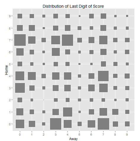
With the Super Bowl only hours away now is your last chance to buy your boxes.  Assuming the last digits are not assigned randomly you can maximize your chances with a little analysis.  While I’ve seen plenty of sites giving the raw numbers, I thought a little visualization was in order.

In the graph above (made using ggplot2 in R, of course) the bigger squares represent greater frequency.  The axes are labelled “Home” and “Away” for orientation, but in the Super Bowl that probably doesn’t matter too much, especially considering that Indianapolis is (Peyton) Manning territory so the locals will most likely be rooting for the Giants.  Further, I believe Super Bowl XLII, featuring the same two teams, had a disproportionate number of Giants fans.  Bias disclaimer:  GO BIG BLUE!!!

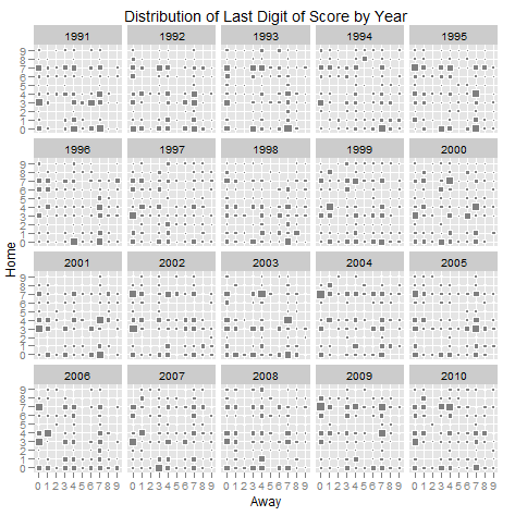
Below is the same graph broken down by year to see how the distribution has changed over the past 20 years.

All the data was scraped from Pro Football Reference.  All of my code and other graphs that didn’t make the cut are at my github site.

As always, send any questions my way.

Related Posts


Jared Lander is the Chief Data Scientist of Lander Analytics a New York data science firm, Adjunct Professor at Columbia University, Organizer of the New York Open Statistical Programming meetup and the New York and Washington DC R Conferences and author of R for Everyone.
A new study, reported in the New York Times, tracked population movements in post-earthquake Haiti using cell phone data.  The article grabbed my attention because one of the authors, Richard Garfield (whom I have done numerous projects with and who has his own Wikipedia entry!), had told me about this very study just a few months ago.

Over dinner in New York’s Little India he explained how the largest cell phone company in Haiti provided him with anonymized cell tower records.  As many people are aware, cell phones–even those without GPS–report their locations back to cell towers at regular intervals.  By tracking the daily position of the phones before and after the earthquake they were able to determine that 20% of Port-Au-Prince’s population had left the capitol within 19 days of the disaster.

They used plenty of solid math in the analysis and amazingly did it all without resorting to spatial statistics.  They have some nice map-based visualizations but I’ve been meaning to get the data from Dr. Garfield so I can attempt something similar to the amazing work done by the NYC Data Mafia on the WikiLeaks Afghanistan data.  Though I don’t promise anything nearly as good.

It is also worth noting that they did this at a fraction of the cost and time of an extensive UN survey.  That survey only had about 2,500 respondents whereas the cell phone project incorporated around 1.9 million people without them spending valuable time with an interviewer.

Related Posts


Jared Lander is the Chief Data Scientist of Lander Analytics a New York data science firm, Adjunct Professor at Columbia University, Organizer of the New York Open Statistical Programming meetup and the New York and Washington DC R Conferences and author of R for Everyone.
This graphs shows received and sent texts by month.  Notice the spike in July 2010.
Fig. 1: This graph shows received and sent text messages by month. Notice the spike in July 2010.

A few weeks ago my iPhone for some reason erased ALL of my previous text messages (SMS and MMS) and it was as if I was starting with a new phone. After doing some digging I discovered that each time you sync your iPhone a copy of its text message database is saved on your computer which can be accessed without jailbreaking.

My original intent was to take the old database and union it with the new database for all the texting I had done since then, thus restoring all of my text messages. But once I got into the SQLite database I realized that I had a ton of information on my hands that was begging to be analyzed. It also didn’t hurt that I was in a lovely but small Vermont town for the week without much else to do at night.

My first finding, as seen above, is that my text messaging spiked after my girlfriend and I broke up around July of last year. Notice that for both years there is a dip in December. That’s because in 2009 I was in Burma during December and for 2010 the data stopped on December 6th when the last backup was made. A simple t-test confirmed that my texting did indeed increase after the breakup.

Fig. 2: This graph shows my text messaging pattern over time for both men and women. Notice the crossover around August 2010.

More interestingly, is that before my girlfriend and I broke up last year I texted more men than women, but shortly after we broke up that flipped. I don’t think that needs much of an explanation. The above graph and further analysis excludes her and family members because they would bias the gender effect. Being a good statistician I ran a poisson regression to see if there really was a significant change. The coefficient plot below (which is on the logarithmic scale) shows that my texting with males increased after the breakup (or Epoch) by 74% (calculated by summing the coefficients for “Epoch”, “Male” and “Male:Epoch” and then exponentiating) while my texting with females increased 127%.

Fig. 3: Here the “Male” coefficient seems statistically insignificant but its direction makes sense so it is left in the model. The “Intercept” is interpreted as the texting rate with females before the breakup, “Epoch” is the increase with females after the breakup, “Intercept” plus “Male” is the rate with males before the breakup. “Epoch” combined with “Male:Epoch” is the change in rate for texts with males after the breakup.

Further analysis and a how-to after the break.

Continue reading

Related Posts


Jared Lander is the Chief Data Scientist of Lander Analytics a New York data science firm, Adjunct Professor at Columbia University, Organizer of the New York Open Statistical Programming meetup and the New York and Washington DC R Conferences and author of R for Everyone.