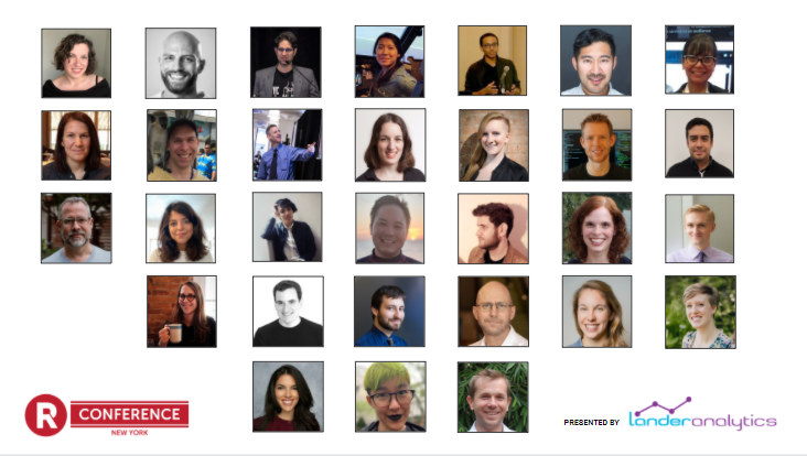
The sixth annual (and first virtual) “New York” R Conference took place August 5-6 & 12-15. Almost 300 attendees, and 30 speakers, plus a stand-up comedian and a whiskey masterclass leader, gathered remotely to explore, share, and inspire ideas.
Let’s take a look at some of the highlights from the conference:
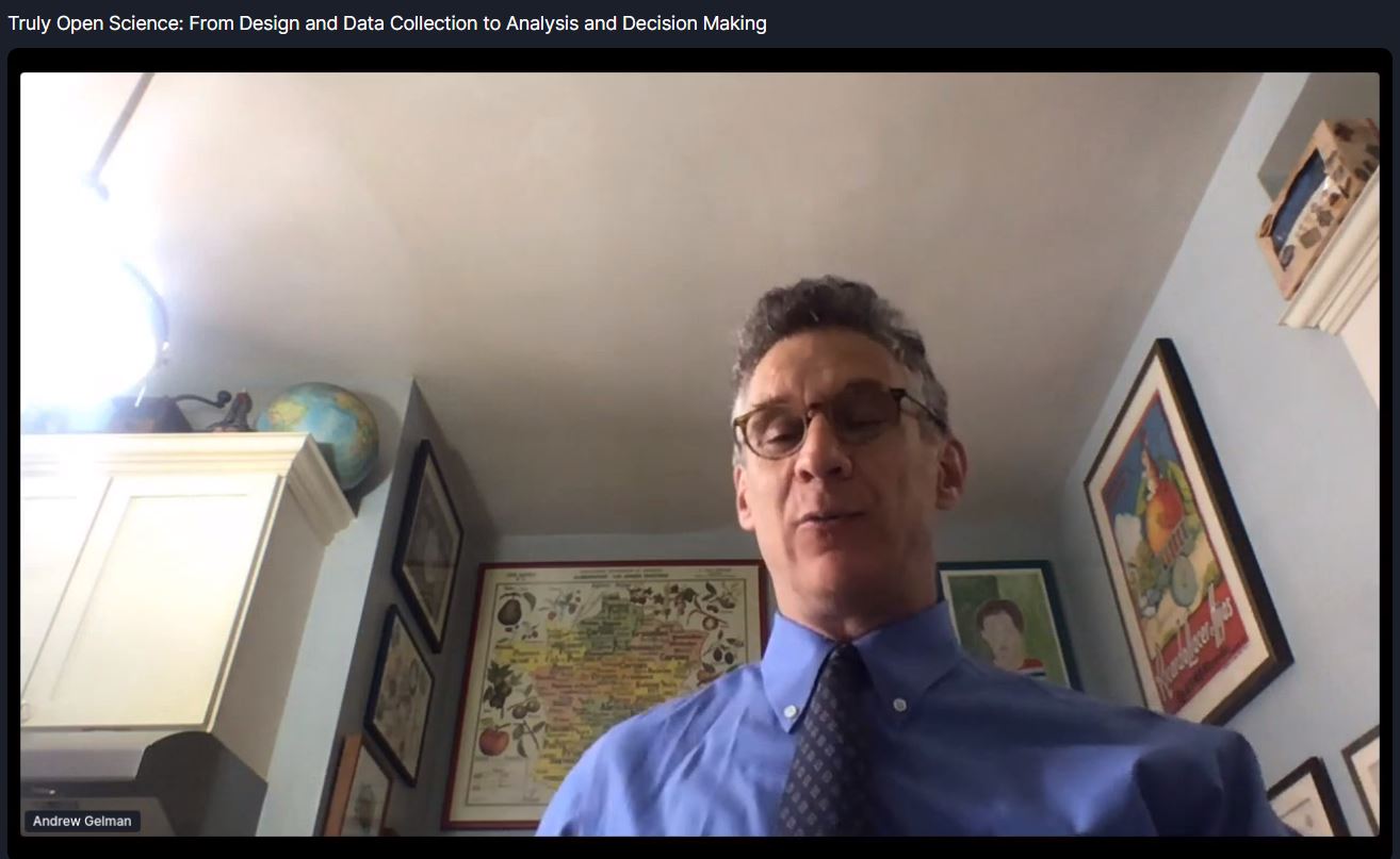
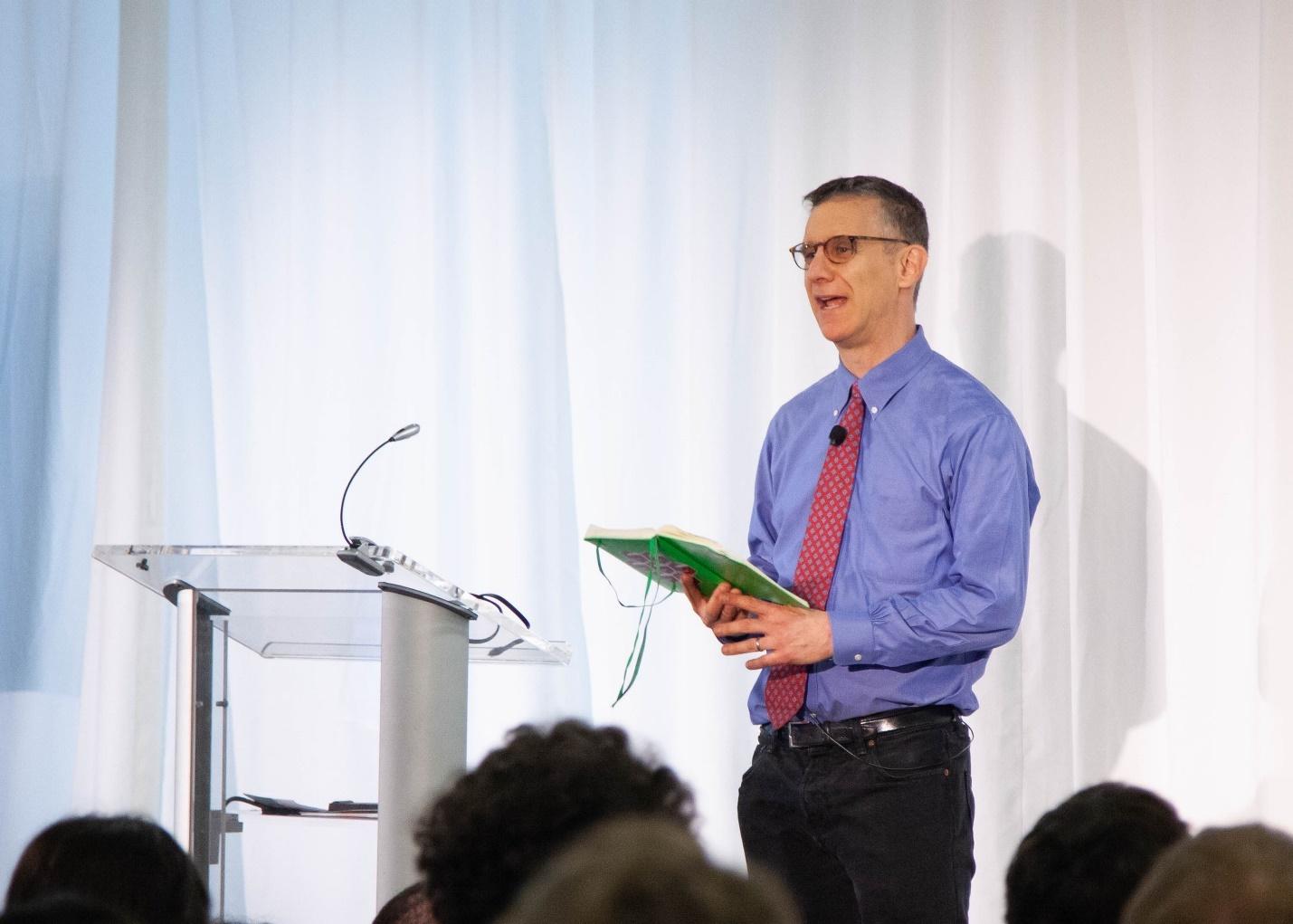
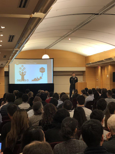
Andrew Gelman Gave Another 40-Minute Talk (no slides, as always)
Our favorite quotes from Andrew Gelman’s talk, Truly Open Science: From Design and Data Collection to Analysis and Decision Making, which had no slides, as usual:
“Everyone training in statistics becomes a teacher.”
“The most important thing you should take away — put multiple graphs on a page.”
“Honesty and transparency are not enough.”
“Bad science doesn’t make someone a bad person.”
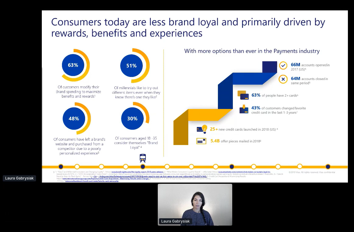
Laura Gabrysiak Shows us We Are Driven By Experience, and not Brand Loyalty…Hope you Folks had a Good Experience!
Laura’s talk on re-Inventing customer engagement with machine learning went through several interesting use cases from her time at Visa. In addition to being a data scientist, she is an active community organizer and the co-founder of R-Ladies Miami.
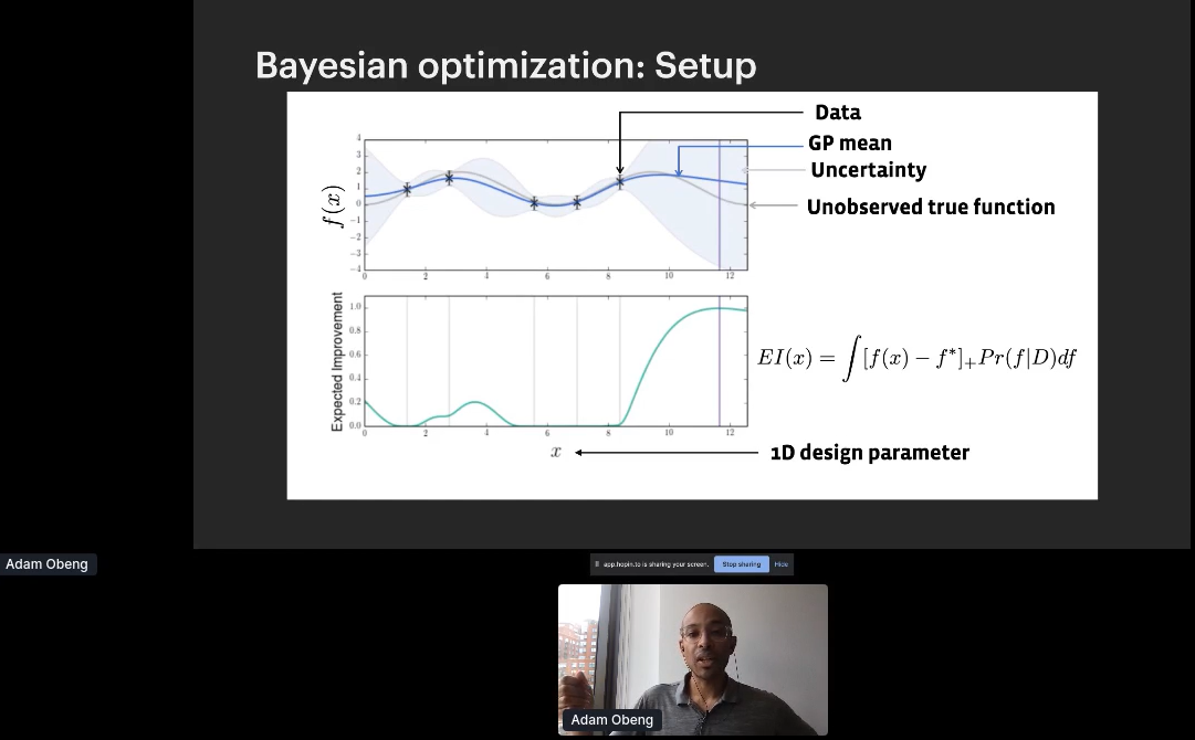
Adam Obeng Delivered a Talk on Adaptive Experimentation
One of my former students at Columbia University, Adam Obeng, gave a great presentation on his adaptive experimentation. We learned that adaptive experimentation is three things: The name of (1) a family of techniques, (2) Adam’s team at Facebook, and (3) an open source package produced by said team. He went through the applications which are hyper-parameter optimization for ML, experimentation with multiple continuous treatments, and physical experiments or manufacturing.
Dr. Jacqueline Nolis Invited Us to Crash Her Viral Website, Tweet Mashup
Jacqueline asked the crowd to crash her viral website,Tweet Mashup, and gave a great talk on her experience building it back in 2016. Her website that lets you combine the tweets of two different people. After spending a year making it in .NET, when she launched the site it became an immediate sensation. Years later, she was getting more and more frustrated maintaining the F# code and decided to see if I could recreate it in Shiny. Doing so would require having Shiny integrate with the Twitter API in ways that hadn’t been done by anyone before, and pushing the Twitter API beyond normal use cases.
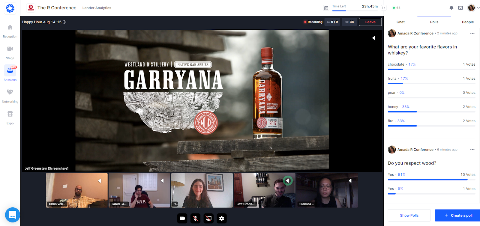
Attendees Participated in Two Virtual Happy Hours Packed with Fun
At the Friday Happy Hour, we had a mathematical standup comedian for the first time in R Conference history. Comic and math major Rachel Lander (no relationship to me!) entertained us with awesome math and stats jokes.
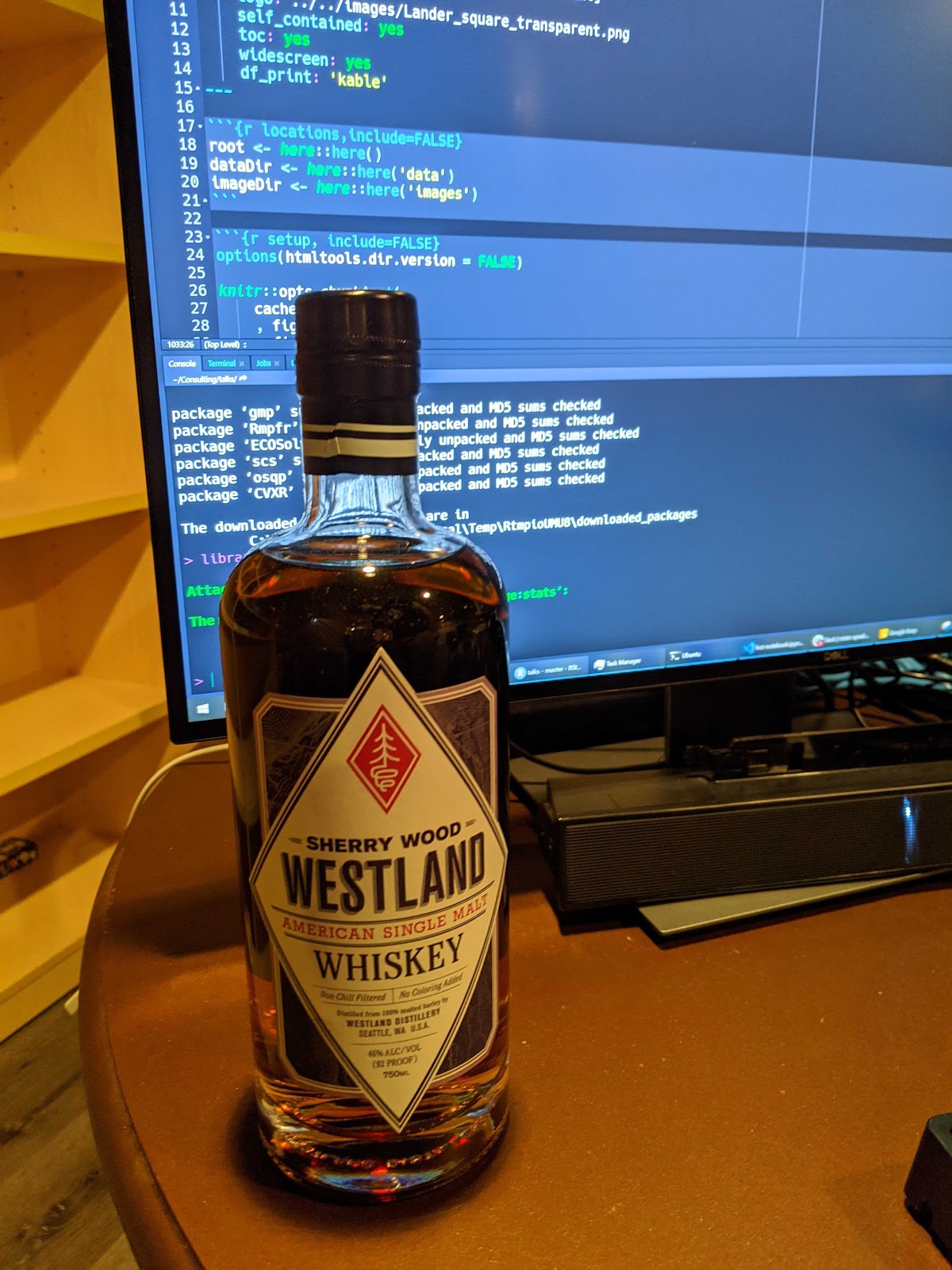
Following the stand up, we had a Whiskey Master Class with our Vibe Sponsor Westland Distillery, and another one on Saturday with Bruichladdich Distillery (hard to pronounce and easy to drink). Attendees and speakers learned and drank together, whether it be their whiskey, matchas, soda or water.
All Proceeds from the A(R)T Auction went to the R Foundation Again
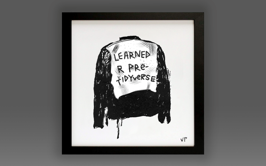
A newer tradition, the A(R)T Auction, took place again! We featured pieces by artists in the R Community, and all proceeds were donated to the R Foundation. The highest-selling piece at auction was Street Cred (2020) by Vivian Peng (Lander Analytics and Los Angeles Mayor’s Office, Innovation Team). The second highest was a piece by Jacqueline Nolis (Brightloom, and Build a Career in Data Science co-author), R Conference speaker, Designed by Allison Horst, artist in residence at RStudio.
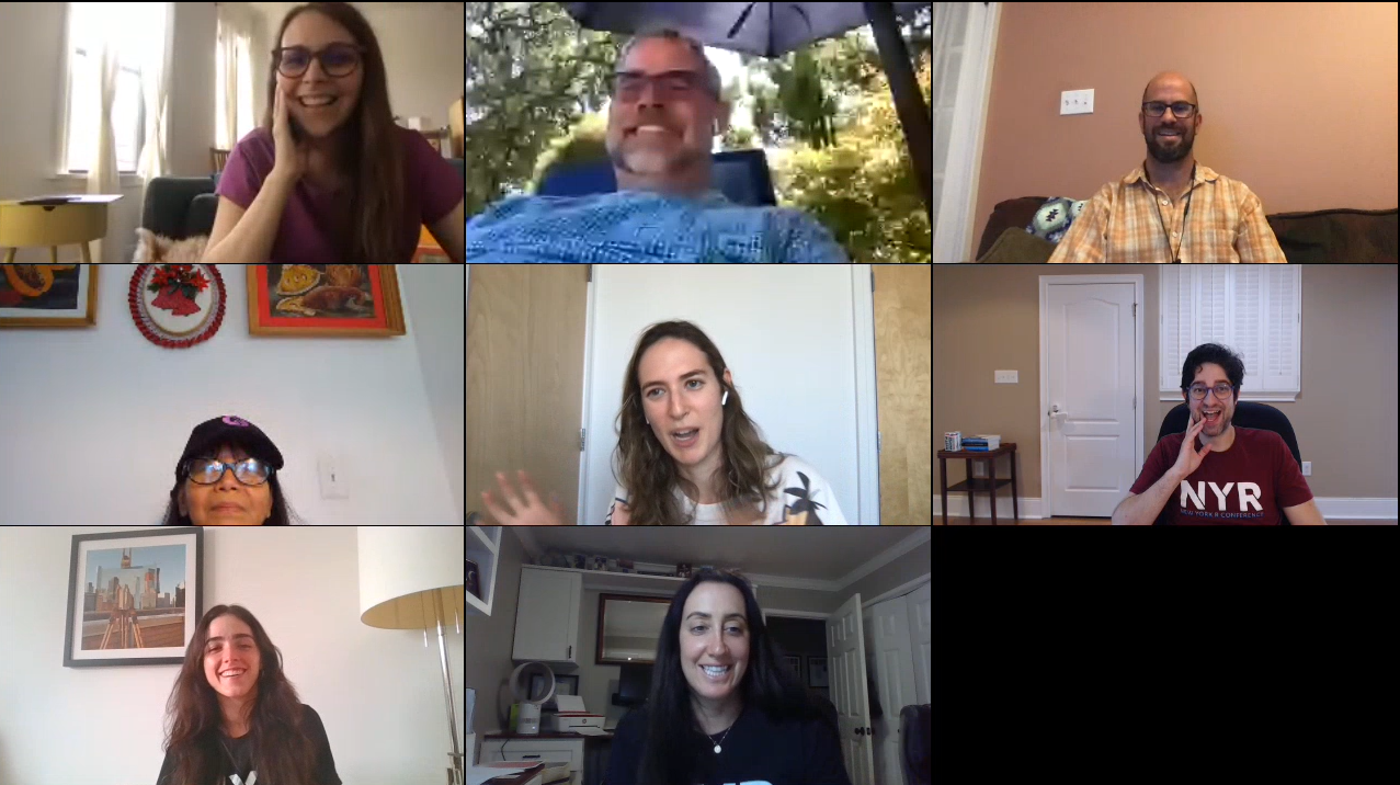
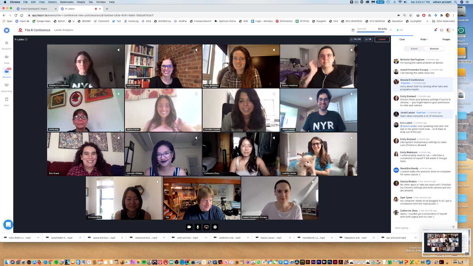
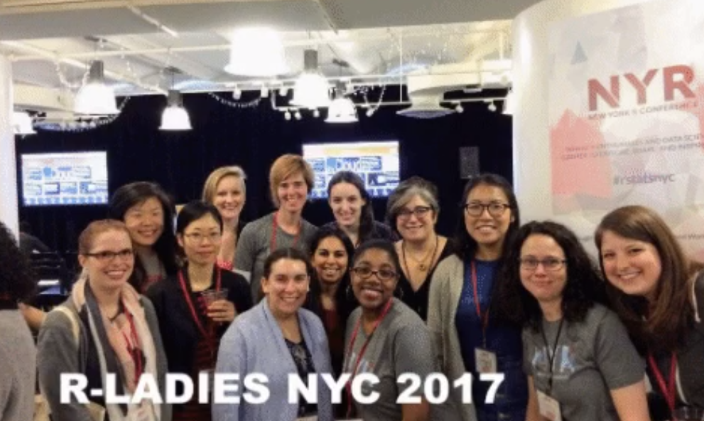
The R-Ladies Group Photo Happened, Even Remotely!
As per tradition, we took an R-Ladies group photo, but, for the first time, remotely– as a screenshot! We would like to note that many more R-Ladies were present in the chat, but just chose not to share video.
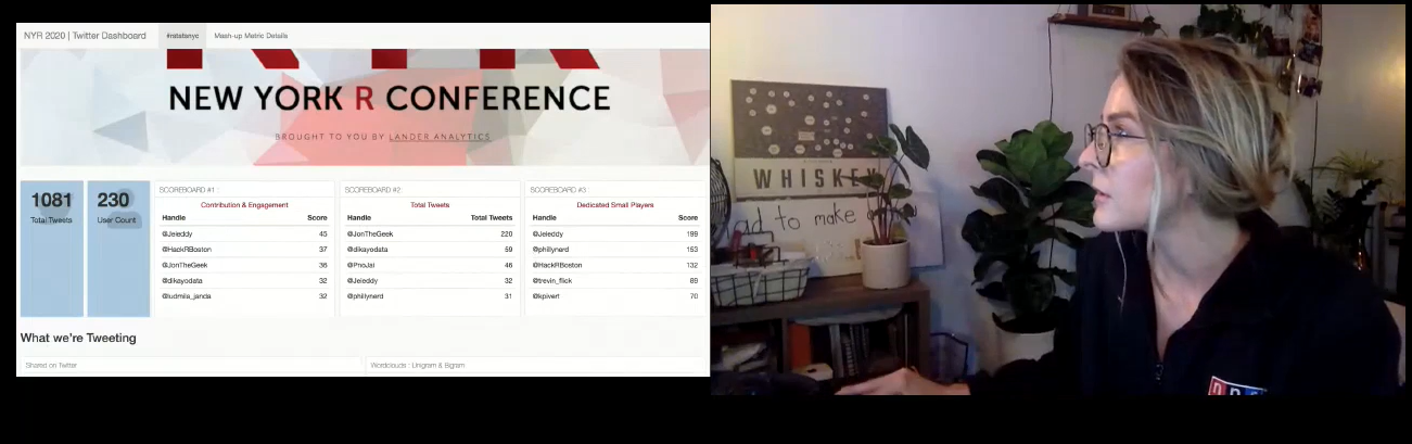
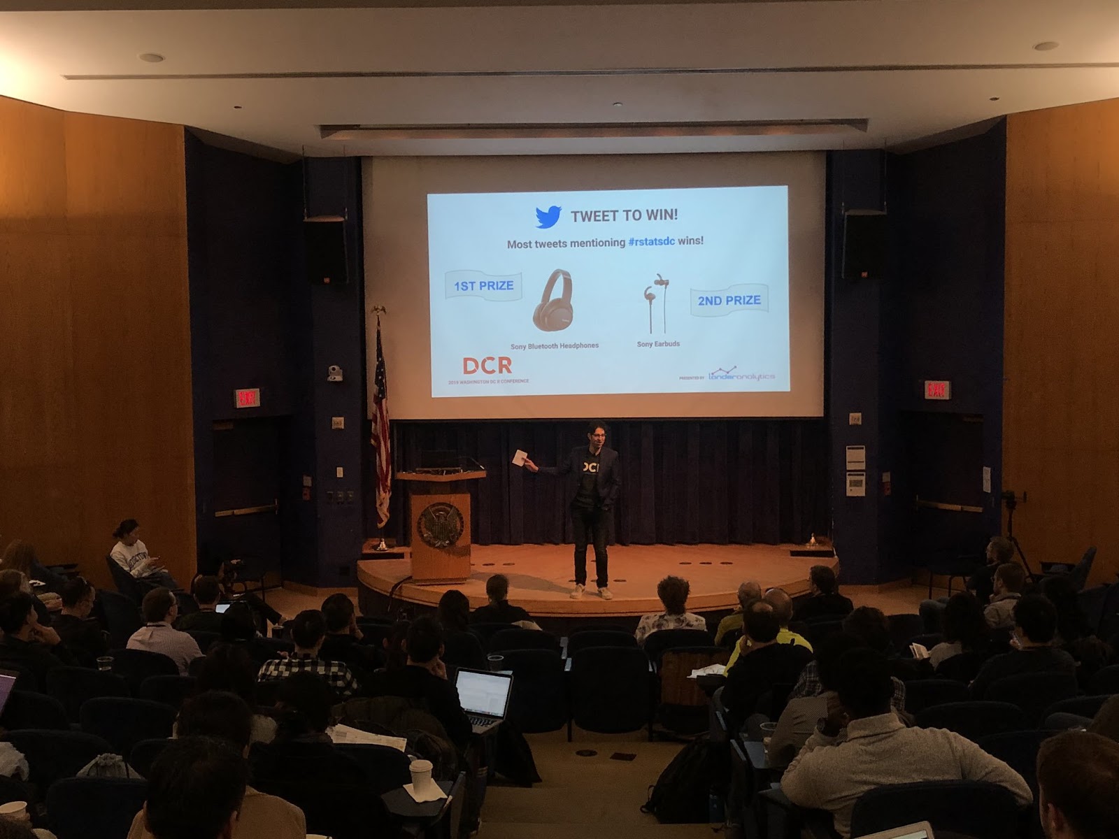
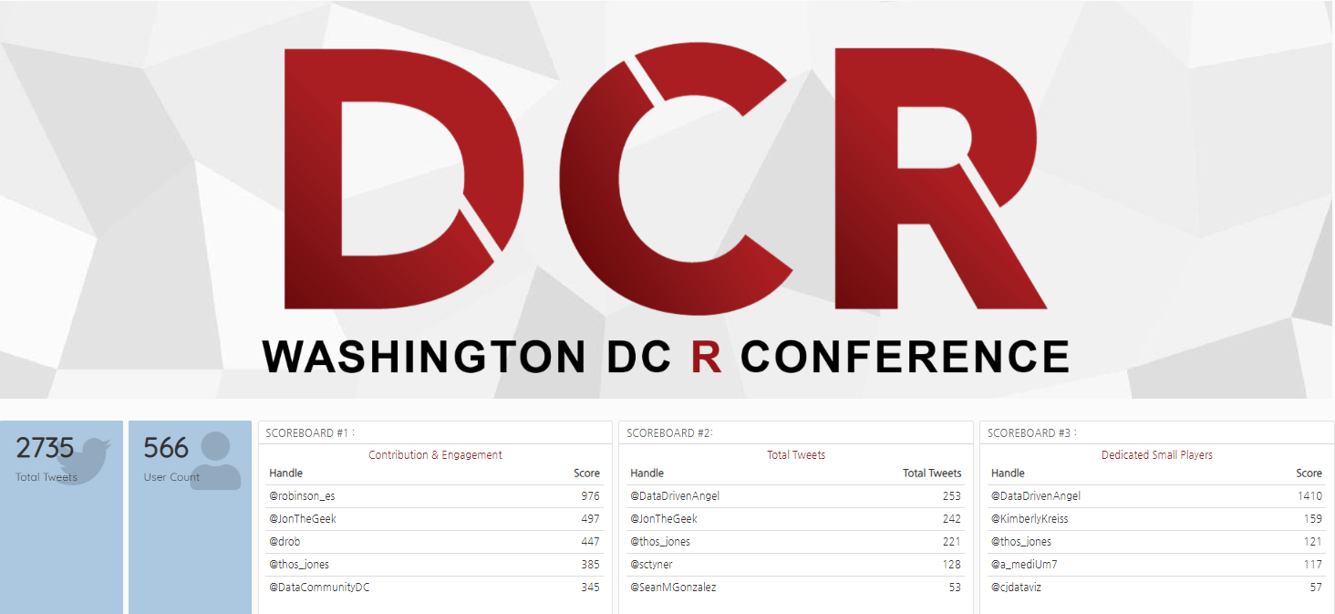
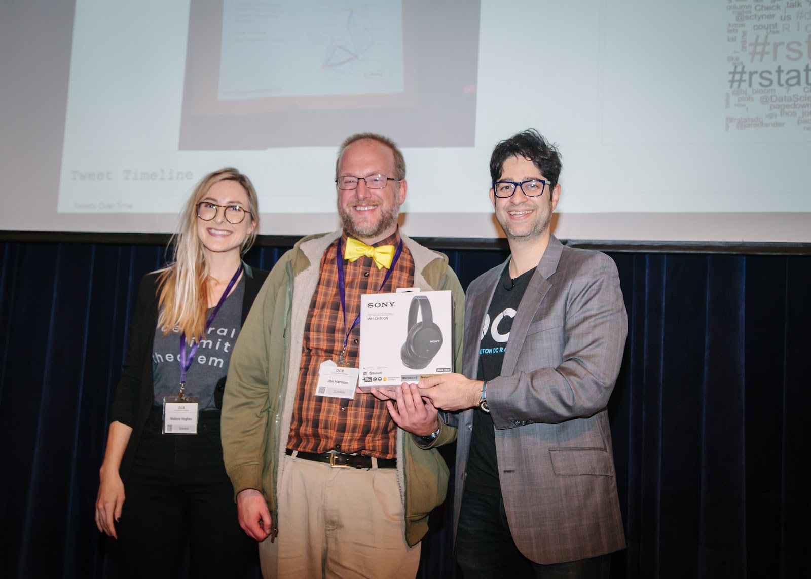
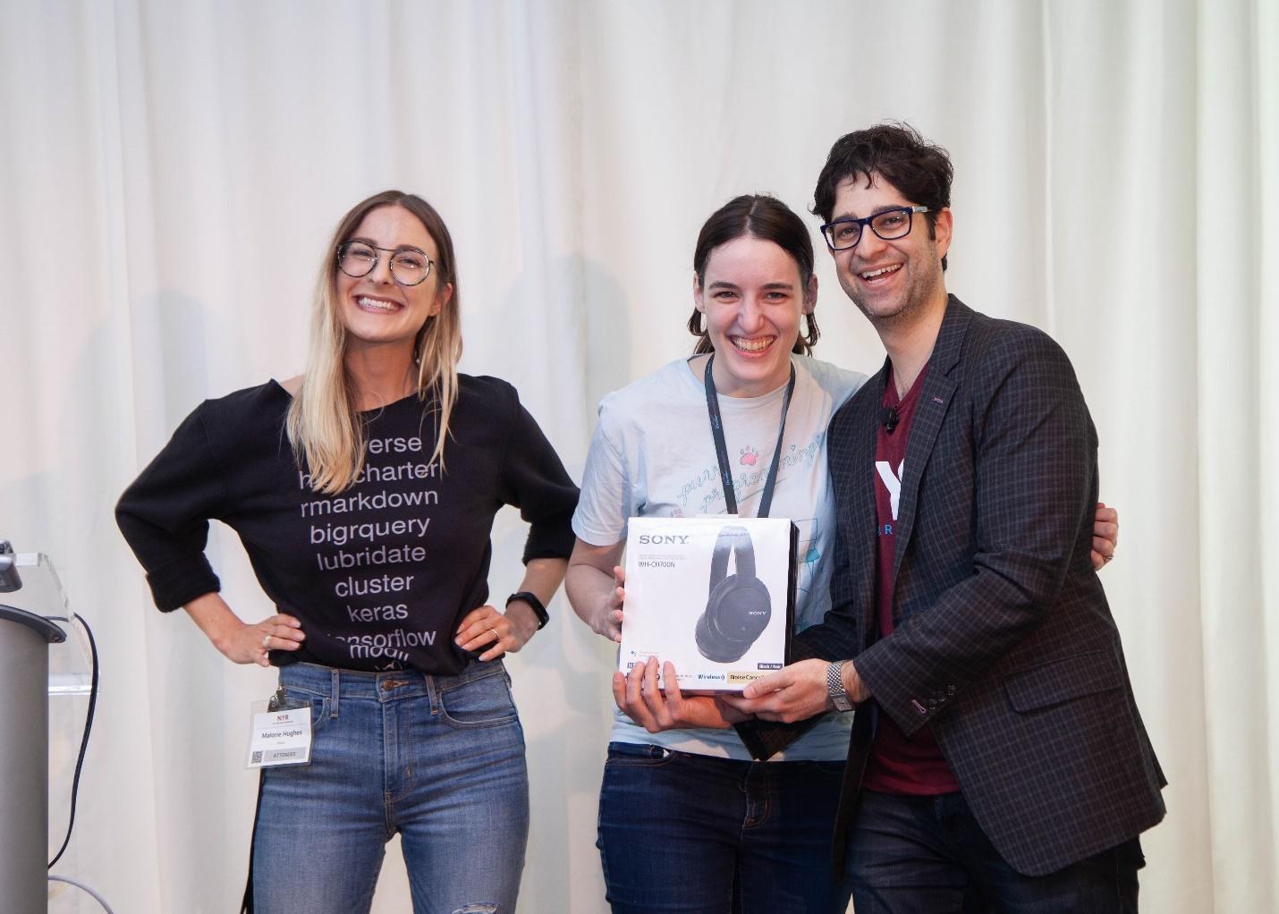
Jon Harmon, Edna Mwenda, and Jessica Streeter win Raspberri Pis, Bluetooth Headphones, and Tenkeyless Keyboards for Most Active Tweeting During the Conference
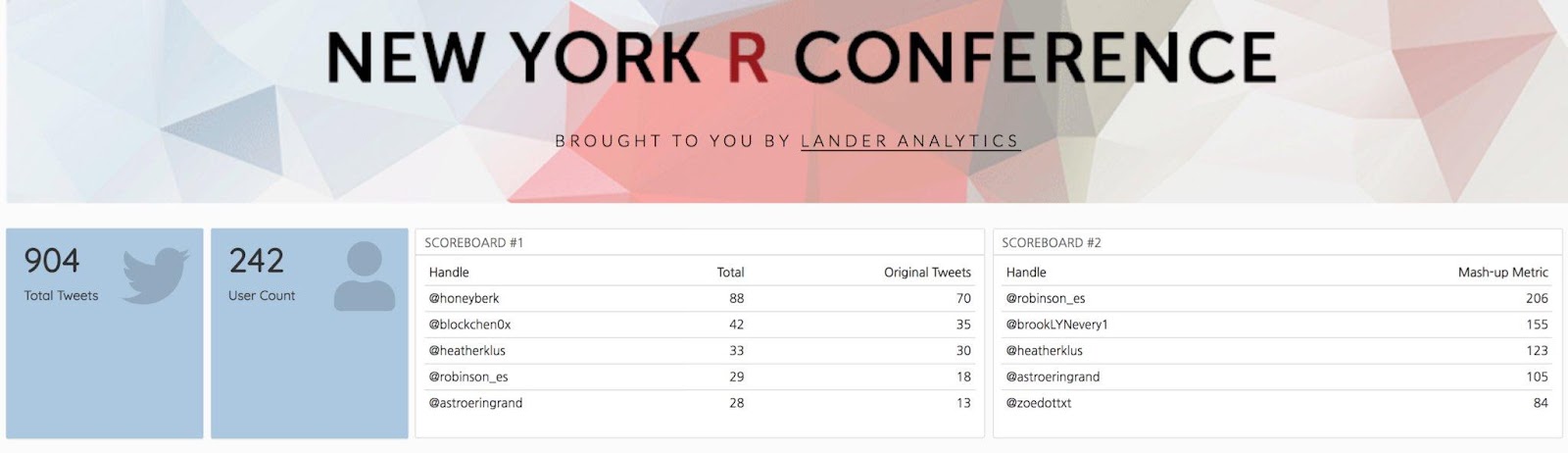
This year’s Twitter Contest, in Malorie’s words, was a “ruthless but noble war.” You can see the NYR 2020 Dashboard here. A custom started that DCR 2018 by our Twitter scorekeeper Malorie Hughes (@data_all_day) has returned every year by popular demand, and now she’s stuck with it forever! Congratulations to our winners!
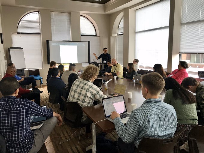
50+ Conference Attendees Participated in Pre-Conference Workshops Before
For the first time ever, workshops took place over the course of several days to promote work-life balance, and to give attendees the chance to take more than one course. We ran the following seven workshops:
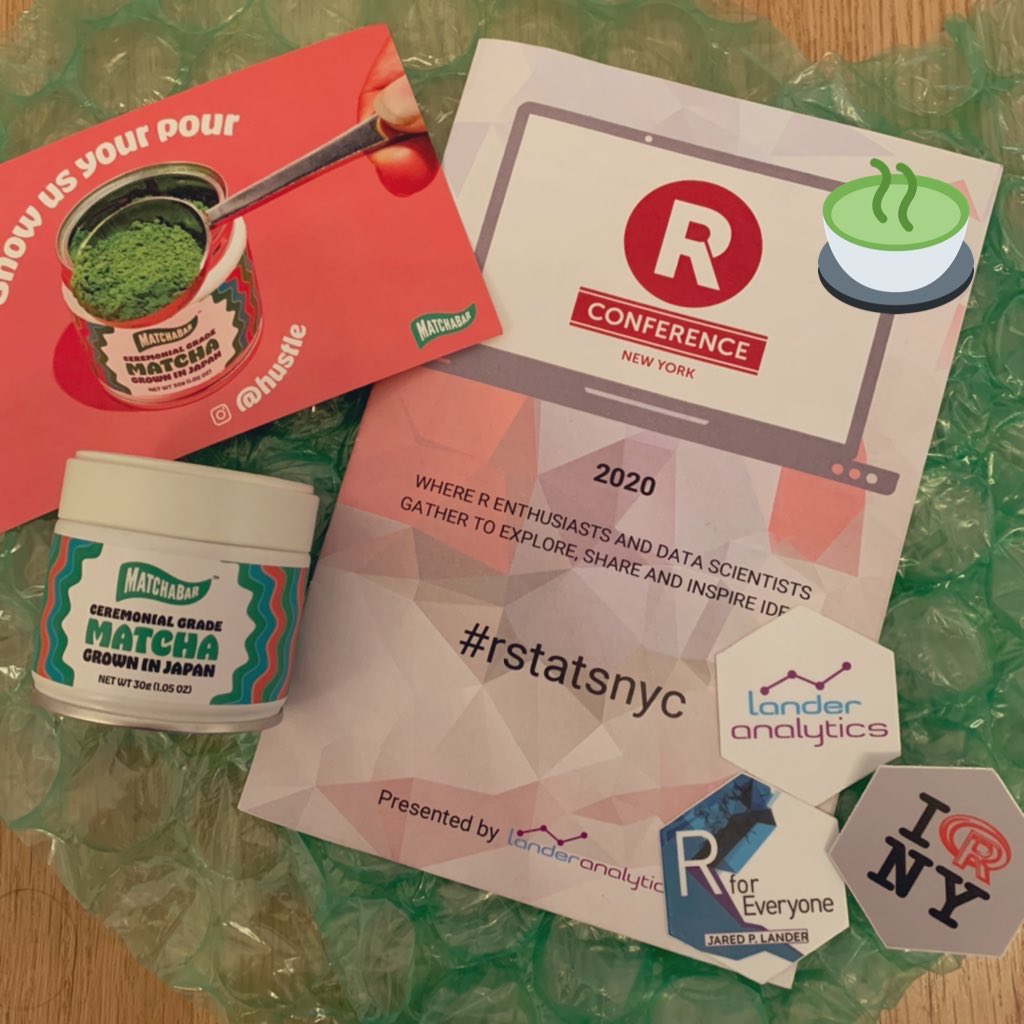
We recreated as much of the in-person experience as possible with attendee networking sessions, the speaker walk-on songs and fun facts, abundant prizes and giveaways, the Twitter contest, an art auction, and happy hours. In addition to all of this, we mailed conference programs, hex stickers, and other swag to each attendee (in the U.S.), along with discount codes from our Vibe Sponsors, MatchaBar, Westland Distillery and Bruichladdich Distillery.
Thank you, Lander Analytics Team!
Even though it was virtual, there was a lot of work that went into the conference, and I want to thank my amazing team at Lander Analytics along with our producer, Bill Prickett, for making it all come together.
Looking Forward to D.C. and Dublin If you attended, we hope you had an incredible experience. If you did not, we hope to see you at the virtual DC R Conference in the fall, and at the first Dublin R Conference and the NYR next year!
The Second Annual DCR Conference made its way to the ICC Auditorium at Georgetown University last week on November 8th and 9th. A sold-out crowd of R enthusiasts and data scientists gathered to explore, share and inspire ideas.
As always, the food was delicious! Our caterer even surprised us with Lander cookies.
Lander Analytics CookiesThe Excellent Buffet
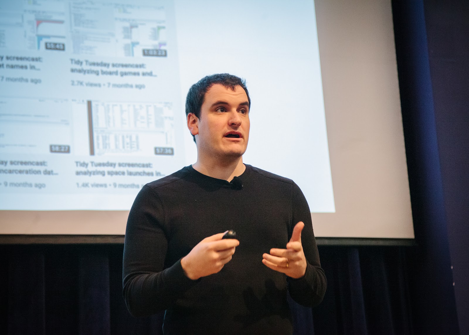
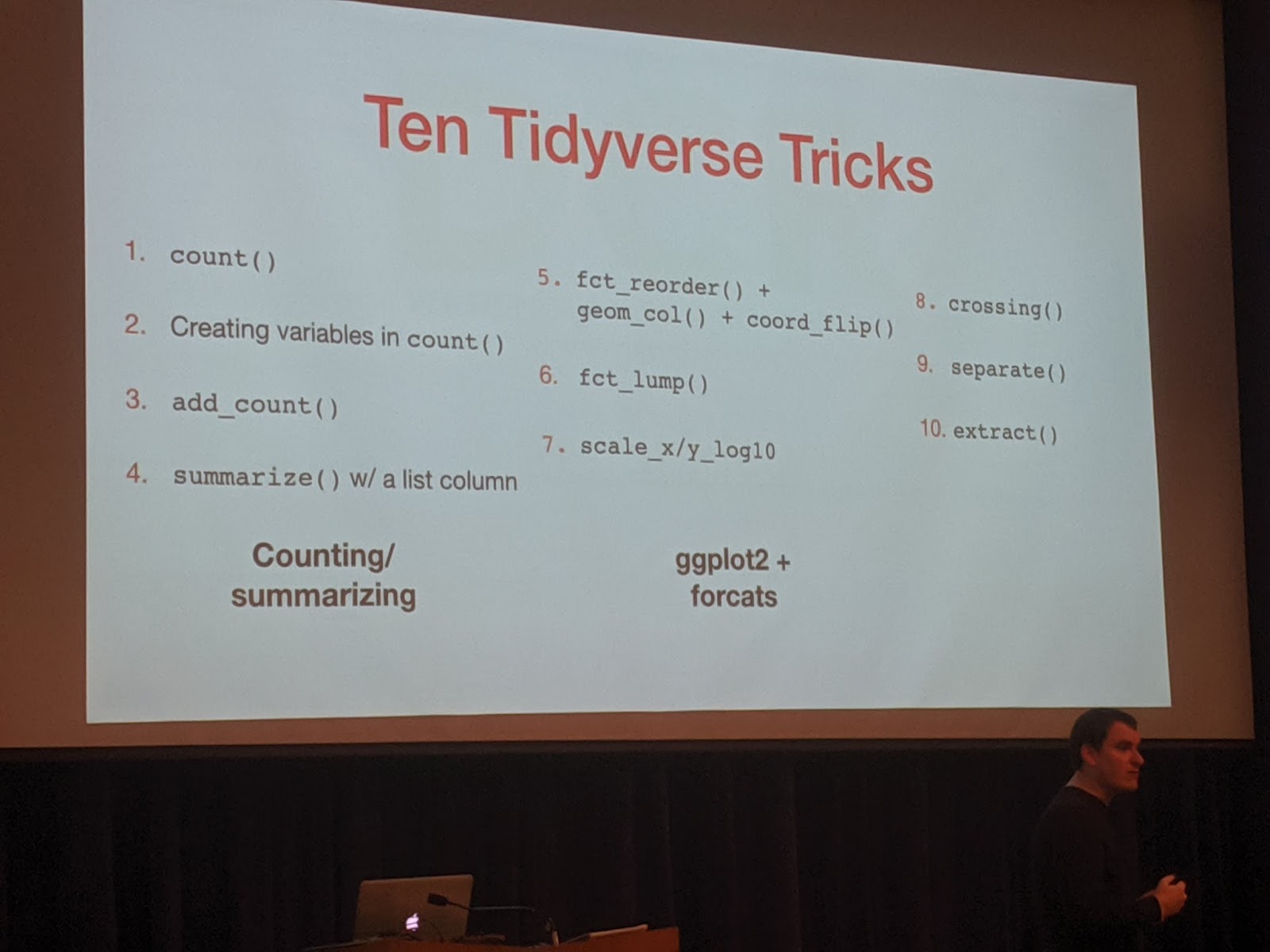
David Robinson shared his Ten Tremendous Tricks in the Tidyverse. Always enthusiastic, DRob did a great job showing both well known and obscure functions for an easier data workflow.
DRobTen Tidyverse Tricks
Elizabeth Sweeney gave an awesome talk on Visualizing the Environmental Impact of Beef Consumption using Plotly and Shiny. We explored the impact of eating different cuts of beef in terms of the number of animal lives, Co2 emissions, water usage, and land usage. Did you know that there is a big difference in the environmental impact of consuming 100 pounds of hanger steak versus the same weight in ground beef? She used plotly to make interactive graphics and R Shiny to make an interactive webpage to explore the data.
Elizabeth Showing off Brains
The integrated development environment, RStudio, fully integrated themselves into the environment.
The RStudio Team
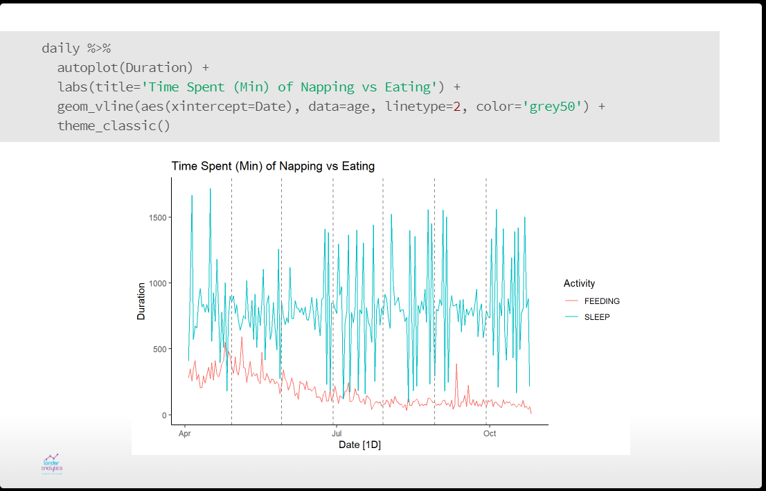
As a father, I’ve earned the right to make dad jokes (see above). You can see the slides for my talk, Raising Baby with R. While babies are commonly called bundles of joy, they are also bundles of data. Being the child of a data scientist and neuroscientist my son was certain to be analyzed myriad ways. I discussed how we used data to narrow down possible names then looked at using time series methods to analyze his sleeping and eating patterns. All in the name of science.
Talking Baby Data
Malorie Hughes Analyzing Tweets Again
We also organized a Tweeting competition with the help of Malorie Hughes, our Twitter scorekeeper. Check out the DCR 2019 Twitter Dashboard with the Mash-Up Metric Details she created.
Tweeting DashboardAs Usual, Emily was the Overall WinnerKim Won a Copy of my BookJon Really Worked Hard to Win These Headphones
There was a glitch in the system and one of our own organizers and former Python user won a prize. We let her keep it, and now she has no excuse not to learn R.
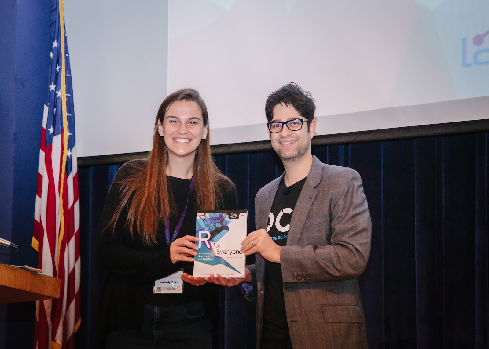
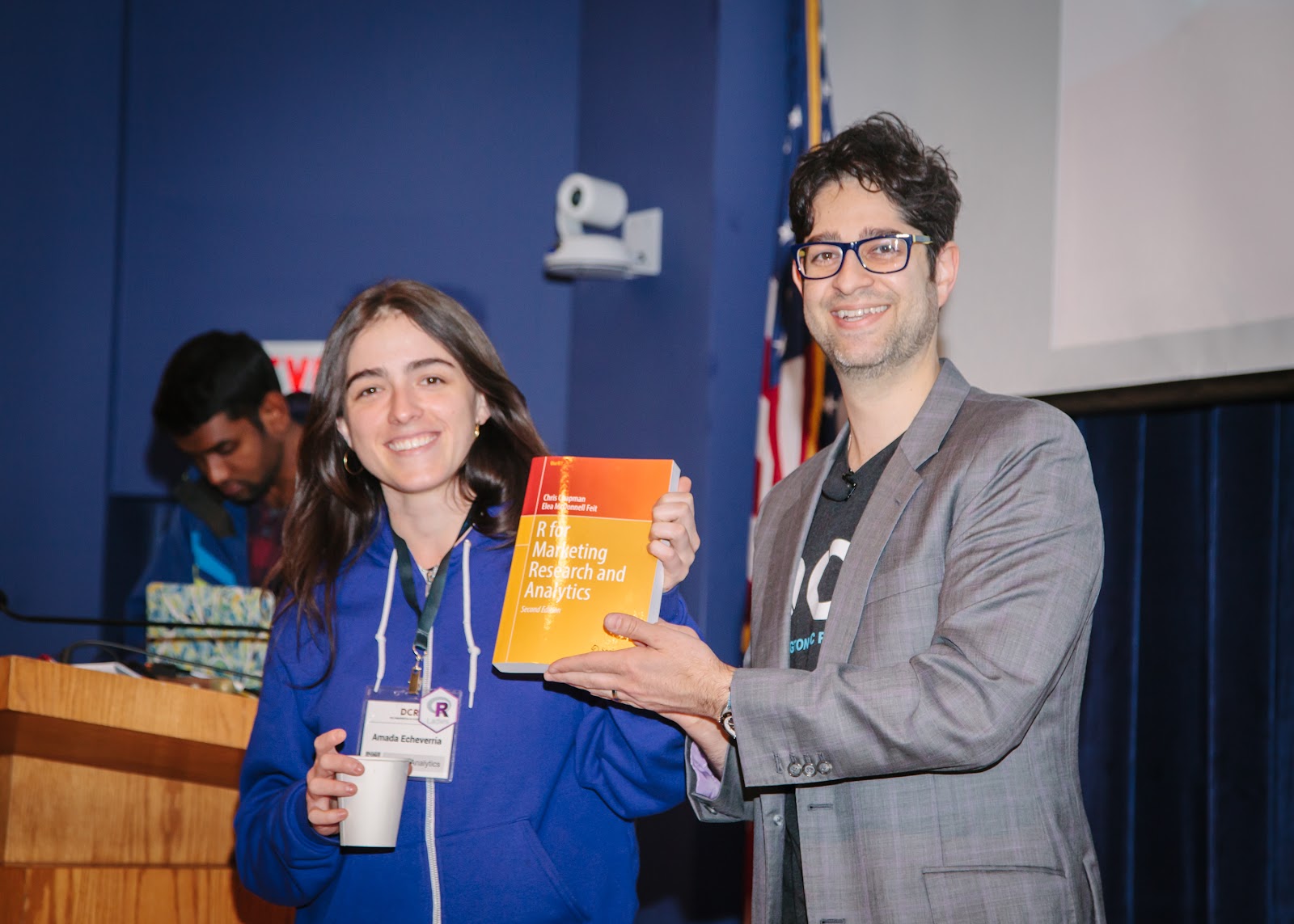
Amada, our Marketing Person, Won an R in Marketing Book
Not to mention we had some great workshops on November 7th, preceding the conference:
The costs involved with a health insurance plan can be confusing so I perform an analysis of different options to find which plan is most cost effective
My wife and I recently brought a new R programmer into our family so we had to update our health insurance. Becky is a researcher in neuroscience and psychology at NYU so we decided to choose an NYU insurance plan.
Our son sporting a New York R Conference shirt.
For families there are two main plans: Value and Advantage. The primary differences between the plans are the following:
Item
Explanation
Value Plan Amount
Advantage Plan Amount
Bi-Weekly Premiums
The amount we pay every other week in order to have insurance
$160 ($4,160 annually)
$240 ($6,240 annually)
Deductible
Amount we pay directly to health providers before the insurance starts covering costs
$1,000
$800
Coinsurance
After the deductible is met, we pay this percentage of medical bills
20%
10%
Out-of-Pocket Maximum
This is the most we will have to pay to health providers in a year (premiums do not count toward this max)
$6,000
$5,000
We put them into a tibble for use later.
# use tribble() to make a quick and dirty tibble
parameters <- tibble::tribble(
    ~Plan, ~Premiums, ~Deductible, ~Coinsurance, ~OOP_Maximum,
    'Value', 160*26, 1000, 0.2, 6000,
    'Advantage', 240*26, 800, 0.1, 5000
)
Other than these cost differences, there is not any particular benefit of either plan over the other. That means whichever plan is cheaper is the best to choose.
This blog post walks through the steps of evaluating the plans to figure out which to select. Code is included so anyone can repeat, and improve on, the analysis for their given situation.
Cost
In order to figure out which plan to select we need to figure out the all-in cost, which is a function of how much we spend on healthcare in a year (we have to estimate our annual spending) and the aforementioned premiums, deductible, coinsurance and out-of-pocket maximum.
#' @title cost
#' @description Given healthcare spend and other parameters, calculate the actual cost to the user
#' @details Uses the formula above to caluclate total costs given a certain level of spending. This is the premiums plus either the out-of-pocket maximum, the actual spend level if the deductible has not been met, or the amount of the deductible plus the coinsurance for spend above the deductible but below the out-of-pocket maximum.
#' @author Jared P. Lander
#' @param spend A given amount of healthcare spending as a vector for multiple amounts
#' @param premiums The annual premiums for a given plan
#' @param deductible The deductible for a given plan
#' @param coinsurance The coinsurance percentage for spend beyond the deductible but below the out-of-pocket maximum
#' @param oop_maximum The maximum amount of money (not including premiums) that the insured will pay under a given plan
#' @return The total cost to the insured
#' @examples
#' cost(3000, 4160, 1000, .20, 6000)
#' cost(3000, 6240, 800, .10, 5000)
#'
cost <- function(spend, premiums, deductible, coinsurance, oop_maximum)
{
    # spend is vectorized so we use pmin to get the min between oop_maximum and (deductible + coinsurance*(spend - deductible)) for each value of spend provided
    pmin(
      # we can never pay more than oop_maximum so that is one side
      oop_maximum,
      # if we are under oop_maximum for a given amount of spend,
      # this is the cost
      pmin(spend, deductible) + coinsurance*pmax(spend - deductible, 0)
    ) +
    # we add the premiums since that factors into our cost
    premiums
}
With this function we can see if one plan is always, or mostly, cheaper than the other plan and that’s the one we would choose.
R Packages
For the rest of the code we need these R packages.
We call our cost function on each amount of spend for the Value and Advantage plans.
spending <- spending %>%
    # use our function to calcuate the cost for the value plan
    mutate(Value=cost(
        spend=Spend,
        premiums=parameters$Premiums[1],
        deductible=parameters$Deductible[1],
        coinsurance=parameters$Coinsurance[1],
        oop_maximum=parameters$OOP_Maximum[1]
    )
    ) %>%
    # use our function to calcuate the cost for the Advantage plan
    mutate(Advantage=cost(
        spend=Spend,
        premiums=parameters$Premiums[2],
        deductible=parameters$Deductible[2],
        coinsurance=parameters$Coinsurance[2],
        oop_maximum=parameters$OOP_Maximum[2]
    )
    ) %>%
  # compute the difference in costs for each plan
  mutate(Difference=Advantage-Value) %>%
  # the winner for a given amount of spend is the cheaper plan
  mutate(Winner=if_else(Advantage < Value, 'Advantage', 'Value'))
The results are in the following table, showing every other row to save space. The Spend column is a theoretical amount of spending with a red bar giving a visual sense for the increasing amounts. The Value and Advantage columns are the corresponding overall costs of the plans for the given amount of Spend. The Difference column is the result of Advantage – Value where positive numbers in blue mean that the Value plan is cheaper while negative numbers in red mean that the Advantage plan is cheaper. This is further indicated in the Winner column which has the corresponding colors.
Spend
Value
Advantage
Difference
Winner
$2,000
$5,360
$7,160
1800
Value
$4,000
$5,760
$7,360
1600
Value
$6,000
$6,160
$7,560
1400
Value
$8,000
$6,560
$7,760
1200
Value
$10,000
$6,960
$7,960
1000
Value
$12,000
$7,360
$8,160
800
Value
$14,000
$7,760
$8,360
600
Value
$16,000
$8,160
$8,560
400
Value
$18,000
$8,560
$8,760
200
Value
$20,000
$8,960
$8,960
0
Value
$22,000
$9,360
$9,160
-200
Advantage
$24,000
$9,760
$9,360
-400
Advantage
$26,000
$10,160
$9,560
-600
Advantage
$28,000
$10,160
$9,760
-400
Advantage
$30,000
$10,160
$9,960
-200
Advantage
$32,000
$10,160
$10,160
0
Value
$34,000
$10,160
$10,360
200
Value
$36,000
$10,160
$10,560
400
Value
$38,000
$10,160
$10,760
600
Value
$40,000
$10,160
$10,960
800
Value
$42,000
$10,160
$11,160
1000
Value
$44,000
$10,160
$11,240
1080
Value
$46,000
$10,160
$11,240
1080
Value
$48,000
$10,160
$11,240
1080
Value
$50,000
$10,160
$11,240
1080
Value
$52,000
$10,160
$11,240
1080
Value
$54,000
$10,160
$11,240
1080
Value
$56,000
$10,160
$11,240
1080
Value
$58,000
$10,160
$11,240
1080
Value
$60,000
$10,160
$11,240
1080
Value
$62,000
$10,160
$11,240
1080
Value
$64,000
$10,160
$11,240
1080
Value
$66,000
$10,160
$11,240
1080
Value
$68,000
$10,160
$11,240
1080
Value
$70,000
$10,160
$11,240
1080
Value
Of course, plotting often makes it easier to see what is happening.
spending %>%
    select(Spend, Value, Advantage) %>%
    # put the plot in longer format so ggplot can set the colors
    gather(key=Plan, value=Cost, -Spend) %>%
    ggplot(aes(x=Spend, y=Cost, color=Plan)) +
        geom_line(size=1) +
        scale_x_continuous(labels=scales::dollar) +
        scale_y_continuous(labels=scales::dollar) +
        scale_color_brewer(type='qual', palette='Set1') +
        labs(x='Healthcare Spending', y='Out-of-Pocket Costs') +
        theme(
          legend.position='top',
          axis.title=element_text(face='bold')
        )
Plot of out-of-pocket costs as a function of actual healthcare spending. Lower is better.
It looks like there is only a small window where the Advantage plan is cheaper than the Value plan. This will be more obvious if we draw a plot of the difference in cost.
spending %>%
    ggplot(aes(x=Spend, y=Difference, color=Winner, group=1)) +
        geom_hline(yintercept=0, linetype=2, color='grey50') +
        geom_line(size=1) +
        scale_x_continuous(labels=scales::dollar) +
        scale_y_continuous(labels=scales::dollar) +
        labs(
          x='Healthcare Spending',
          y='Difference in Out-of-Pocket Costs Between the Two Plans'
        ) +
        scale_color_brewer(type='qual', palette='Set1') +
        theme(
          legend.position='top',
          axis.title=element_text(face='bold')
        )
Plot of the difference in overall cost between the Value and Advantage plans. A difference greater than zero means the Value plan is cheaper and a difference below zero means the Advantage plan is cheaper.
To calculate the exact cutoff points where one plan becomes cheaper than the other plan we have to solve for where the two curves intersect. Due to the out-of-pocket maximums the curves are non-linear so we need to consider four cases.
The spending exceeds the point of maximum out-of-pocket spend for both plans
The spending does not exceed the point of maximum out-of-pocket spend for either plan
The spending exceeds the point of maximum out-of-pocket spend for the Value plan but not the Advantage plan
The spending exceeds the point of maximum out-of-pocket spend for the Advantage plan but not the Value plan
When the spending exceeds the point of maximum out-of-pocket spend for both plans the curves are parallel so there will be no cross over point.
When the spending does not exceed the point of maximum out-of-pocket spend for either plan we set the cost calculations (not including the out-of-pocket maximum) for each plan equal to each other and solve for the amount of spend that creates the equality.
To keep the equations smaller we use variables such as \(d_v\) for the Value plan deductible, \(c_a\) for the Advantage plan coinsurance and \(oop_v\) for the out-of-pocket maximum for the Value plan.
When the spending exceeds the point of maximum out-of-pocket spend for the Value plan but not the Advantage plan, we set the out-of-pocket maximum plus premiums for the Value plan equal to the cost calculation of the Advantage plan.
When the spending exceeds the point of maximum out-of-pocket spend for the Advantage plan but not the Value plan, the solution is just the opposite of the previous equation.
#' @title calculate_crossover_points
#' @description Given healthcare parameters for two plans, calculate when one plan becomes more expensive than the other.
#' @details Calculates the potential crossover points for different scenarios and returns the ones that are true crossovers.
#' @author Jared P. Lander
#' @param premiums_1 The annual premiums for plan 1
#' @param deductible_1 The deductible plan 1
#' @param coinsurance_1 The coinsurance percentage for spend beyond the deductible for plan 1
#' @param oop_maximum_1 The maximum amount of money (not including premiums) that the insured will pay under plan 1
#' @param premiums_2 The annual premiums for plan 2
#' @param deductible_2 The deductible plan 2
#' @param coinsurance_2 The coinsurance percentage for spend beyond the deductible for plan 2
#' @param oop_maximum_2 The maximum amount of money (not including premiums) that the insured will pay under plan 2
#' @return The amount of spend at which point one plan becomes more expensive than the other
#' @examples
#' calculate_crossover_points(
#' 160, 1000, 0.2, 6000,
#' 240, 800, 0.1, 5000
#' )
#'
calculate_crossover_points <- function(
    premiums_1, deductible_1, coinsurance_1, oop_maximum_1,
    premiums_2, deductible_2, coinsurance_2, oop_maximum_2
)
{
    # calculate the crossover before either has maxed out
    neither_maxed_out <- (premiums_2 - premiums_1 +
                              deductible_2*(1 - coinsurance_2) -
                              deductible_1*(1 - coinsurance_1)) /
        (coinsurance_1 - coinsurance_2)

    # calculate the crossover when one plan has maxed out but the other has not
    one_maxed_out <- (oop_maximum_1 +
                          premiums_1 - premiums_2 +
                          coinsurance_2*deductible_2 -
                          deductible_2) /
        coinsurance_2

    # calculate the crossover for the reverse
    other_maxed_out <- (oop_maximum_2 +
                            premiums_2 - premiums_1 +
                            coinsurance_1*deductible_1 -
                            deductible_1) /
        coinsurance_1

    # these are all possible points where the curves cross
    all_roots <- c(neither_maxed_out, one_maxed_out, other_maxed_out)

    # now calculate the difference between the two plans to ensure that these are true crossover points
    all_differences <- cost(all_roots, premiums_1, deductible_1, coinsurance_1, oop_maximum_1) -
        cost(all_roots, premiums_2, deductible_2, coinsurance_2, oop_maximum_2)

    # only when the difference between plans is 0 are the curves truly crossing
    all_roots[all_differences == 0]
}
We then call the function with the parameters for both plans we are considering.
We see that the Advantage plan is only cheaper than the Value plan when spending between $20,000 and $32,000.
The next question is will our healthcare spending fall in that narrow band between $20,000 and $32,000 where the Advantage plan is the cheaper option?
Probability of Spending
This part gets tricky. I’d like to figure out the probability of spending between $20,000 and $32,000. Unfortunately, it is not easy to find healthcare spending data due to the opaque healthcare system. So I am going to make a number of assumptions. This will likely violate a few principles, but it is better than nothing.
Assumptions and calculations:
Healthcare spending follows a log-normal distribution
We will work with New York State data which is possibly different than New York City data
We know the mean for New York spending in 2014
We will use the accompanying annual growth rate to estimate mean spending in 2019
We have the national standard deviation for spending in 2009
In order to figure out the standard deviation for New York, we calculate how different the New York mean is from the national mean as a multiple, then multiply the national standard deviation by that number to approximate the New York standard deviation in 2009
We use the growth rate from before to estimate the New York standard deviation in 2019
We then take just New York spending for 2014 and multiply it by the corresponding growth rate.
ny_spend <- health_spend %>%
  # get just New York
  filter(State_Name == 'New York') %>%
  # this row holds overall spending information
  filter(Item == 'Personal Health Care ($)') %>%
  # we only need a few columns
  select(Y2014, Growth=Average_Annual_Percent_Growth) %>%
  # we have to calculate the spending for 2019 by accounting for growth
  # after converting it to a percentage
  mutate(Y2019=Y2014*(1 + (Growth/100))^5)

ny_spend
Y2014
Growth
Y2019
9778
5
12479.48
The standard deviation is trickier. The best I can find was the standard deviation on the national level in 2009. In 2013 the Centers for Medicare & Medicaid Services wrote in Volume 3, Number 4 of Medicare & Medicaid Research Review an article titled Modeling Per Capita State Health Expenditure Variation: State-Level Characteristics Matter. Exhibit 2 shows that the standard deviation of healthcare spending was $1,241 for the entire country in 2009. We need to estimate the New York standard deviation from this and then account for growth into 2019.
Next, we figure out the difference between the New York State spending mean and the national mean as a multiple.
We see that the New York average is 1.4187464 times the national average. So we multiply the national standard deviation from 2009 by this amount to estimate the New York State standard deviation and assume the same annual growth rate as the mean. Recall, we can multiply the standard deviation by a constant.
My original assumption was that spending would follow a normal distribution, but New York’s resident agricultural economist, JD Long, suggested that the spending distribution would have a floor at zero (a person cannot spend a negative amount) and a long right tail (there will be many people with lower levels of spending and a few people with very high levels of spending), so a log-normal distribution seems more appropriate.
So we only have a 2.35% probability of our spending falling in that band where the Advantage plan is more cost effective. Meaning we have a 97.65% probability that the Value plan will cost less over the course of a year.
We can also calculate the expected cost under each plan. We do this by first calculating the probability of spending each (thousand) dollar amount (since the log-normal is a continuous distribution this is an estimated probability). We multiply each of those probabilities against their corresponding dollar amounts. Since the distribution is log-normal we need to exponentiate the resulting number. The data are on the thousands scale, so we multiply by 1000 to put it back on the dollar scale. Mathematically it looks like this.
The following code calculates the expected cost for each plan.
spending %>%
  # calculate the point-wise estimated probabilities of the healthcare spending
  # based on a log-normal distribution with the appropriate mean and standard deviation
  mutate(
    SpendProbability=dlnorm(
      Spend,
      meanlog=log(ny_spend$Y2019),
      sdlog=log(ny_spend$SD2019)
    )
  ) %>%
  # compute the expected cost for each plan
  # and the difference between them
  summarize(
    ValueExpectedCost=sum(Value*SpendProbability),
    AdvantageExpectedCost=sum(Advantage*SpendProbability),
    ExpectedDifference=sum(Difference*SpendProbability)
  ) %>%
  # exponentiate the numbers so they are on the original scale
  mutate_each(funs=exp) %>%
  # the spending data is in increments of 1000
  # so multiply by 1000 to get them on the dollar scale
  mutate_each(funs=~ .x * 1000)
ValueExpectedCost
AdvantageExpectedCost
ExpectedDifference
5422.768
7179.485
1323.952
This shows that overall the Value plan is cheaper by about $1,324 dollars on average.
Conclusion
We see that there is a very small window of healthcare spending where the Advantage plan would be cheaper, and at most it would be about $600 cheaper than the Value plan. Further, the probability of falling in that small window of savings is just 2.35%.
So unless our spending will be between $20,000 and $32,000, which it likely will not be, it is a better idea to choose the Value plan.
Since the Value plan is so likely to be cheaper than the Advantage plan I wondered who would pick the Advantage plan. Economist Jon Hersh invokes behavioral economics to explain why people may select the Advantage plan. Some parts of the Advantage plan are lower than the Value plan, such as the deductible, coinsurance and out-of-pocket maximum. People see that under certain circumstances the Advantage plan would save them money and are enticed by that, not realizing how unlikely that would be. So they are hedging against a low probability situation. (A consideration I have not accounted for is family size. The number of members in a family can have a big impact on the overall spend and whether or not it falls into the narrow band where the Advantage plan is cheaper.)
In the end, the Value plan is very likely going to be cheaper than the Advantage plan.
Try it at Home
I created a Shiny app to allow users to plug in the numbers for their own plans. It is rudimentary, but it gives a sense for the relative costs of different plans.
Data scientists and R enthusiasts gathered for the 5th annual New York R Conference held on May 9th-11th. In front of a crowd of more than 300 attendees, 24 speakers gave presentations on topics ranging from deep learning and building packages in R to football and hockey analytics.
This year marked the ten-year anniversary of the New York Open Statistical Programming Meetup. It has been incredible to see the growth of meetup over the years. We now have over 10,000 members around the world!
Let’s take a look at some of the highlights from the conference:
Jonah Gabry Kicked Off “R” Week at the New York Open Statistical Programming Meetup with a Talk on Using Stan in R
Jonah Gabry kicking off R Week with a talk about the Stan ecosystem
Jonah Gabry from the Stan Development Team kicked off “R” week with a talk on making Bayes easier in the R ecosystem. Jonah went over the packages (rstanarm, rstantools, bayesplot and loo) which emulate other R model-fitting functions, unify function naming across Stan-based R packages, and develop plotting functions using ggplot objects.
50 Conference Attendees Participated in Pre-Conference Workshops on Thursday before the Conference
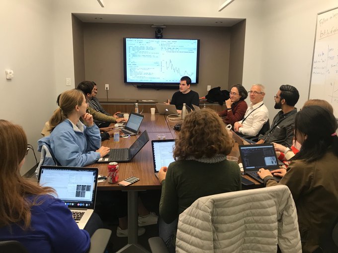
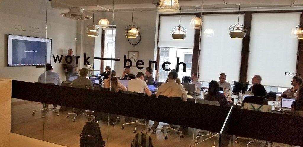
People learning about machine learning from Max Kuhn during the pre-conference workshops
On the Thursday before the two-day conference, more than 50 conference attendees arrived at Work-Bench a day early for a full day of workshops. This was the first year of the R Conference Workshop Series. Max Kuhn, Dan Chen, Elizabeth Sweeney and Kaz Sakamoto each led a workshop which covered the following topics:
Machine Learning with Caret (Max Kuhn)
Git for Data Science (Dan Chen)
Introduction to Survival Analysis (Elizabeth Sweeney)
Geospatial Statistics and Mapping in R (Kaz Sakamoto)
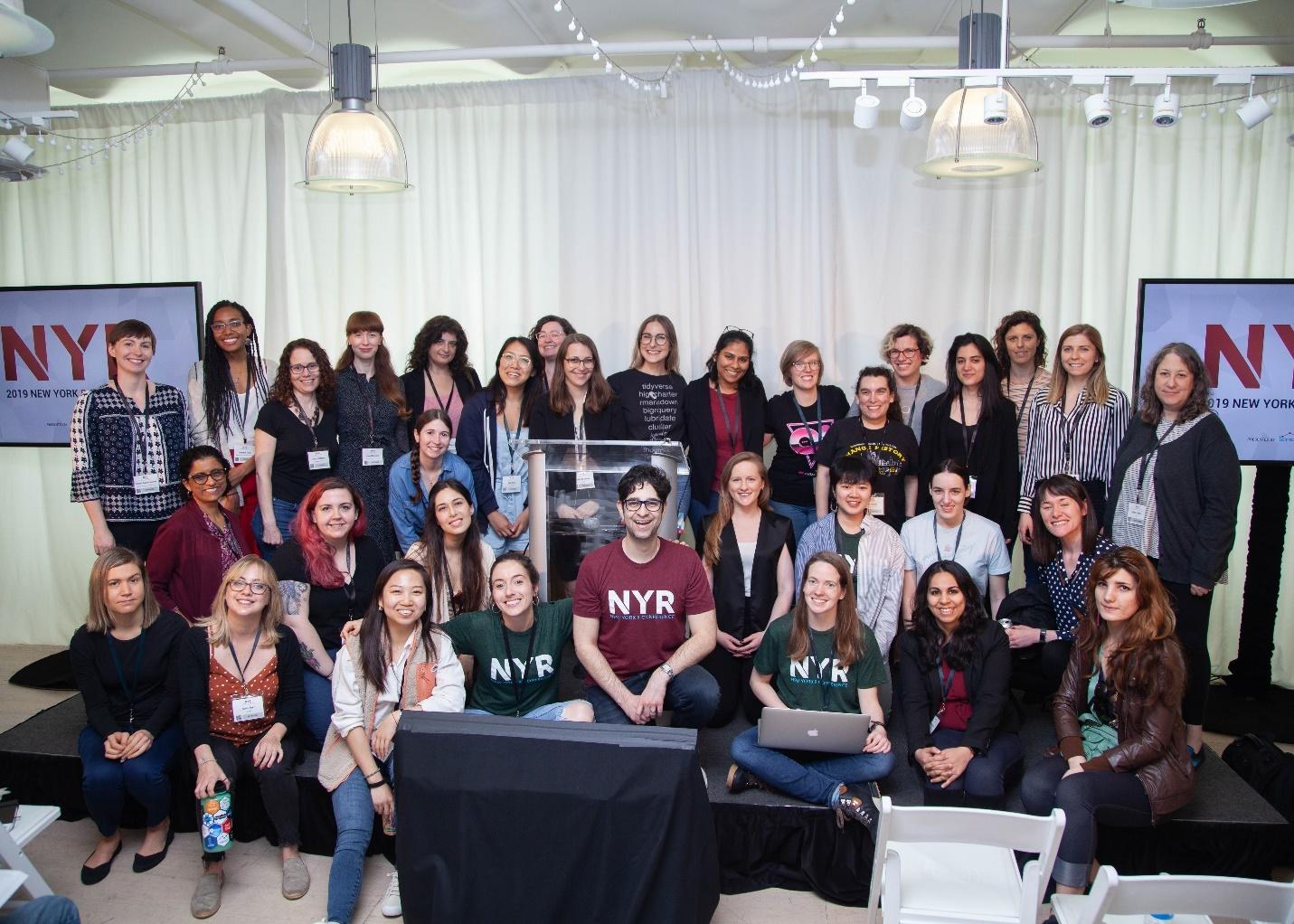
The Growth of R-Ladies Summed Up in Three Pictures…
We are so excited to see the growth of the R-Ladies community and we appreciate their support for the NY R Conference over the years. Congratulations ladies!
Dr. Andrew Gelman Delivers Keynote Speech on the Fallacy of P-Values and Thinking like a Statistician—All Without Slides
Andrew Gelman wowing the crowd as usual
There wasn’t a soul in the crowd who wasn’t hanging on every word from Columbia professor Dr. Andrew Gelman. The only speaker with a 40-minute time slot, and the only speaker to not use slides, Dr. Gelman talked about life as a statistician, warned of the perils of p-values and stressed the importance of simulation—before data collection—to improve our understanding of possible real-life scenarios. “Only through simulating fake data, can you really have statistical confidence about whatever performance metric you’re aiming for,” Gelman noted.
While we try not to pick a favorite speaker, Dr. Gelman runs away with that title every time he comes to speak at the New York R Conference.
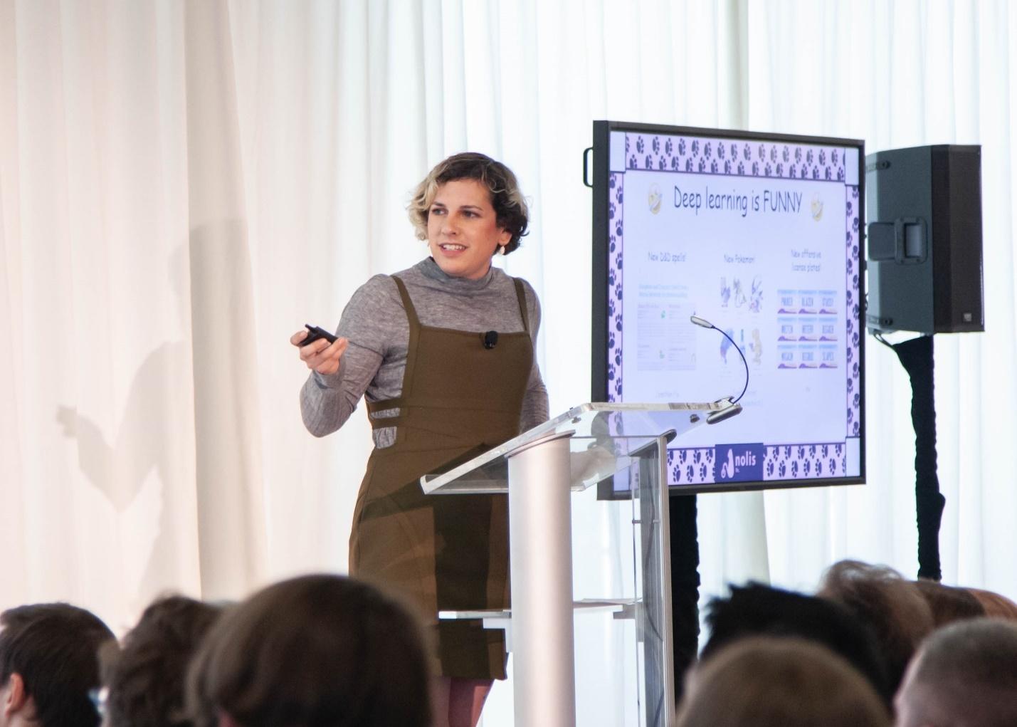
Jacqueline and Heather Nolis Taught Us to Not to Be Afraid of Deep Learning and Model Deployment in Production
Jacqueline Nolis showing how fun and easy deep learning can be
The final talk on day one was perhaps the most entertaining and insightful from the weekend. Jacqueline Nolis taught us how developing a deep learning model is easier than we thought and how humor can help us understand a complex idea in a simple form. Our top five favorite neural network-generate pet names: Dia, Spok, Jori, Lule, and Timuse!
On Saturday morning, Heather Nolis showed us how we can deploy the model into production. Heather walked through the steps involved in preparing an R model for production using containers (Docker) and container orchestration (Kubernetes) to share models throughout an organization or for the public. How can we put a model into production without your laptop running 24/7? By running the code safely on a server in the cloud!
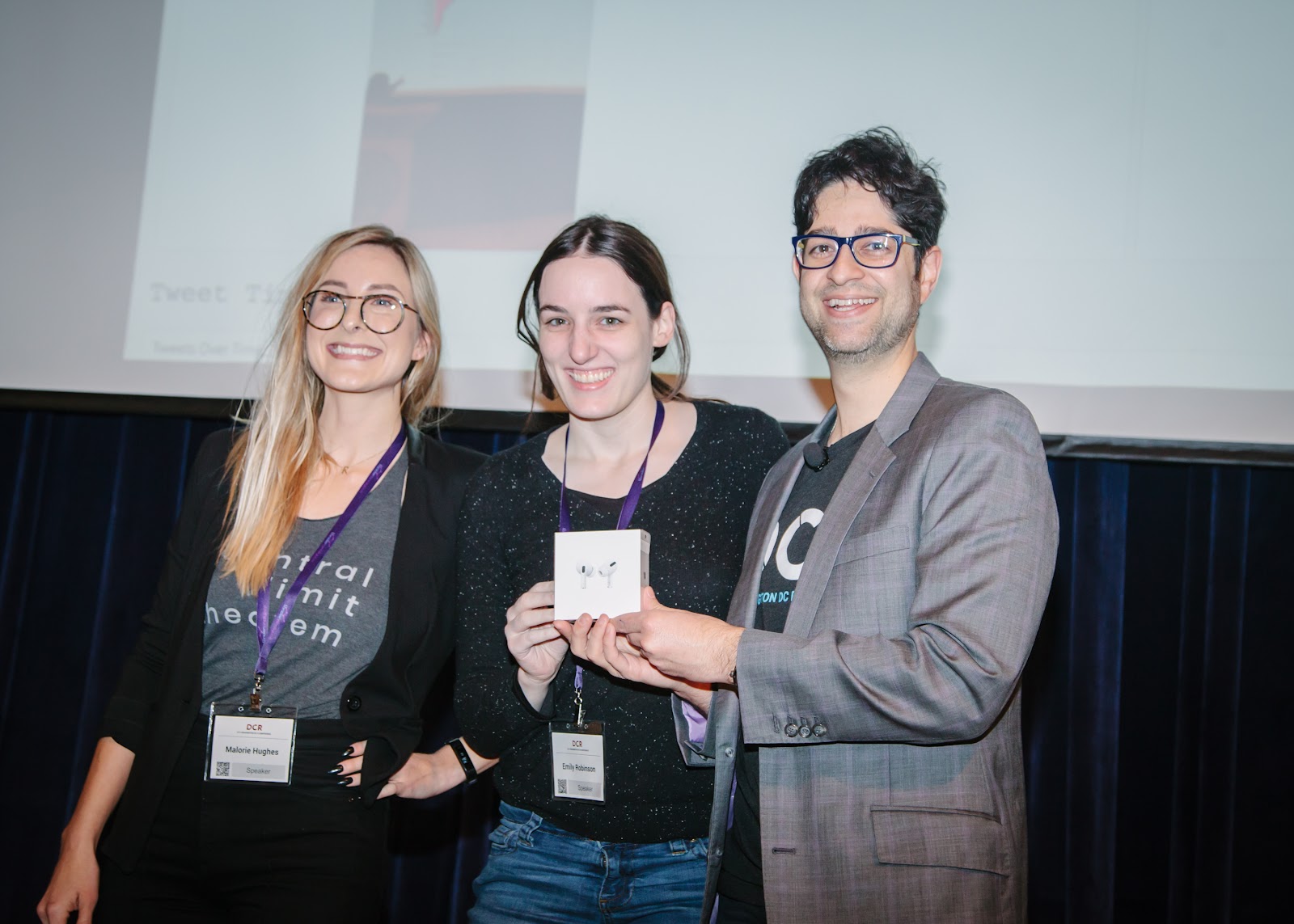
Emily Robinson and Honey Berk Win Headphones for Most Tweets During the Conference
Emily Robinson winning the tweeting grand prize
If you’re not following Emily Robinson (@robinson_es) and Honey Berk (@honeyberk), you’re missing out! Emily and Honey led all conference attendees in Twitter mentions according to our Twitter scorekeeper Malorie Hughes (@data_all_day). Because of Emily and Honey’s presence on Twitter, those who were unable to attend the conference were able to follow along with all of our incredible speakers throughout the two-day event.
Tweet stats dashboard created by Malorie Hughes
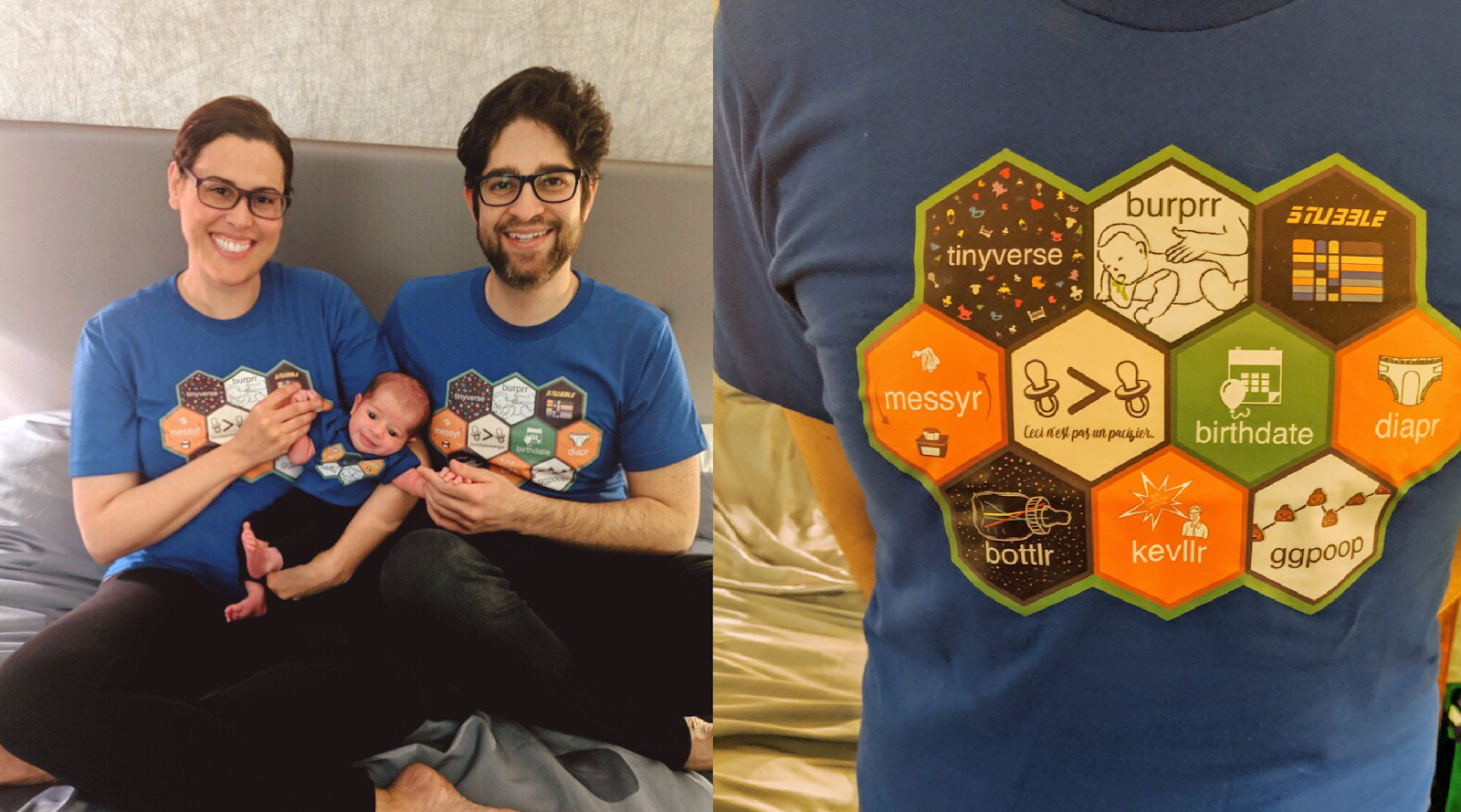
Jared Lander Debuts New-Born R Package Hex Sticker T-Shirts: Congratulations to Jared and Rebecca on the Birth of their Son, Lev
Baby themed hex sticker shirts designed by Vivian Peng
During my talk I debuted a custom R package hex sticker t-shirt with my wife Rebecca and son Lev. We R a very nerdy family.
Looking Forward to 2020
If you attended the 2019 New York R Conference, we hope you had an incredible experience. If you did not attend the conference, we hope to see you next year!
The crowd at an early meetup fit in a small room at Columbia with room to spare.
I started attending regularly and pretty soon Drew decided to serve pizza which later led to years of pizza data. He also designed a logo for the NYC Data Mafia, which made for a great t-shirt that we still sell. One time, a number of us were talking and realized we were all answering each other’s questions on StackOverflow. Our community was growing both in person and online. I fell in love with the group because it was a great place to learn and hang out with smart, welcoming people.
During the first two years our hosts included NYU, Columbia, AOL and a handful of others. At this time there were about 1,800 members with Drew as the sole organizer who was ready to focus on other parts of his life, so he asked Wes McKinney and me to take over as organizers. This was after Drew renamed the group the Open Statistical Programming Meetup as to include other open source languages like Python, Julia, Go and SQL. I was incredibly thrilled to organize this group which meant so much to me.
The Meetup’s most popular night featured Hadley Wickham and coincided with my fifth date with Rebecca Martin, my future wife.
That night was also my fifth date with Rebecca Martin. We originally met during Michael Kane’s talk about PubMed then reconnected about a year later. We went on to get married and have a kid together. The New York Times used the nerdiest closing line ever for our wedding announcement: “The couple met in New York in May 2014 at a meet-up about statistical programming organized by the groom.”
Rebecca and I recently added a new R programmer to our family and celebrated with baby-themed hex sticker shirts.
The Meetup has grown not only in numbers but in reach as well. There’s a website hosting all of the presentations, we livestream the Meetups and people from all over the world chat in our Slack team. Our live events include an ongoingworkshopseries and conferences in New York and Washington DC, which just hit their fifth anniversary, all for building and supporting the community and open source software.
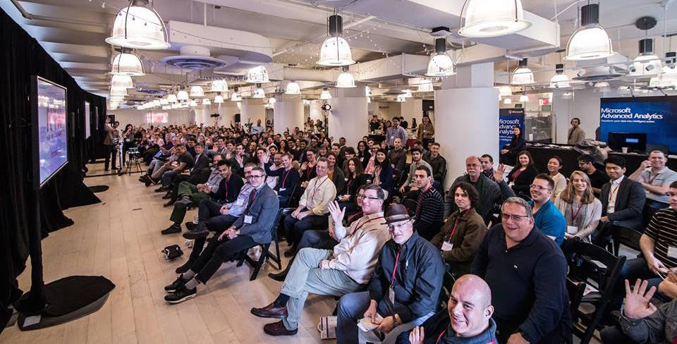
The crowd at the New York R Conference.
These past ten years have been a collection of amazing experiences for me where I got to learn from some of the world’s best experts and develop lasting relationships with great people. This community means so much to me and I very much look forward to its continued growth over the next decade.
On Pi Day this year I was giving a keynote talk at DataFest in Scotland, so we celebrated Pi Day a week later, on the 21st. While it wasn’t the exact date, there’s never a bad time to eat pizza and Pi Cake.
This was the tenthPiCake, and it’sprettyhard to beat the Einstein design on last year’s Pi Cake, so Empire Cakes gave created us a cake with the actual definition of pi: The ratio of a circle’s circumference to its diameter.
For pizza we went to the new Lombardi’s in Chelsea. They use an amazing electric oven instead of coal, so if you look closely you can tell the difference, but the pizza was still great and the decor was fantastic.
After four sold-out years in New York City, the R Conference made its debut in Washington DC to a sold-out crowd of data scientists at the Ronald Reagan Building on November 8th & 9th. Our speakers shared presentations on a variety of R-related topics.
R Superstars Mara Averick, Roger Peng and Emily Robinson
A hallmark of our R conferences is that the speakers hang out with all the attendees and these three were crowd favorites.
Michael Powell Brings R to the aRmy
Major Michael Powell describes how R has brought efficiency to the Army Intelligence and Security Command by getting analysts out of Excel and into the Tidyverse. “Let me turn those 8 hours into 8 seconds for you,” says Powell.
Max Kuhn Explains the Applications of Equivocals to Apply Levels of Certainty to Predictions
After autographing his book, Applied Predictive Modeling, for a lucky attendee, Max Kuhn explains how Equivocals can be applied to individual predictions in order to avoid reporting predictions when there is significant uncertainty.
NYR and DCR Speaker Emily Robinson Getting an NYR Hoodie for her Awesome Tweeting
Emily Robinson tweeted the most at the 2018 NYR conference, winning her a WASD mechanical keyboard and at DCR she came in second so we gave her a limited edition NYR hoodie.
Max Richman Shows How SQL and R can Co-Exist
Max Richman, wearing the same shirt he wore when he spoke at the first NYR, shows parallels between dplyr and SQL.
Michael Garris Tells the Story of the MNIST Dataset
Michael Garris was a member of the team that built the original MNIST dataset, which set the standard for handwriting image classification in the early 1990s. This talk may have been the first time the origin story was ever told.
R Stats Luminary Roger Peng Explains Relationship Between Air Pollution and Public Health
Roger Peng shows us how air pollution levels has fallen over the past 50 years resulting in dramatic improvements in air quality and health (with help from R).
Kelly O’Briant Combining R with Serverless Computing
Kelly O’Briant demonstrates how to easily deploy R projects on Google Compute Engine and promoted the new #radmins hashtag.
Hot Dog vs Not Hot Dog by David Smith (Inspired by Jian-Yang from HBO’s Silicon Valley)
On the first day I challenged the audience to analyze the tweets from the conference and Malorie Hughes, a data scientist with NPR, designed a Twitter analytics dashboard to track the attendee with the most tweets with the hashtag #rstatsdc. Seth Wenchel won a WASD keyboard for the best tweeting. And we presented Malorie wit a DCR speaker mug.
Strong Showing from the #RLadies!
The #rladies group is growing year after year and it is great seeing them in force at NYR and DCR!
A common theme is that getting everyone setup on their individual computers is very difficult. No matter how many instructions I provide, there are always a good number of people without a proper environment. This can mean not using RStudio projects, not having the right packages installed, not downloading the data and sometimes not even installing R.
Solution
After many experiments I finally came upon a solution. For every class I teach I now create a skeleton project hosted on GitHub with instructions for setup.
The instructions (in the README) consist of three blocks of code.
Package installation
Copying the project structure from the repo (no git required)
Downloading data
All the user has to do is copy and paste these three blocks of code into the R console and they have the exact same environment as the instructor and other students.
Using this process, 95% of my students are prepared for class.
The inspiration for this idea came from a fun coffee with Hadley Wickham and Jenny Bryan during a conference in New Zealand and the implementation is made possible thanks to the usethis package.
Automating the Setup
Now that I found a good way to get students started, I wanted to make it easier for me to setup the repo. So I created an R package called RepoGenerator and put it on CRAN.
The first step to using the package is to create a GitHub Personal Access Token (instructions are in the README). Then you build a data.frame listing datasets you want the students to download. The data.frame needs at least the following three columns.
Local: The name, not path, the file should have on disk
Remote: The URL where the data files are stored online
Mode: The mode needed to write the file to disk, ‘w’ for regular text files, ‘wb’ for binary files such as Excel or rds files
An example data.frame is available in the RepoGenerator package.
After that you define the packages you want your students to use. There can be as few or as many as you want. In addition to any packages you list, rprojroot and usethis are added so that the instructions in the new repo will be certain to work.
Now all you need to do is call the createRepo() function.
createRepo(
    # the name to use for the repo and project
    name='WorkshopExampleRepo',
    # the location on disk to build the project
    path='~/WorkshopExampleRepo',
    # the data.frame listing data files for the user to download
    data=datafiles,
    # vector of packages the user should install
    packages=packages,
    # the GitHub username to create the repo for
    user='jaredlander',
    # the new repo's README has the name of who is organizing the class
    organizer='Lander Analytics',
    # the name of the environment variable storing the GitHub Personal Access Token
    token='MyGitHubPATEnvVar'
)
After this you will have a new repo setup for your users to copy, including instructions.
That’s All
Reducing setup issues at the start of a training can really improve the experience for everyone and allow you to get straight into teaching.
Please check it out and let me know how it works for you.
Excited to announce that i am waiting in a LINE for the WOMEN’s restroom at a tech conference! Thanks @RLadiesNYC, @RLadiesGlobal, and @nyhackr for the opportunity, wouldn’t be here without your support
Particularly gratifying for me was seeing so many of my students speak. Eurry Kim, Dan Chen and Alex Boghosian all gave excellent talks.
Some highlights that stuck out to me are:
Emily Robinson Shows There is More to the Tidyverse than Hadley
Emily Robinson, otherwise known as ERob, gave an excellent talk showing how the Tidyverse is so much more than just Hadley and that there are many people inspired by him to contribute in the Tidy way.
Sean Taylor Forecasted the Future with Prophet
Sean Taylor, former New Yorker and unrepentant Eagles fan, demonstrate his powerful R and Python, package Prophet, for forecasting time series data. Facebook open sourced his work so we could all benefit.
Hadley Wickham showed us how to get into the internals of R and figure out how to examine objects from a memory perspective.
Jennifer Hill Demonstrated Awesome Machine Learning Techniques for Causal Inference
Following her sold-out meetup appearance in March, Jennifer continued to push the boundaries of causal inference.
I Made the Authors of Caret and scitkit-learn Show That R and Python Can Get Along
While both Andreas and Max gave great individual talks, I made them pose for this peace-making photo.
David Robinson Got the Upper Hand in a Sibling Twitter Duel
Given only about 30 minutes notice, David put together an entire slideshow on how to livetweet and how to compete with your sibling.
In the End Emily Robinson Beat Her Brother For Best Tweeting
Despite David’s headstart Emily was the best tweeter (as calculated by Max Kuhn and Mara Averick) so she won the WASD Code mechanical keyboard with MX Cherry Clear switches.
Silent Auction of Data Paintings
Thomas Levine made paintings of famous datasets that we auctioned off with the proceeds supporting the R Foundation and the Free Software Foundation. The Robinson family very graciously chipped in and bought the painting of the Pizza Poll data for me! I’m still floored by this and in love with the painting.
It’s Pi Day, when we celebrate all things round by eating pizza and Pi Cake. This is the ninthyearwehavecelebratedPiDay and the fourth year in a row we got the Pi Cake from Empire Cakes. This year’s pizza place was Arturo’s on Thompson and Houston. Arturo’s is a great example of old New York pizza with an oven dating to the 1920’s.
In addition to the traditional Pi Symbol atop the cake we added Albert Einstein since today is also his birthday. It seems fitting that we lost one of the world’s other greatest physicists, Stephen Hawking on the same math holiday.
Pi Cake 2018
The crew has grown quite large from the five of us who celebrated our first pie day almost a decade ago.